Build Design Systems With Penpot Components
Jul 21, 2:15 AM
Penpot's new component system for building scalable design systems, emphasizing designer-developer collaboration.
smashingmagazine.com

UX Planet — Medium | Nick Babich 
As you probably already guessed this article is dedicated to blue color. Without a doubt, blue is one of the most important colors in UI design, and one of the most frequent. Just look at your smartphone app icons, and you’ll see that a lot of them are blue: Facebook, Twitter, Shazam, Safari, etc.
There are a lot of reasons to use blue, I’ll list a few of them:
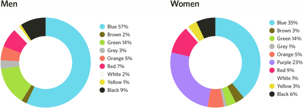 Color preference is an important aspect of visual experience
 Blue has an association with nature due to this being the color of ocean and sky.


 Delta airlines
 Blue evokes a sense of balance as well as calm intelligence. That’s why the vast majority of financial services firms use blue.
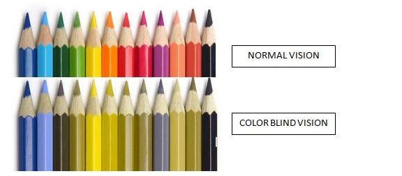 How visually impaired people see colors
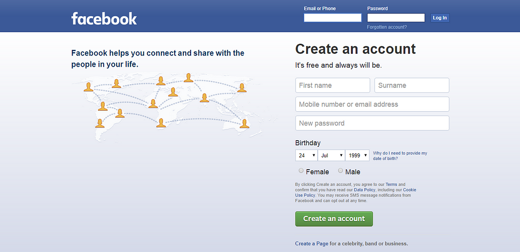 Blue is Facebook’s dominant color, because Mark Zuckerberg is colorblind. As he said, “blue is the richest color for me — I can see all of blue.”
I hope that after reading this article you have a good idea of why blue color is so popular among designers. However, this doesn’t mean that you should go and change the main color in your app/website to blue.
Blue isn’t the universal best color. There’s simply no universal best color.
What works on one site or app, doesn’t necessarily work on another. It’s a safe bet to select the color according to the preferences of your target audience:
Ultimately, the right color for your design is the one that your users think is right.
What is your favorite color? Let me know in comments!
Follow UX Planet: Twitter | Facebook
Originally published at babich.biz
The Most Important Color In UI Design was originally published in UX Planet on Medium, where people are continuing the conversation by highlighting and responding to this story.
AI-driven updates, curated by humans and hand-edited for the Prototypr community


