Build Design Systems With Penpot Components
Jul 21, 2:15 AM
Penpot's new component system for building scalable design systems, emphasizing designer-developer collaboration.
smashingmagazine.com

medium bookmark / Raindrop.io |
“In nature, light creates the color. In the picture, color creates the light.”
— Hans Hofmann
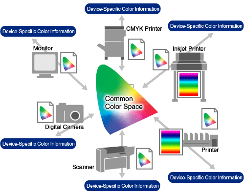
Formed in 1993, the International Color Consortium (ICC) is made of eight vendors who wanted to standardize a vendor-neutral color management system which would function transparently across all operating systems and software packages. An ICC profile is a set of data that characterizes a color input or output device, or a color space, according to standards promulgated by the (ICC).
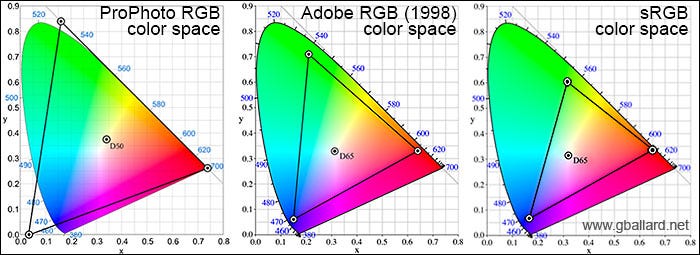
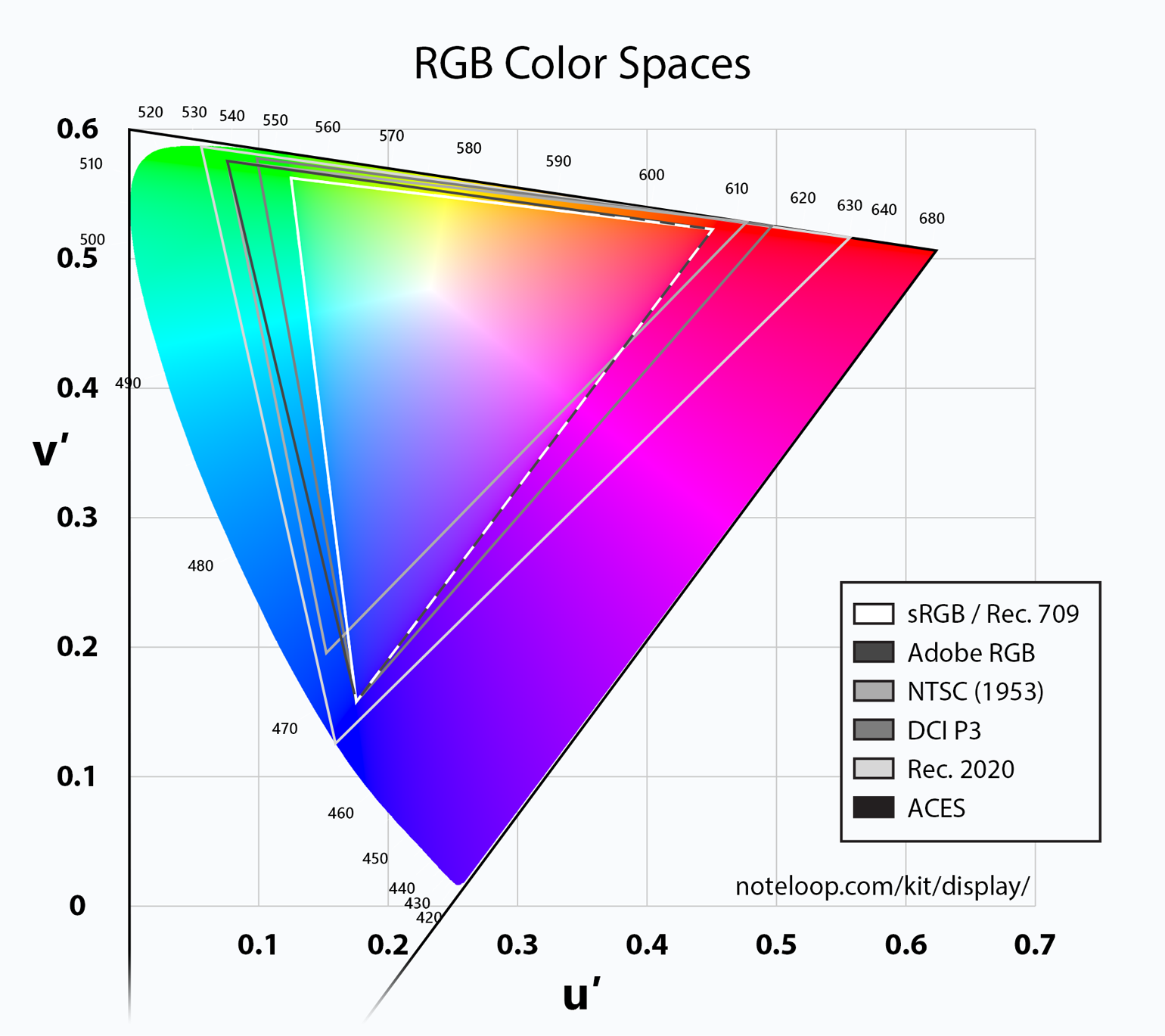
Color Space — Color space (color model, color system) is an abstract mathematical model which describes the range of colors as numbers, typically as 3 or 4 values or color components (e.g. RGB, CMYK). Each color in the system is represented by a single dot.
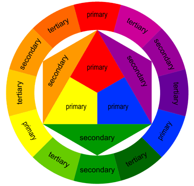
Primary Colors — In the RYB (or subtractive) color model, the primary colors are red, yellow and blue.
Secondary Colors — The three secondary colors (green, orange and purple) are created by mixing two primary colors.
Tertiary Colors — Another six tertiary colors are created by mixing primary and secondary colors.
Complementary Colors — Colors that oppose each other on the color wheel, like red and green
Analogous (Adjacent) Colors — Colors that are next to each other on the color wheel, like blue and purple.
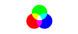
Additive Color — A method to create color by mixing a number of different light colors, with shades of red, green, and blue being the most common primary colors used in additive color system.
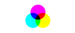
Subtractive Color — A method where colors are created by subtracting (absorbing) parts of the spectrum of light present in ordinary white light, by means of colored pigments or dyes, such as those in paints, inks, and the three dye layers in typical color photographs on film.
RGB Colors — Red, Green and Blue. In the RGB model, the overlapping of additive colors (red, green and blue) results in subtractive colors (cyan, magenta and yellow). These are the best colors for digitally displayed assets. The red, green, and blue use 8 bits each, which have integer values from 0 to 255. This makes 256*256*256=16777216 possible colors.
RBG Additive
CMYK Colors — Cyan, Magenta, Yellow and Black. In the CMYK model, the overlapping of subtractive colors (cyan, magenta and yellow) results in additive colors (red, green and blue). These are the best colors for printed assets. The values are represented as cmyk(C%, M%, Y%, K%), where C, M, Y, and K are the percent values for the cyan, magenta, yellow, and black values of the color.
CMYK Subtractive
“All colors are the friends of their neighbors and the lovers of their opposites.”
— Marc Chagall
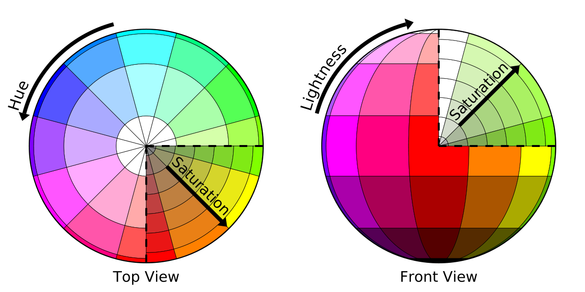
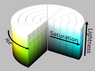
Hue — Hue refers to the color of the image itself. Hue is a degree on the color wheel (from 0 to 360 degrees) — 0 (or 360) is red, 120 is green, 240 is blue. It is formally defined as “the degree to which a stimulus can be described as similar to or different from stimuli that are described as red, green, blue, and yellow” (source).
Saturation — Color saturation refers to the intensity of color in an image. When color is fully saturated, the color is considered its purest (truest) version. Saturation is a percentage value: 0% means a shade of gray and 100% is the full color. Pure colors are fully saturated.
Tint — A tint is a mixing result of an original color where white has been added. A tint is lighter than the original color.
Shade — A shade is a mixing result of an original color where black has been added. A shade is darker than the original color.
Tone — Tone is a result of mixing a pure color with any neutral/grayscale color including the two extremes white and black. A tone is produced either by the mixture of a color with gray, or by both tinting and shading.
Chroma — The quality of a color’s purity, intensity or saturation. In other words, chroma is the perceivedstrengthof a surface color, the degree of visual difference from a neutral grey of the same lightness.
Brightness/Lightness — Brightness is the relative lightness or darkness of a particular color, from black (no brightness) to white (full brightness). Lightness is a percentage; 0% is black, 100% is white.
Intensity — Intensity refers to the purity of a hue.The highest intensityor purity of a hue is the hue as it appears in the spectrum or on the color wheel. A hue reduced in intensity is called a Tone.
Luminosity — This is the measurement of brightness, with a scale from white to black. Luma (%) is the intensity of the achromatic signal contributing to our color perception. A saturation value of 0 indicates mostly grey while 100% luminosity (or L = 255) is white.
Measurement — Hue, saturation, and lightness (brightness) are computed from raw R, G and B channel values scaled into a range of 0 to 255.
“If one says ‘red’ — the name of color — and there are fifty people listening, it can be expected that there will be fifty reds in their minds. And one can be sure that all these reds will be very different.”
— Josef Albers
RGB — An RGB color value is specified with: rgb(red, green, blue). Each parameter (red, green, and blue) defines the intensity of the color and can be an integer between 0 and 255 or a percentage value (from 0% to 100%) (W3School).
RGBA — RGBA stands for red green blue alpha. RGBA color values are an extension of RGB color values with an alpha channel — which specifies the opacity of the object. The alpha parameter is a number between 0.0 (fully transparent) and 1.0 (fully opaque), and the RGB values (W3School).
Hexadecimal colors — A hexadecimal color is specified with: #RRGGBB, where the RR (red), GG (green) and BB (blue) hexadecimal integers specify the components of the color. All values must be between 00 and FF. For example, the #0000ff value is rendered as blue, because the blue component is set to its highest value (ff) and the others are set to 00 (W3School).
HSL colors — HSL stands for hue, saturation, and lightness — and represents a cylindrical-coordinate representation of colors. An HSL color value is specified with: hsl(hue, saturation, lightness). Hue is a degree on the color wheel (from 0 to 360) — 0 (or 360) is red, 120 is green, 240 is blue. Saturation is a percentage value; 0% means a shade of gray and 100% is the full color. Lightness is also a percentage; 0% is black, 100% is white (W3School).
HSLA Colors
HSLA colors — HSLA color values are an extension of HSL color values with an alpha channel — which specifies the opacity of the object. An HSLA color value is specified with: hsla(hue, saturation, lightness, alpha), where the alpha parameter defines the opacity. The alpha parameter is a number between 0.0 (fully transparent) and 1.0 (fully opaque) (W3School).
Color is visual emotion. You can use it to tell stories and condition people to act, feel, and behave a certain way.
“Color is a power which directly influences the soul.”
― Wassily Kandinsky
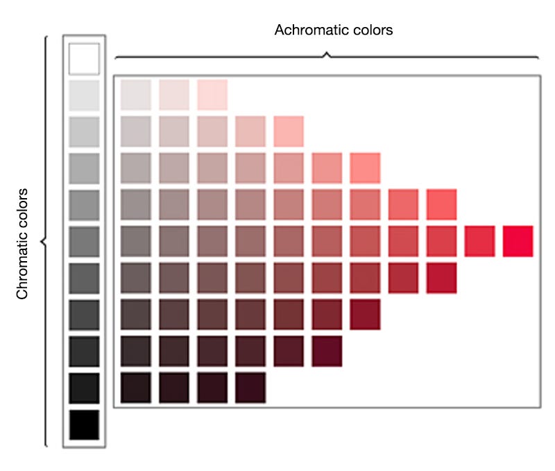
Any color that lacks strong chromatic content is said to be unsaturated, achromatic, near neutral, or neutral. Achromatic colors (white, grey and black) have lightness, but no hue or saturation. Near neutrals include browns, tans, pastels, and darker colors (Color Theory). These colors are used to represent softness and lightness, typically conveying calmness and more neutral undertones.
Can we feel hot or cold based on color? The difference between warm and cool colors is related to the observed contrast in landscape light, between the warm colors associated with daylight or sunset, and the cool colors associated with a gray or overcast day. These can be categorized as environmental colors — where we inherently associate real world elements with how they make us feel (temperature, humidity).
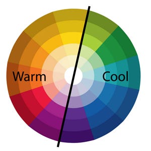
Warm vs Cool Color WHeel
Warm colors are often said to be hues from red through yellow, browns and tans included. In contrast, cool colors are often said to be the hues from blue green through blue violet, most grays included — indicating more of a temperature representation of color. Warm colors are said to appear more active, while cool colors tend to recede or fade into the background (Color Theory).
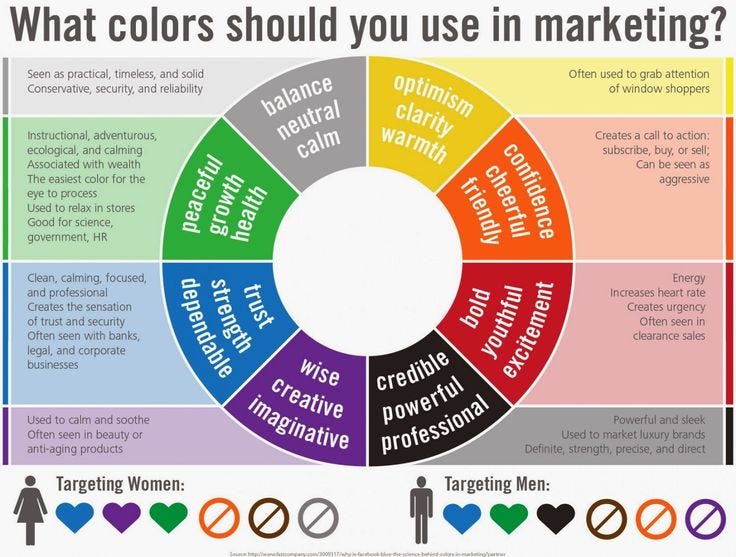
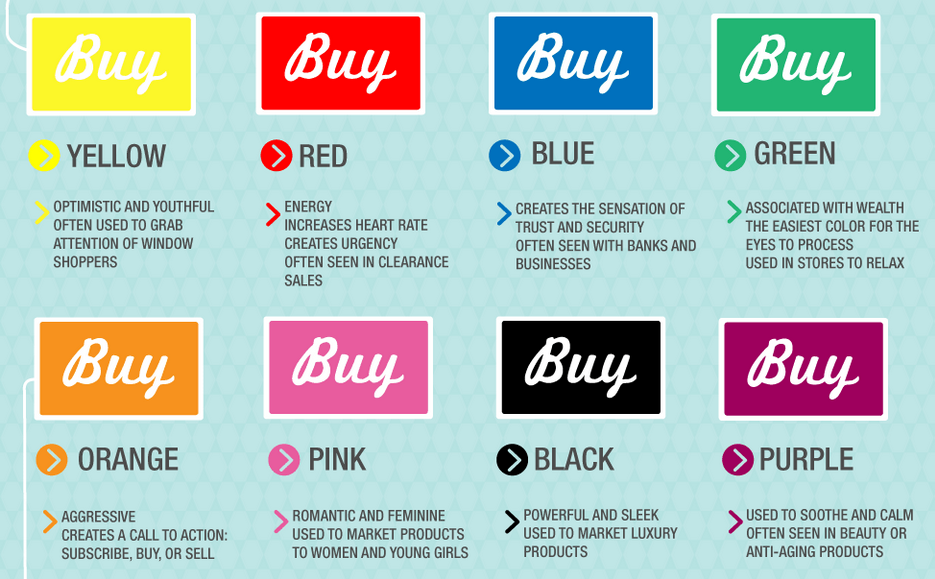
Color psychology refers to the emotional conditioning of color — its impact on how people think, feel, and act.
Blue — Trust, Intelligence
Red — Love, Energy, Passion, Anger, Hunger
Black — Bold, Rich, Power, Evil
Green — Soothing, Natural, Jealousy, Balance, Restful
Yellow — Cheer, Childish, Warmth, Optimistic
Orange — Youthful, Happy, Attraction, Friendly
Pink — Sensitive, Caring, Love, Sexuality, Emotion
Purple — Royal, Luxury, Mysterious, Sadness
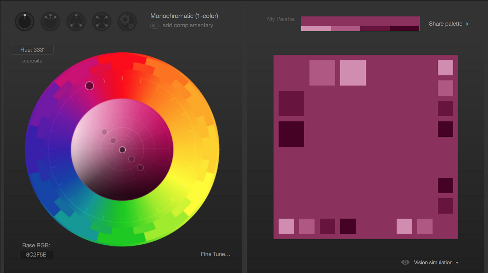
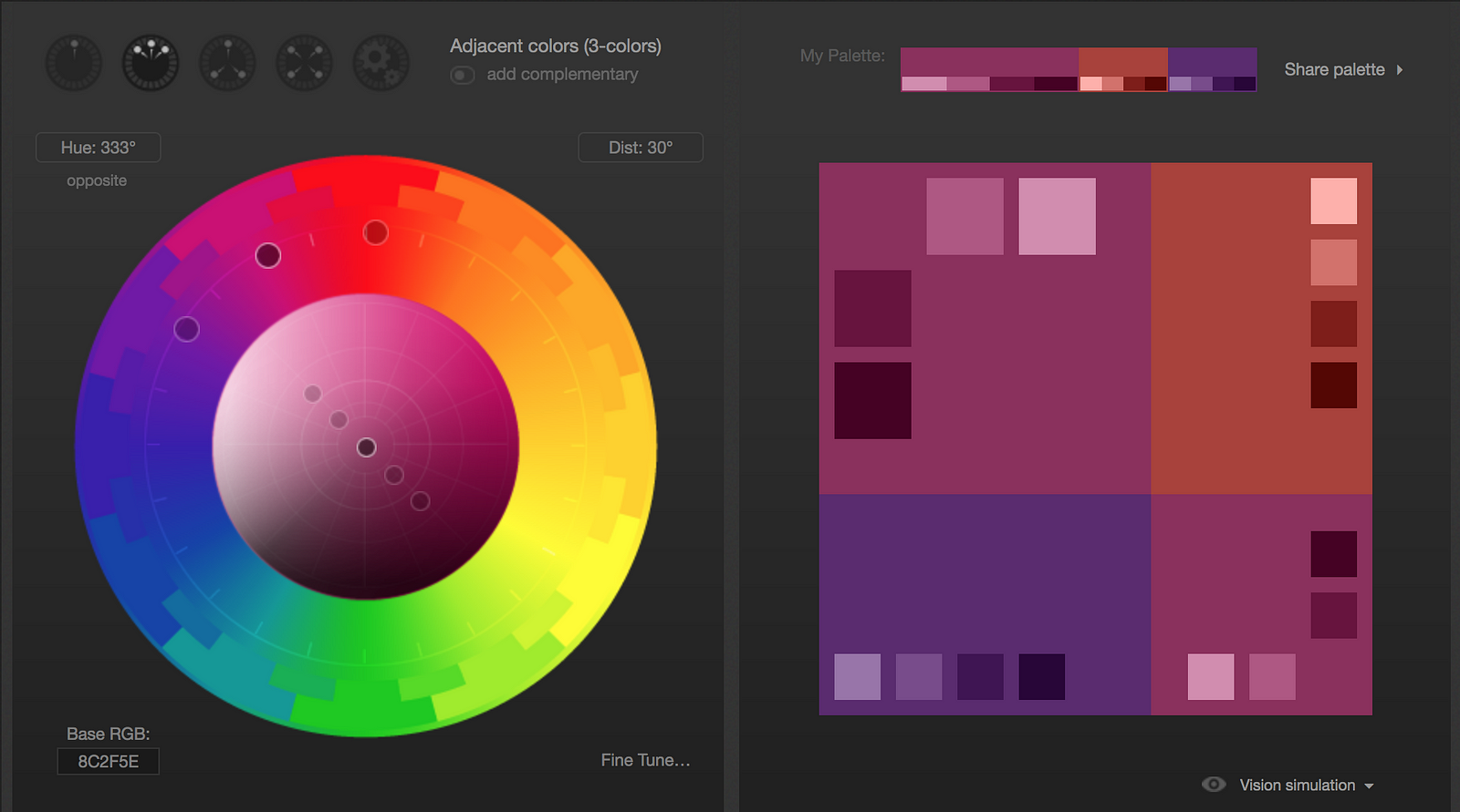
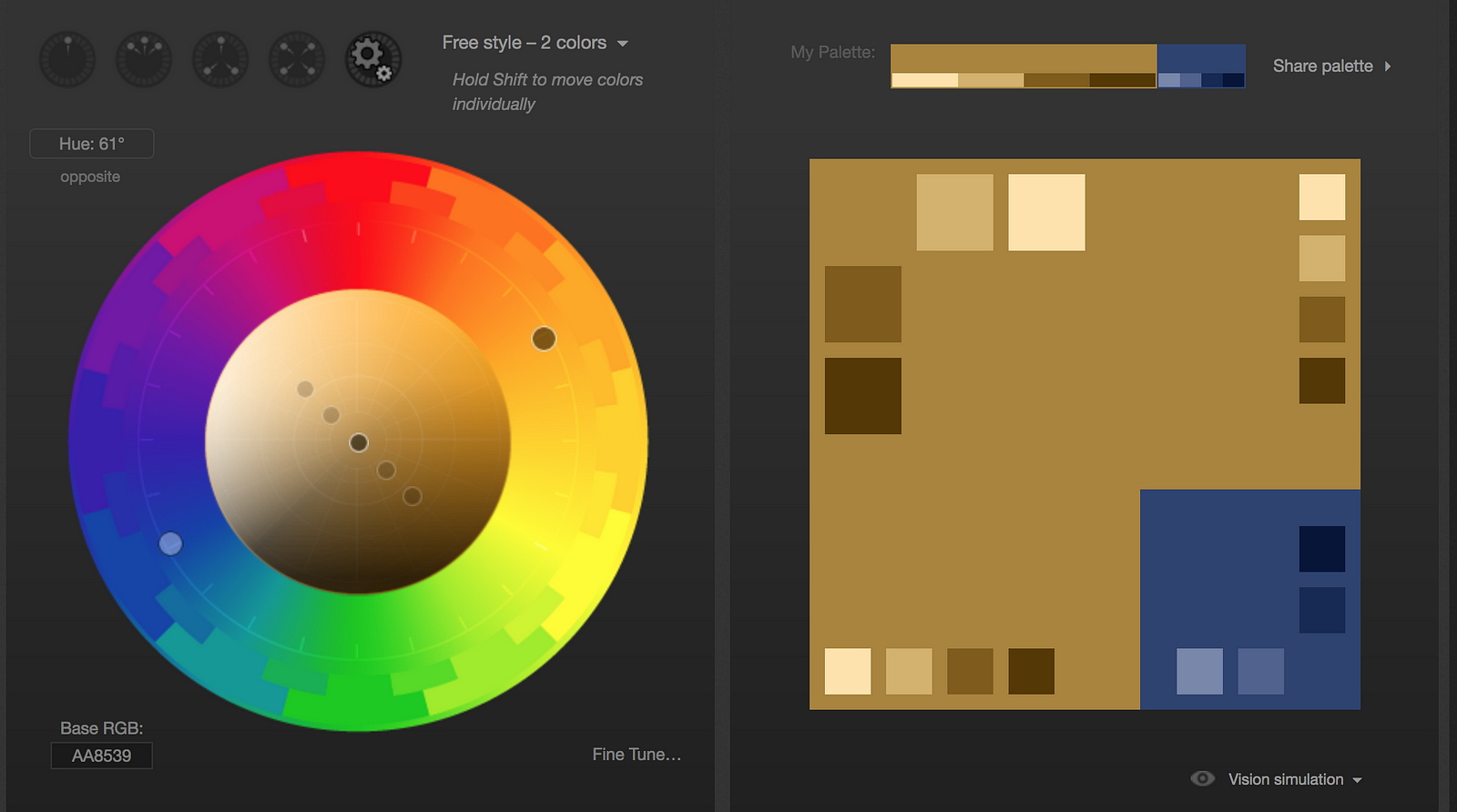
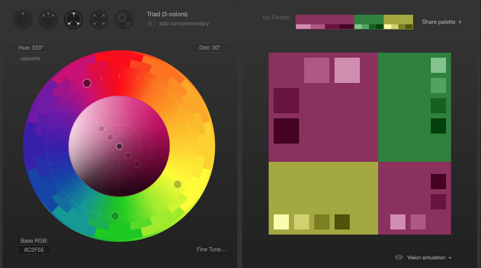
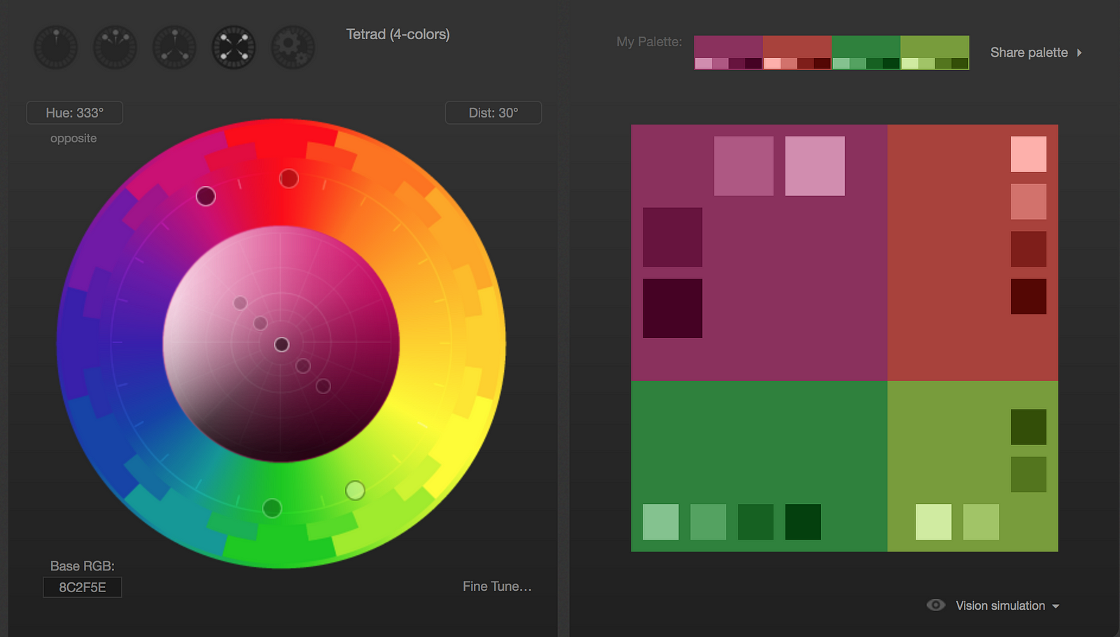
Here are some color palettes made with the tool Paletton to demonstrate the different hues and saturations designers can use for particular color palettes.
“Color can overwhelm… One must understand that when it comes to color, ‘less’ is often ‘more’ — lesson taught us by the masters but ignored by many artists.”
— Joe Singer
Approximately 8% of men and 0.5% of women are affected by some form of color blindness. Designers should be mindful of users with color blindness and should ensure that important UX interactions do not discriminate against color blindness.
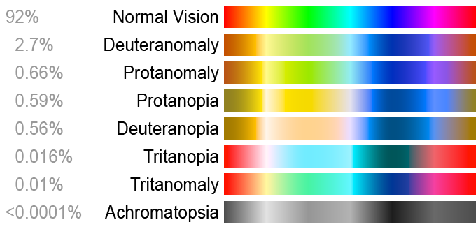
Color Blind Spectrum
This color blindness is caused by the loss or limited function of red cone or green cone photopigments (NIH).
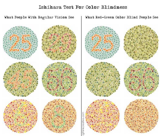
Blue-yellow color blindness is rarer than red-green color blindness. Blue-cone (tritan) photopigments are either missing or have limited function (NIH).
People with complete color blindness (monochromacy) don’t experience color at all and the clearness of their vision may also be affected (NIH).
The aim of color calibration is to measure and/or adjust the color response of a device (input or output) to a known state.
Use these tools to build effective color schemes.
Stylify — Online styleguide generator
SC5 — Another awesome web-based styleguide generator
Paletton — An advanced color palette creator.
Adobe Color CC — Another robust color palette generator.
Colormind — An AI powered color picker.
Canva — Extract color profiles from photos.
Color Oracle — Color blindness simulator and checker.
uiGradients — Gradient generator.
ColorZilla — Robust gradient generator for web content.
ColorSnapper — Color selector for any digital screen.
Additive Color — Wikipedia
Color — W3 Schools
Work With Color — WWC
NIH Color Blindness — NIH
— —
Want to see more awesome designer guides? Follow me for more!
AI-driven updates, curated by humans and hand-edited for the Prototypr community


