Build Design Systems With Penpot Components
Jul 21, 2:15 AM
Penpot's new component system for building scalable design systems, emphasizing designer-developer collaboration.
smashingmagazine.com

Creative Review | Patrick Burgoyne
 Unveiling any new identity these days involves a collective holding of breath, girding of loins and terror of Twitter for all concerned. Nevertheless, 2017 saw some major rebrands encompassing everything from football clubs to museums to whole countries.
With an eye on tackling the inevitable backlash and involving its community in the process, Mozilla attempted to conduct its rebrand in the open. Design consultancy johnson banks signed up for the ride (which we followed closely), culminating in the release of the final scheme in January.

“I think in Mozilla’s case, with a very engaged online community, it’s been a great way to engage and involve,” johnson banks’ Michael Johnson said of the process, in which each stage was made public. “When this launches it should not come as a surprise, no-one in [Mozilla’s] close community will be able to say ‘you didn’t ask me’. Would it work for a highly protective, autocratic, top-down style organisation? No. But it’s now not unusual for dozens, sometimes hundreds of staff to be involved in rebrands, so the principle of opening up even further isn’t such a bad idea. Whilst I have a few scars from the last 10 months, the wounds aren’t deep – they’ll heal over!”

Legibility? Pah, who needs it: one of the more challenging schemes of the year was unveiled in May with Uniform‘s identity for the Fakultet for kunst, musikk og design, UiB at the University of Bergen.
 The mark took the whole (rather long and unwieldy) name of the institution and, in its most extreme form, compressed it together to form a jumble of letters that nonetheless was distinctive and memorable. In other executions, however, the name extended into a more immediately readable form.

If there has been a theme in visual identity over the past two years, perhaps it has been what some dismiss as ‘blandification’ but others view as a welcome return to simpler, easier to use schemes whereby complex, ‘flexible’ systems are being replaced by more stripped down schemes. A case in point was North’s new system for the Southbank Centre.

It replaced a previous scheme by Wolff Olins (see below)
 Southbank 2007. Wolff Olins team, led by Brian Boylan and Marina Willer
“The previous Southbank Centre identity had very little brand presence – the identity had become very sporadic and often nearly invisible,” North’s Charlie De Grussa told us. “The in-house design team had always struggled to apply the ‘weave’ (see below) in its original intent, due to technical limitations and not being able to overlay such graphic elements on artists or performers’ images.”
Instead, North introduced a ‘masthead’ approach which “allows Southbank Centre to be top and centre but the content to always change as required without weakening the brand expression. Over time, the masthead coupled with the typography will become an instantly recognisable device signalling Southbank Centre as the host with the events and exhibitions the content.”


![]()

Application issues were reportedly at the heart of the reasoning behind another North scheme to be launched this year – for the Science Museum Group. Johnson banks’ previous scheme for the Science Museum itself had, we were told, proved problematic for the institution which was now also looking for a way to bring all its constituent museums together.
Again, the scheme as criticised for so-called ‘blandification’ and for not being original (graduated type having been used for several prior schemes). In fact the Twitter reaction ran the full gamut of standard designer responses including that it looked like a ‘student project’, was unnecessary (despite tweeters having no knowledge of the brief) and that it looked like other things.


North told us it was asked to design an identity that would enable the Science Museum Group to present itself as “a family of museums with a shared vision”. “Without criticising the past identity, [it was felt that] it just wasn’t one that could work across the whole group, and be easily understood and read by everybody,” North’s Sean Perkins explained. The studio had discussed the fact that other companies had used a similar effect but “We all agreed that the SMG identity could execute a typographic gradient idea uniquely and that the approach offered a near perfect solution to the group design brief.”
The scheme also highlighted how difficult it can be for designers to see work which they had hoped would endure and to which they have a strong emotional bond replaced by something new. This seems particularly acute with identities as, almost overnight, old can be superseded with new. Johnson banks, designers of the previous scheme, took to Twitter to voice their dismay – something for which they were themselves criticised. Later, however, the studio posted a more reflective piece on why brands change, painful though it may be.
And talking of painful, Juventus unveiled one of the most contentious rebrands of the year as it ditched decades of footballing iconographic heritage for a new badge.
 Juventus logo launch. Image: Interbrand Milan
Juventus’s previous club badge (not a ‘logo’, please note) employed the mixture of iconography and graphic devices familiar in the football and sporting world. Its home city of Turin was symbolised by a bull set against a black and white striped background referencing the club’s famous shirts. All this was housed within an oval ‘Old French’ shield which supposedly recalled Italian ecclesiastical symbolism.

Most of that was cast aside in favour of a geometric, sharp-edged letter J created by the Milan office of Interbrand. According to Juventus, the mark is the visual manifestation of a growth strategy that sees the club moving beyond football and, via partnerships with other leading Italian brands, into becoming an entertainment or lifestyle brand.
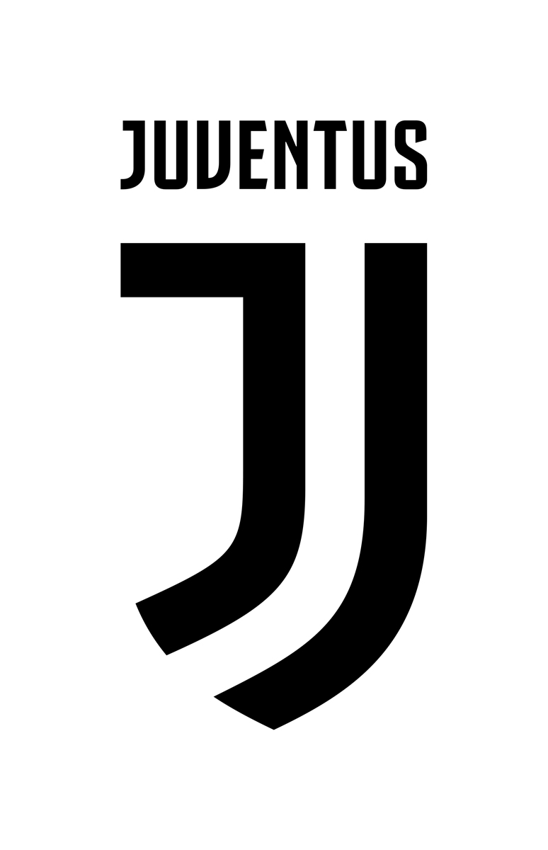 The new Juventus logo by Interbrand Milan
More sports brand controversy ensued with the rebrand of Formula 1, our story on which was the most-read piece on this website all year.
![]() The new Formula 1 logo in red on white
The new Formula 1 logo in red on white
A new mark from Wieden + Kennedy London replaced a much-loved piece of graphic design history – Carter Wong’s negative-space-powered predecessor. And if that wasn’t enough, graphic designer backs were further put up by the fact that – the horror – the new scheme was the work of an ad agency not a design studio (though of course it was done by designers working at said agency).
 Various proposed broadcast elements
Perhaps more interesting was the obvious visual debt the new scheme paid to TDR’s much-loved Wipeout graphics from the 90s – a computer game about racing informing the design of its real-life equivalent.
More popular schemes among the design community were those for Czech Rail and for the LSO, the former for its retro loveliness and the latter for its use of newish tech.
 Studio Marvil, SŽDC branding
Studio Marvil’s SŽDC branding (which we reported on here) had an obvious antecedent in Design Unit’s British Rail work. Studio Marvil explained that the ‘Ž’ of the name is taken as an abbreviation for ‘Railway’ (‘Železnice’ in Czech), “which sums up the otherwise long and not easily memorable name of the company”. The letter is stylised as “a rails scheme – three parallel railway tracks linked by a railroad switch”.
 Studio Marvil, SŽDC branding
 Studio Marvil, SŽDC branding
The Partners’ London Symphony Orchestra scheme used motion capture to translate conductor Sir Simon Rattle’s movements into a series of animations and visual elements.
 LSO Elgar poster
 Rattle’s movements were translated into motion graphics
Working with the University of Portsmouth and Vicon Motion Systems, The Partners used live motion-capture to record Rattle conducting movements on Elgar’s Variations on an Original Theme, ‘Enigma’. A circle of 12 cameras captured Rattle as he conducted using a specially-modified baton. The data collected was then sent to Hong Kong-based digital artist Tobias Gremmlerwho worked with the Partners team to transform the motion data into a series of four animated films reflecting the varied emotional qualities of the music.
Writing in CR, critic Francisco Laranjo questioned this ‘data driven’ approach, pointing out that it had been extensively used before and that “These data visualisations are in many cases impressively dense, beautifully crafted but simply unreadable objects. Through the beautification of data, designers often run the risk of making banal, or simply ignoring, the transformation of data into information, and finally knowledge.”
But the scheme received near-universal praise within the industry and won Best in Book in CR’s Annual for 2017.
And finally, while it’s no-doubt daunting to design a new identity for a much-loved museum or football club, imagine doing it for a whole country.
In September, Cardiff and Amsterdam-based Smorgåsbord unveiled a new scheme for Wales.

Smörgåsbord was commissioned by the Welsh government following a successful pitch to create an identity system that could be used across the tourism, business and food and drink sectors. The branding features a redrawn Welsh dragon, original photographs of the Welsh landscape and a bespoke typeface, Cymru Wales Sans, created with London foundry Colophon.


National branding and tourism campaigns can often veer towards either pastiche or a design that looks great but could represent anywhere. Visit Wales managed to avoid cliche while highlighting what Wales is known for – its great coastline and rugged hills – while also creating something that feels fresh and contemporary – read the full story here.
And there we have it – here’s to more rebrands in 2018, many of which will no doubt resemble student work, or something else, or have really bad kerning.
The post The year in visual identity appeared first on Creative Review.
AI-driven updates, curated by humans and hand-edited for the Prototypr community


