Build Design Systems With Penpot Components
Jul 21, 2:15 AM
Penpot's new component system for building scalable design systems, emphasizing designer-developer collaboration.
smashingmagazine.com

UX Power Tools – Medium | Christian Beck 
Look, I know I’m not the best with colors, but gold pretty much always looks brown to me in web design. It misses that luminance that it has in the real world — making it appear more yellow. But hey, who am I kidding, I haven’t seen a gold block in my life. I think it’s something like this?

It’s one thing to have gold in your graphics, illustrations or logos. But it’s even more challenging to use gold in actual UI elements without it looking…well, gross.
Here’s a growing list of aesthetically-pleasing applications of gold.
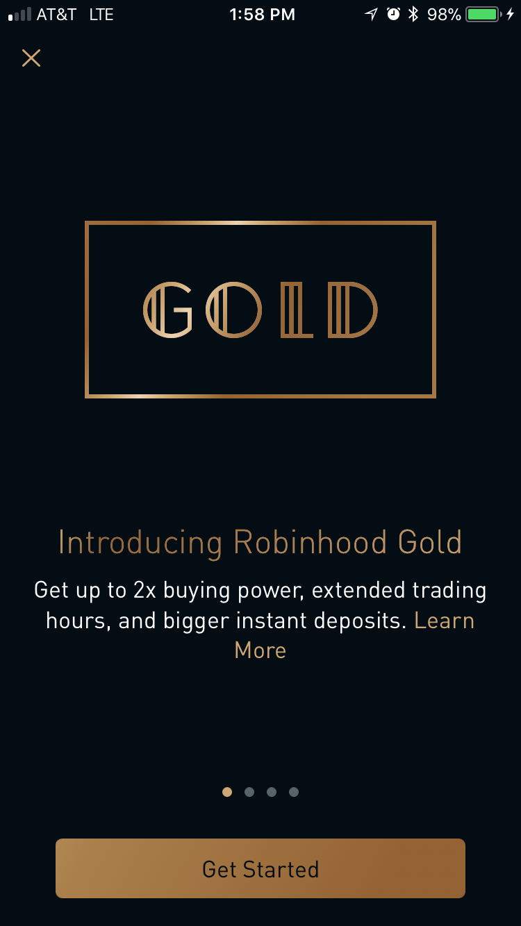
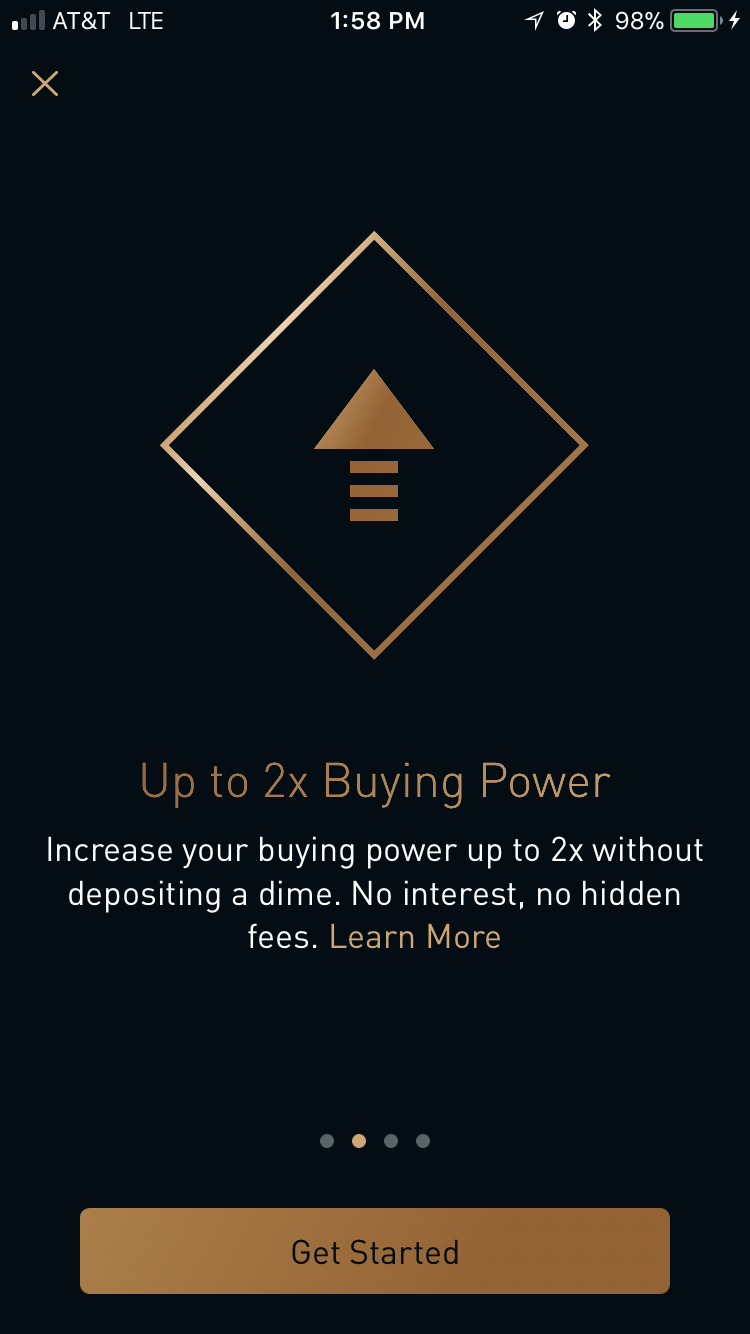
 Robinhood Gold
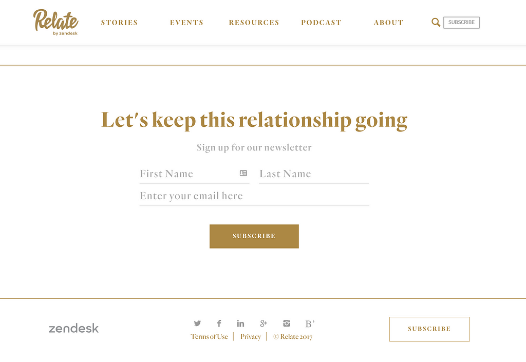 https://relate.zendesk.com/
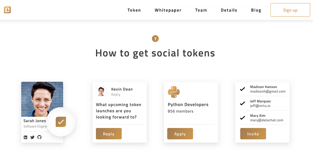 https://21.co
 Nerds & Company
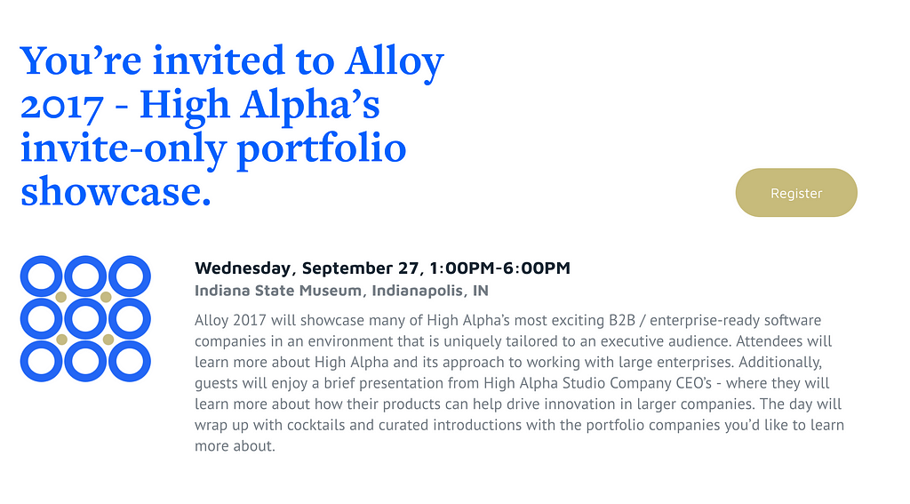 Alloy 2017 event site
 https://backtotheroots.nu/
When I’m not gold plating my design work, I’m working on Sketch design tools at UX Power Tools to make you a better, more efficient designer.
Follow UX Power Tools on Twitter
Follow me on Twitter
Tiny Trend #10: Gold UI was originally published in UX Power Tools on Medium, where people are continuing the conversation by highlighting and responding to this story.
AI-driven updates, curated by humans and hand-edited for the Prototypr community


