Build Design Systems With Penpot Components
Jul 21, 2:15 AM
Penpot's new component system for building scalable design systems, emphasizing designer-developer collaboration.
smashingmagazine.com

UX Power Tools – Medium | Jon Moore 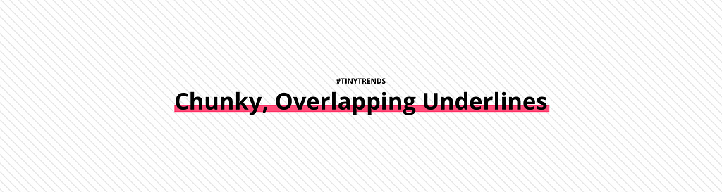
There used to be a time where you could just use use standard <a> underlines for links and then designers started getting annoyed that the lines would overlap characters that had descenders (way back from 2012). There are smart fixes for that today, but the other way to fix it is to just double-down on that overlap. WE’RE GOING ALL-IN, BABY.
Chunky, overlapping lines can be used for hyperlinks when the color is light enough. They can also be used as typographic decoration on headings, or to simply draw attention to particular words or phrases.
I have a feeling this is truly a tiny trend and will look clunky once we all get tired of it. But until that happens, lets take a look at some fantastic applications of this trend and bask in their chunky, overlapping goodness.
 https://dribbble.com/shots/3111755-The-Big-Landscape
 by Backchannel
 wired.com
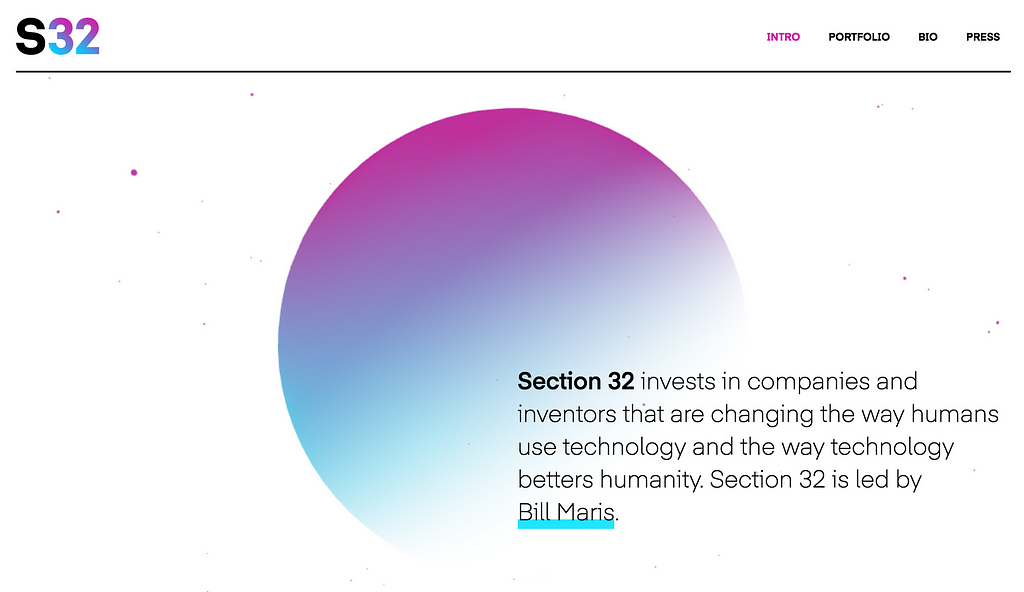 http://www.section32.com/
 ideo.com
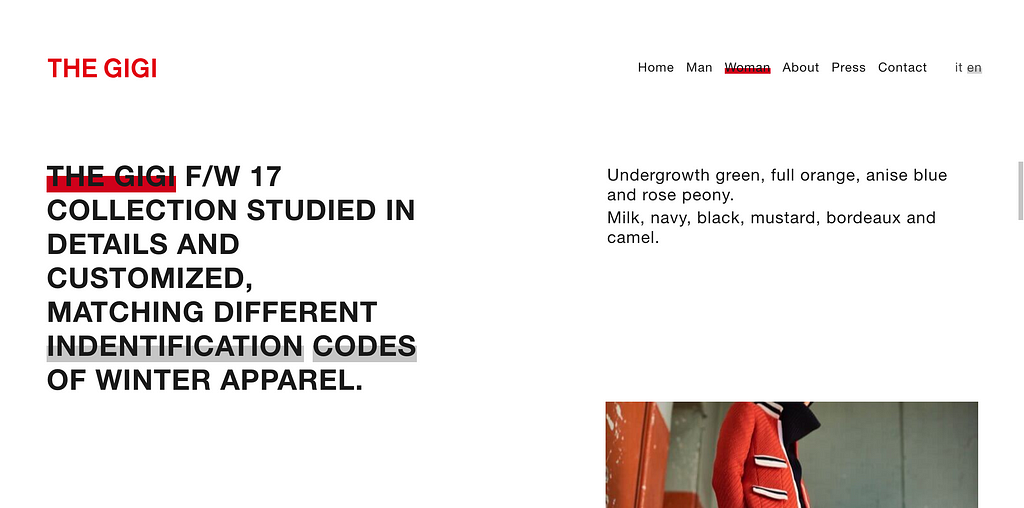 http://www.thegigi.it/
When I’m not underlining words with big, fat lines, I’m working on Sketch design tools at UX Power Tools to make you a better, more efficient designer.
Follow UX Power Tools on Twitter
Follow me on Twitter
Tiny Trend #7: Chunky, Overlapping Underlines was originally published in UX Power Tools on Medium, where people are continuing the conversation by highlighting and responding to this story.
AI-driven updates, curated by humans and hand-edited for the Prototypr community


