Build Design Systems With Penpot Components
Penpot's new component system for building scalable design systems, emphasizing designer-developer collaboration.

UX Planet — Medium | Francesca Guadagnini 
Some months ago, around May 2017, I started realising I wanted to change my job.
I’ve been working in the same agency for 3 years and I started feeling the desire for a new experience.
As I am working as a UX Designer, I started searching on my own but also being contacted by head hunters — one of them, in particular, were offering me an interesting opportunity and I decided to pick it up.
After the first phone call with the head hunter, a Skype interview with the company followed up and — of course — they gave me a challenge to focus on.
This is something I personally don’t like that much, it sounds like:
‘Hello, we have this problem, could you solve it for us? Do your best, thanksbye! Oh and, please — quickly, and for free.”
Well ok, since I was pretty interested in the job offer I decided to embrace the challenge and treat it as an excuse to refine my research & study methodology.
The challenge I’ve been working on sounded like that:
Design the User Experience and interface for a sub-section of our mobile app, focusing on the real-time monitoring of the tyres’ pressure while driving.
The challenge wasn’t really focused on the final interface solution, but on the designer way of thinking and on its personal approach to face problems.
I immediately started thinking about possible users, possible usage situations, possible usability issues, tons of interface sketches, and after all this mess I stopped thinking about things I didn’t know and focused on the little I knew.
Since the app works as a monitoring system it should take in consideration multiple scenarios such as static conditions or while driving, resulting in a useful resource able to give help in every scenario.
I started analysing all the available elements, trying to understand the app perimeter, its data set and how to manage it, and also eventually more specific functionalities.
Let’s see how all the system elements communicate.
This helps in understanding how the data is sent and retrieved, and which barriers we should keep in mind (Internet Connection, BLE, etc…).
 The System
Now, having in mind how the system works, it’s important to clarify the available dataset. The dataset is needed in order to fully understand constraints, limits, potentiality and level of automation the app could ideally reach, before going deep in the design phase.
 The Dataset
At this point, Personas generation is a necessary step.
Anyway, in this case I had just a few ideas about how to develop them, so I started working the over way around, imagining scenarios first.
When would users interact with it? Why? What’s the app real advantage?
Understanding contexts and reasons to interact with the app helped me determining the scenarios definitions and how the experience may differ from one user to another.
A context may include very specific variables but also more general ones such as environmental ones, in case of relevance.
In this case, since we’re talking about tires, I thought that weather and temperature conditions were also important to be kept in mind.

Context really helps understanding all the situations we can encounter while using the app. Displaying them visually it’s a way to start composing scenarios, creating small groups.
 Visualising the context
Creating Scenarios now is very easy, mixing the tiles (in a way that makes sense!):

Ok but… Who’s going to use the app?
Personas generation is a delicate phase, since they will guide all the design decisions. For this reason they need to be picked carefully, in fact wrong personas usually mean a wrong (deviated, not-so-accurate, etc…) design.
Personas should represent a major user group for the app, determine major user needs and summarize research data, previously done via user interviews or, in case of no time, personal research.
In this particular case, the app was focusing ona set of digital services for prestige users.
These users are typically owners of one or more top level cars, such as Lamborghini, Ferrari, McLaren, who installed the new system developed by the company offering a platform to monitor tyres’ Pressure, Temperature and wear.
This, for me, has been the most difficult part of the process.
I am not an expert about automotive, I frequently use my car but, of course, I am not a prestige owner as well as none of my friends.
(Honestly, I just remembered that JK from Jamiroquai had a Ferrari cars collection.)
Anyway, after googling about real people that could fit the app average users, (enterpreneurs, startups founders etc…), I did a quick research on common behavioral patterns and ended up with 2 profiles.
 Personas 1
 Personas 2
… Of course, I had to mix a couple of things and add some hypothetical elements, hoping they weren’t too far from reality.
Now we are ready to create our Use Cases, putting Personas next to them.

There are tons of ways to set a customer journey.
What I did is, picking a use case, imagining a situation where the app could be userful to the user and helping him solving an issue.
In this case, I basically mixed a use case + bad luck.
 User Journey for an average use case
Here we have now our mood curve.
Ideally, the app should be able to limitate the low peak as shorter as possible, re-establishing a good mood providing solutions for the user’s needs.
 Mood curve
In addition to this, the app should be able to keep user expectations and feelings high, without being annoying or disturbing.
For our specific case the app should keep in consideration that, when the user is driving, he won’t be able to look at the phone screen, for this reason it could provide vocal feedbacks that keep the user concentrated on the road, without having to use his hands to check whatsoever.
Feedbacks, positive and negative, should be short, concise, and not alarming. When representing a problem, a precise color code should vehiculate the information, direct and based on common sense.
More specific information such as numeric values should be put on a second layer of information, since they’re slower to be read. However, when the user changes his condition from while driving to static, the app should be sufficiently exhaustive to vehicolate all the necessary infos.
The app should reach a good level of automation, taking in consideration whether the user is driving or not, and also if he’s driving at night or during the day, changing the color interfaces being more relaxing for users’ eyes.
Anyway, the app should give a valid and easy-to-read representation of the car and tyres, used in static or dynamic conditions, while driving or not, with a precise connection to reality.
I wasn’t sure about how to present the design I had in mind.
Initially, I though about sketches. Since the challenge was focusing on a way of thinking and not on the final interface, sketches could be a reasonable way to visualise the whole thing letting the Company focus on a core idea instead of interface elements (colors, font, general style), avoiding cliché opinions such as:
We like it, but it’s too grey. Did you considered adding some colors?
Talking about wireframes, that’s very popular.
Plus, in my case, I had to design a sub-section of an app I had no idea about it.
The app I had to relate at wasn’t on the market at that time, and what I could find were just a couple of rough screenshots, without knowing if they were the final ones or just concepts presentations.
It sounded like designing a dress without knowing who’s going to wear it.
Anyway, I thought they needed something more ‘real’ and ‘tangible’ than sketches. At the end, the position I was applying for was focused on design.
Let’s go back to the main challenge for a second:
Design the User Experience and interface for a sub-section of our mobile app, focusing on the real-time monitoring of the tyres’ pressure while driving.
Imagining I am driving, I need something quick to relate at.
No reading, no distracting, just a very quick peripheral vision feedback.
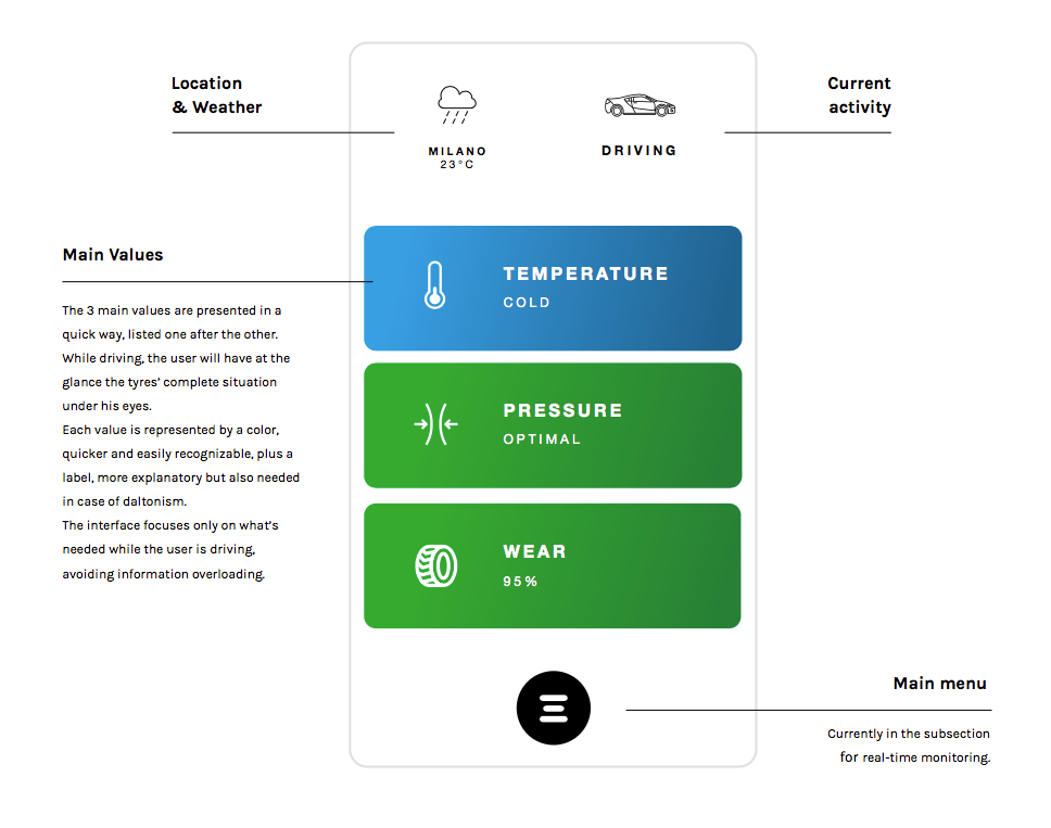
 Overview Page, color&labels work as two information layers.
If something’s going on, I should be able know it, gently.
Temperature rising (too much), loosing pressure, I’d like someone to tell me — voice feedbacks.
Of course, I would also like to have a visual feedback as well.
 Colors are quick to understand, text labels are needed for color blindness and more detailed information
In a problem solving optic, I should be able to understand what’s going on more in detail thanks to a dedicated section.
I thought to separate basic information (basically ‘ok’ and ‘not ok’) from specific values, in order to reduce complexity.
 Tapping on the ‘Pressure’ tile, going into the pressure detail view
Better travel by bike!

Wait, bikes have tires too…
We all agree saying that it makes more sense to let the car inform the user about its general situation, and not an app.
Probably, the app was maybe just a small part of a renewed company Strategy who wanted to know more their users, their behaviors, their preference and also a way to test their products grabbing user data, but I didn’t focus on the overall sense of it (even if I was really tempted!).
Anyway, it’s been fun.
🙂 Hope you all enjoyed and it would be great to receive your suggestions!

Credits
Cover Photo by Dardan Mu on Unsplash
All icons by NounProject
Tires monitoring – a User Experience design challenge was originally published in UX Planet on Medium, where people are continuing the conversation by highlighting and responding to this story.
AI-driven updates, curated by humans and hand-edited for the Prototypr community