Build Design Systems With Penpot Components
Jul 21, 2:15 AM
Penpot's new component system for building scalable design systems, emphasizing designer-developer collaboration.
smashingmagazine.com

medium bookmark / Raindrop.io |
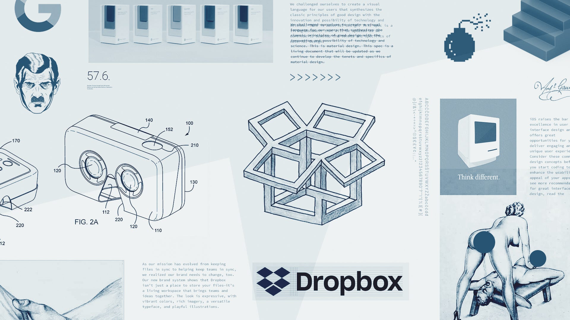
As being one of the independent players of Internet world, Dropbox showed up with a brand new, bold and brave makeup and declared that it is not another boring blue website anymore. By this move, it should come as no surprise that Dropbox remembers and uses its right to be different when all digital products becoming more and more like each other. It duly did what needed to be done. What if it did not!
Design guidelines published by technology leaders such as Apple, Google and Microsoft have started to dominate overall design world. However, these guidelines are rather technology-focused documents. They are not prepared as to originate a design trend (such a thing is impossible in practical terms). These guidelines are the adjustment laws of a successful user experience of their technologies. It requires quite a different effort to seek a visual design language through this.
Whether it is about design or fashion or music, a trend has initiators but not dominant creators. Trends take form, develop and become the trigger of next trend by virtue of collective movement. Many stories can be varied, thanks to colors and patterns in design trends that communicate emotionally with their user. Yet this can not be practiced with guidelines. Guidelines are not intended for this purpose in the first place. Guideline is formed to create a seamless experience within the ecosystem of the brand it belongs to.
Dropbox has a right not to follow any guideline. It has opted for establishing an emotional communication with their users instead of negotiating price since its competitors have the power to provide similar services for free. Dropbox has told the story of its own with an unusual visual language. It has been stated that Dropbox is a creativity tool, not a productivity and storage tool. Paper which was introduced last year and the micro-copies used in the system were also supporting this approach.
“Our new design system is built on the idea that extraordinary things happen when diverse minds come together. We communicate this visually by pairing contrasting colours, type, and imagery to show what’s possible when we bring ideas together in unexpected ways.” (Dropbox Creative Director Aaron Robbs & Vice President of Design Nicholas Jitkoff)
When first setting foot on the market in 2007, Dropbox was the most important start-up modifying the cloud technology into daily life. It was a righteous and vital decision differing from and even challenging the design aesthetic dominated by Google Drive, Microsoft One Drive and Apple I-Cloud which try to get a share of the cake.
If you are interpreting the whole thing as a teenage boy jealous of his brother and dying his hair blue to draw attention, you should better read the rest of my article. Since storytelling of Dropbox was typed with the inspiring insights of an experienced designer, not with a teenage-type manifesto.
Quirky combination of warm and cold colors and draft feeling of the craft which has intentionally left rough, are actually representing an incomplete work can be visible as well. You do not have to enrich or polish your work for saving and sharing with others. Dropbox bravely states that you cannot see the forest for the trees, if you try to stereotype yourself. And the brutalists of the web agree with Dropbox.
Web-brutalism is a design trend started as a digital art. It was transformed into a conscious movement by the web brutalist artists in the middle of 2010s. Recently, it has started to get more inclusive and started its maturity phase.
As it is not possible to explain web-brutalism and brutal artists of web, independent from the time of their existence, we need to explain the 2010s that we live in from the point of digital world.
The 2010s are the years that information age evolved to innovation age.
Standardization is the key factor of being acceptable by everybody. Indeed, each new idea is for the old world. Realization of ideas depends on whether they are in coordination with the existing services around them.
All services we use today are standardized as they are either purchased or dominated by 3 big technology companies. Sometimes standardization may be a charging cable while other times a UI design.
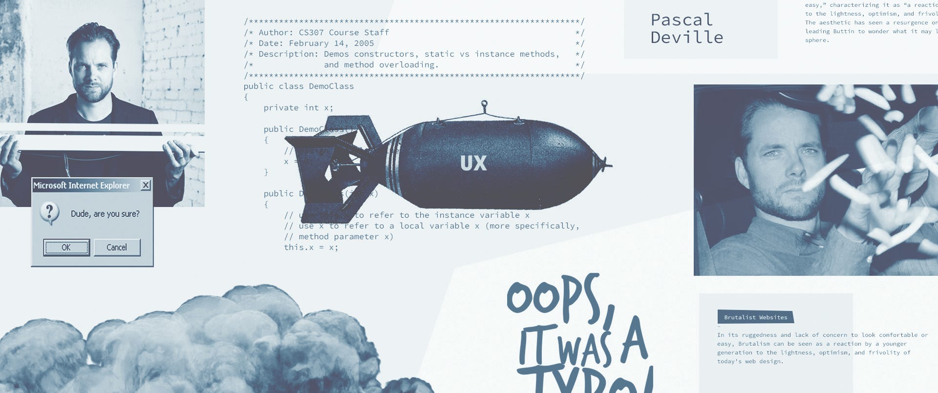
Web-brutalism is a movement that provokes creativity and diversity against to standardization in the world of web. This movement was named by Zurich based creative director Pascall Deville, yet he is not the founder. The movement was initiated by designers from different geographies who are totally unaware of each other. Pascall noticed this odd-looking work with a very straightforward initiative and insight and listed it at webbrutalism.com, which he published in 2014. And it was the first time web designers done wonderful things together on the web without so-called ‘best practices’.
Now, webbrutalsim.com receives over 100 site submissions a day. Some of them are coming from a cultural background like punk music or abstract art experiments, and some of them come from very serious commercial sites which are trying to find new authentic way for reaching their target audience.
Web-brutalism started to get inclusive by creating its own standards and codes of aesthetic in time, even though it had showed up as a reaction to standardisation. Just like its grandfather, brutalism.
The name ‘web-brutalism’ is a reference to brutalism in the area of architecture in 1950s and has no concern with the ‘brutal’ word in English. Etymology of this word comes from French; ‘béton-brut’ which means ‘raw-concrete’ in English. To fully understand brutalism in web design, we have to flash back to architecture and industrial design history and go to roots.
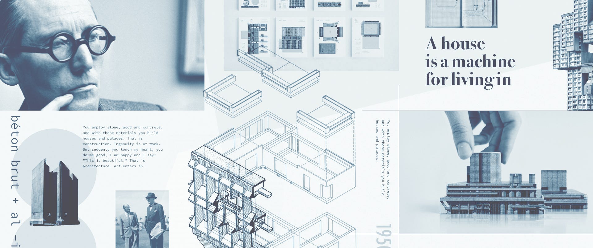
High Modernism, as the last movement of 20th century, it aroused the interest of the whole design world. It stayed away from all the ornaments, even wall painting. It has an ugly and awful design language since it emerged as a reaction to aesthetic sense of the time. However, this ugliness has also become another sense of storytelling and aesthetic.
From retro science-fiction novels to today’s most popular Netflix series, future portrait in human mind is identified with ugliness and awfulness. Thus, brutalist buildings are seen as futuristic. Though brutalism is opposing to be pretentious. It features and shows the value of the material used for construction of a building instead of polishing and hiding it. In sum, it criticizes of the bourgeois comfort, sense of aesthetic, looking elegant and being cool as a “you are who you are” reaction.
All design movement comes from a reaction. Web-brutalism emerged as a reaction, criticism and uprising to standardization just as brutalism. It has led to homogenization of UX web world of. It caused a swarm with carbon copy sites of internet since UX rules are given as the excuse. Same blue colors, same button types, and same photograph style. Even the content-copy are the same. The Internet is becoming like Coldplay. It is the murder of creative thinking in communication design that UI designers rely on to UX rules and templates.
WordPress and similar themes, “best practices” in UX blogs are practical tools which reduce the development periods and failure rates. Mobile friendly flat design approach provides easy engagement of users by means of its familiar interfaces and thus facilities fluid UX. Let’s face it, UX is not a design style. It is not a design language. It does not propose a shape or color. UX is an objective discipline enabling the optimization of design decisions by interpreting the qualitative (and if any quantitative) data.
UX studies has great importance within digital communication design process.There is no product which can get a second chance from its users nowadays. Therefore, it should be following scientific rules and proved data coming from extensive user research. Though not all websites are a digital product. (Not even mentioning poster design in regards to material design principles) A good designer must know which rule to bend or break. A designer must be unashamed. He/she should be able to present subjective expression in the process which is led by their own experience, vision and imagination. In just the same way as in other design fields… If we do not confuse Charles Eames with Arne Jacobsen, Danial Libeskind with Franky Gary, Bang & Olufsen with Braun and Anton & Irene with Wedge & Lever, the reason is their subjective expressions. It is because they have the courage to break out of the standards and have a different language. Even though the design process requires a collective working…
Here are the ugly kids of internet, the web-brutalists call out the digital product UI designers to come out of their comfort zone and be divergent. This reaction that started with individual digital art samples has already turned into a design trend and splashed to other design fields. Web-designers will also be able to create their own stories and design languages if they can wriggle out of the companies’ anxiety which dominate them as well as the inactivity and laziness caused by the template market.
Dictionary of Online Behavior
Dictionary of Online Behavior is a collection of new words that describe behaviors emerged on social networks.
The Outline
New kind of publication for a new kind of human.
Derek Man Lui
He is a copywriter from San Francisco, currently setting China on fire.
Picture Show
Video portraits of artists and their work.
Thingyfy Agency
World’s first dual-core digital transformation agency.
XXIX
A small but good design studio.
Web Brutalism
My slideshare presentation about it
AI-driven updates, curated by humans and hand-edited for the Prototypr community


