Build Design Systems With Penpot Components
Penpot's new component system for building scalable design systems, emphasizing designer-developer collaboration.
UX Planet — Medium | Leow Hou Teng
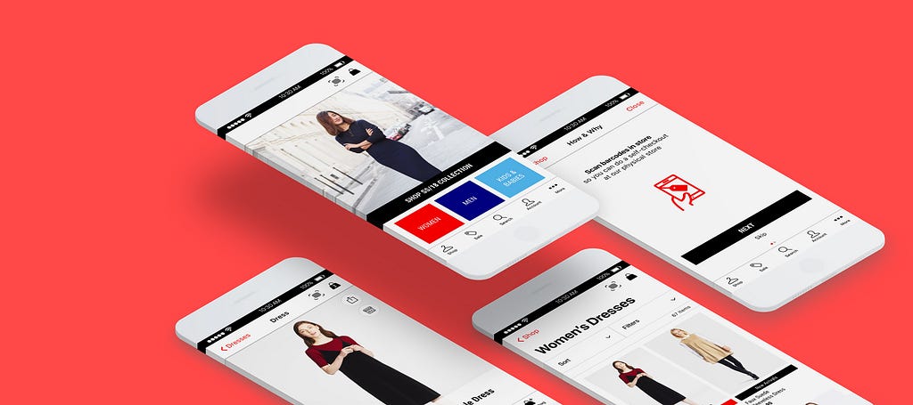 All iPhone Mockup Template by TranMauTriTam
The UI/UX case study documents the processes involved in a redesign of a fashion retail and e-commerce app. The app includes a product scan feature for customers to perform a self-checkout at a physical store. This design sprint took 11-days to complete and is submitted to the UXDI course at General Assembly, Singapore.
Work in a team to identify problems and/or opportunities with an existing mobile application and utilise your knowledge to design a solution.
For this project, my team selected the Uniqlo, Singapore app to redesign. For this documentation, the brand name will not be mentioned again below. The ideas below apply to most fashion retailers with an e-commerce presence.

The 11-days group project (3 members) includes the following processes and methodologies:
#1 Discover
#2 Define
#3 Design
#4 Testing
#5 Deliver
 News clippings from The Straits Times and Channel NewsAsia
It is increasingly difficult for retail businesses to remain competitive in Singapore. This is due to the high rental fees to maintain a physical store and the difficulty in hiring lower-skilled sales assistants.
In addition, consumers are increasingly shopping online on platforms such as Taobao, ASOS, ZALORA for their fashion fix.
In the recent Singapore National Day Rally Speech (Aug 17), the prime minister pushes for consumers and retailers to adopt mobile payments. This will be done through initiatives such as ‘PayNow’ and a common national QR code.
Based on this setting, my team picked a retail outlet with a physical and online (mobile app) presence as our project.
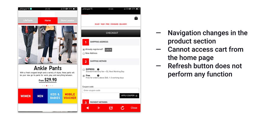 Screen grab from heuristic evaluation report–Consistency and Standards
First, we started by analysing the existing app to identify key problems and issues. This was compared to online reviews on Google Play and the App Store.

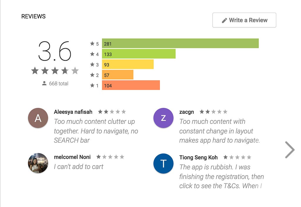 App reviews on Google Play and Apple App Store
The main issues discovered was the app is a hybrid app, i.e. it is pulling information from a web page. This creates potential issues:
 Competitive Analysis–Comparing features on the Home screen
Next, we compared the app to the competitors’ apps. The competitors are determined by these 4 points:

At the start of the project, we had three main questions in mind.
How might we…
First, we define the unique experience at the physical store to adapt it to the mobile app.
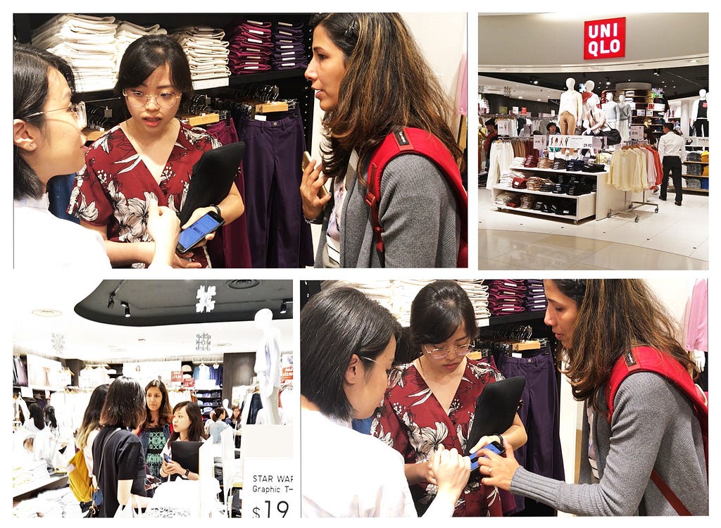 Contextual inquiry at the physical store
We conducted a field study at an outlet by speaking to customers and shop assistants. Also, we showed the product scan feature found on our competitor’s mobile app.
 Sample interview questions grouped by topics
We interviewed 7 users to find out what they think of the current app. The questions we asked were centred on various touch points common to fashion e-commerce apps. For example, we asked questions related to:
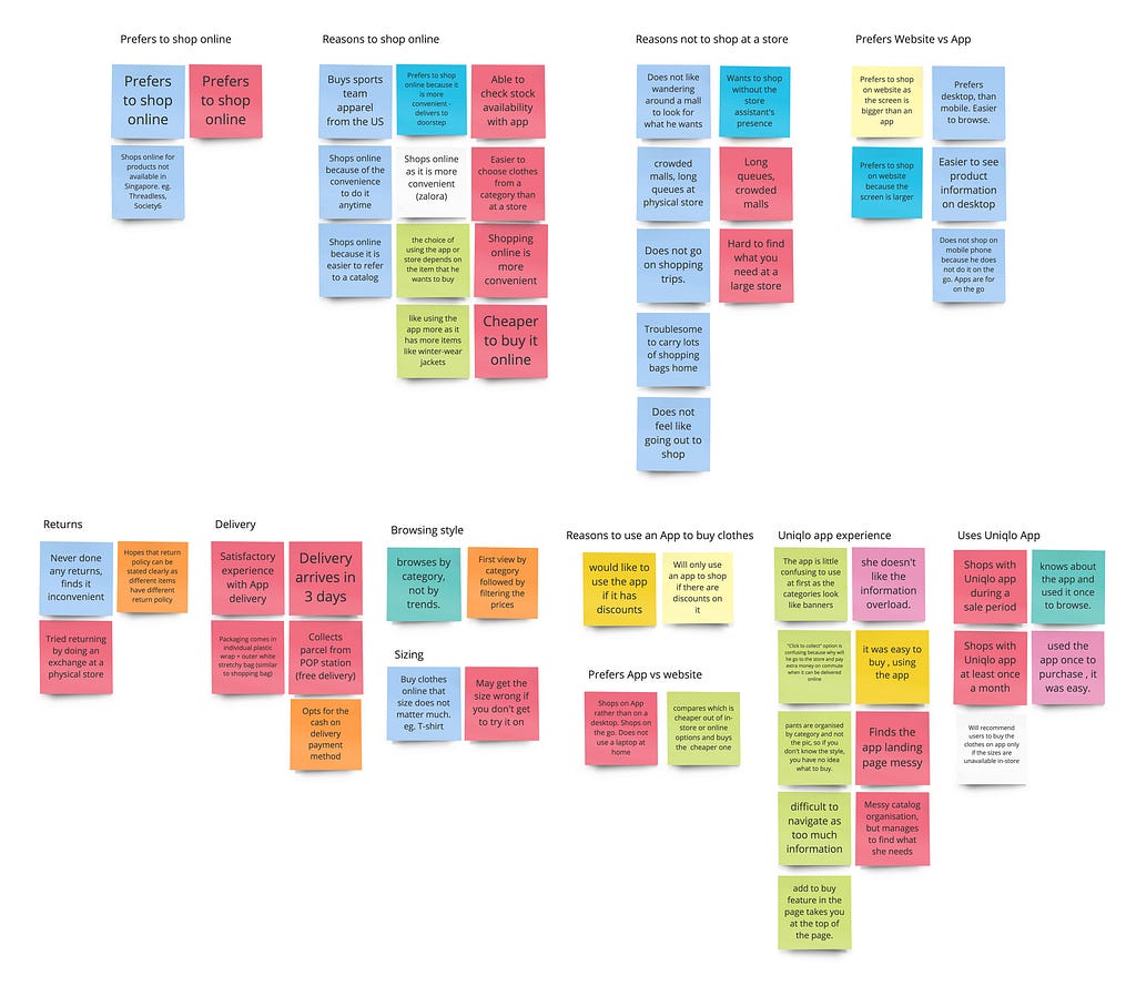 Existing App User
 Shopper–Potential App User
After conducting user interviews and contextual inquiry, the next step we did was to organise the insights into groups in an Affinity Map. With this map, we could identify common habits, problems, and pain points. The map also helped us to identify 2 key personas (elaborated below) where the same coloured post-its are usually grouped together. Eg. Red and pale blue posts-its are existing users.
Based on the patterns identified in the affinity map, we came out with 2 personas — an existing user of the app, and a current shopper who is a potential user of the app. These personas describe a typical user/potential user, their habits, problems, pain points, and other details about him/her.
Persona 1 — Existing user of the app
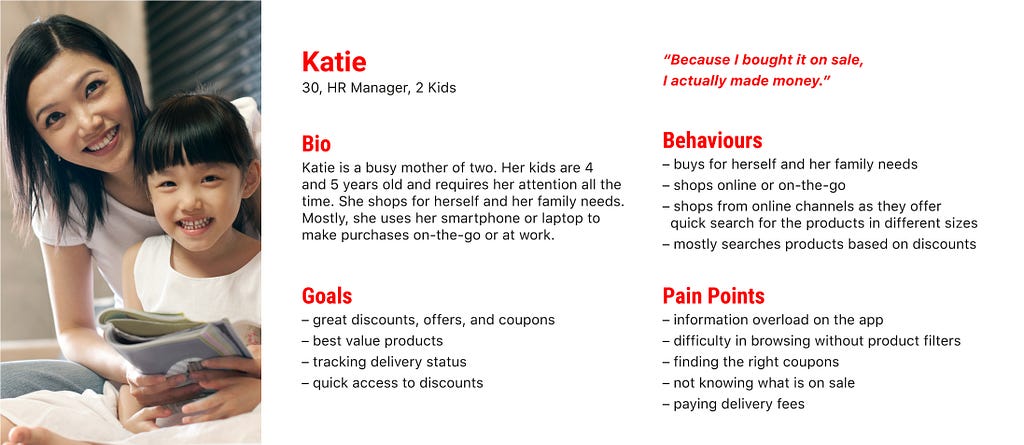 User Persona–Existing user of the app
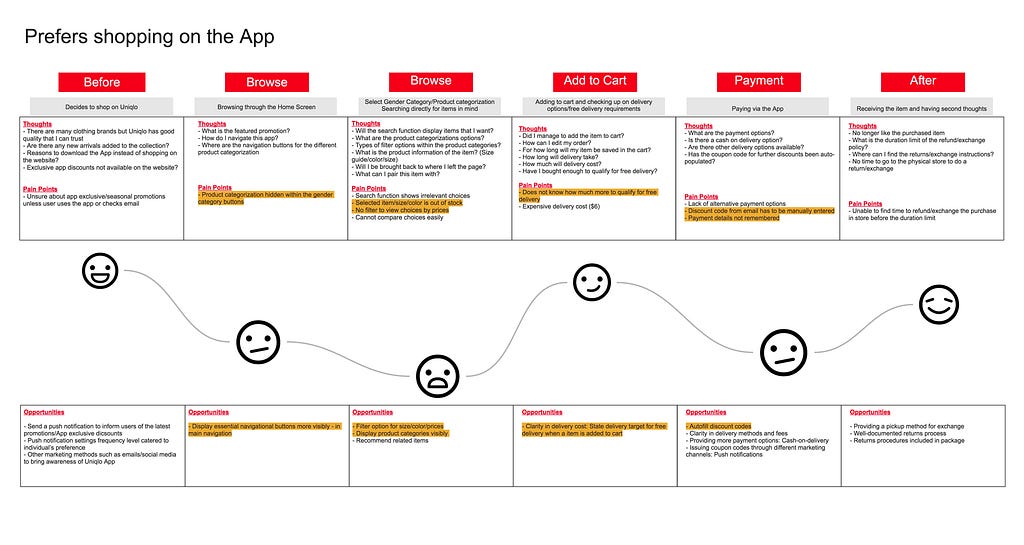 Customer Journey Map–Shopping on the App
Katie prefers to shop online and is an existing user of the app. She wants quick access to all the discounts and finds it difficult to find the size and availability of the items she wants. While she is familiar and comfortable using the app, she hopes the user experience can be improved.
Persona 2 — Existing shopper and potential user of the app
 User Persona–Shopper at physical store/Potential user of app
 Customer Journey Map–Shopping at a physical store
Natalie shops at the physical store and is not aware of the existing app. While she enjoys shopping at the store, there are often long queues at the payment counter. She may be a potential user of the app since she uses other e-commerce apps to shop for clothes.
 Feature Prioritisation Matrix–User Needs vs Business Needs
 57% of users surveyed rated a 4 or more, that is important to have a self-checkout counter in-store
Through a design studio process, we came up with various new features we intend to include in the new app. To come out with a Minimal Viable Product (MVP, or Minimal Lovable Product, MLP) we conducted an online survey to find out what users want on the app. We looked at the features from the business perspective and organised them according to our user and business needs. Features at the top right corner (the box in red) are the ones that should be included in the new version of the app.
The new features are illustrated in storyboards, detailing the environment, scenario, and context where the app may be used.
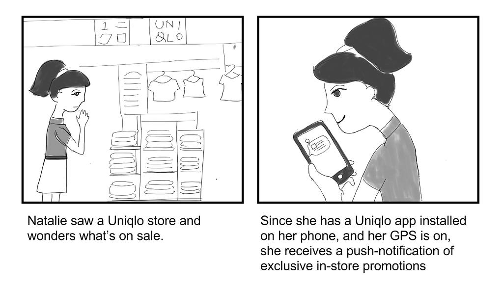 Storyboard by Parul–Receiving a push-notification when user is near the store
 Storyboard by Parul–Using the barcode scan and self-checkout function
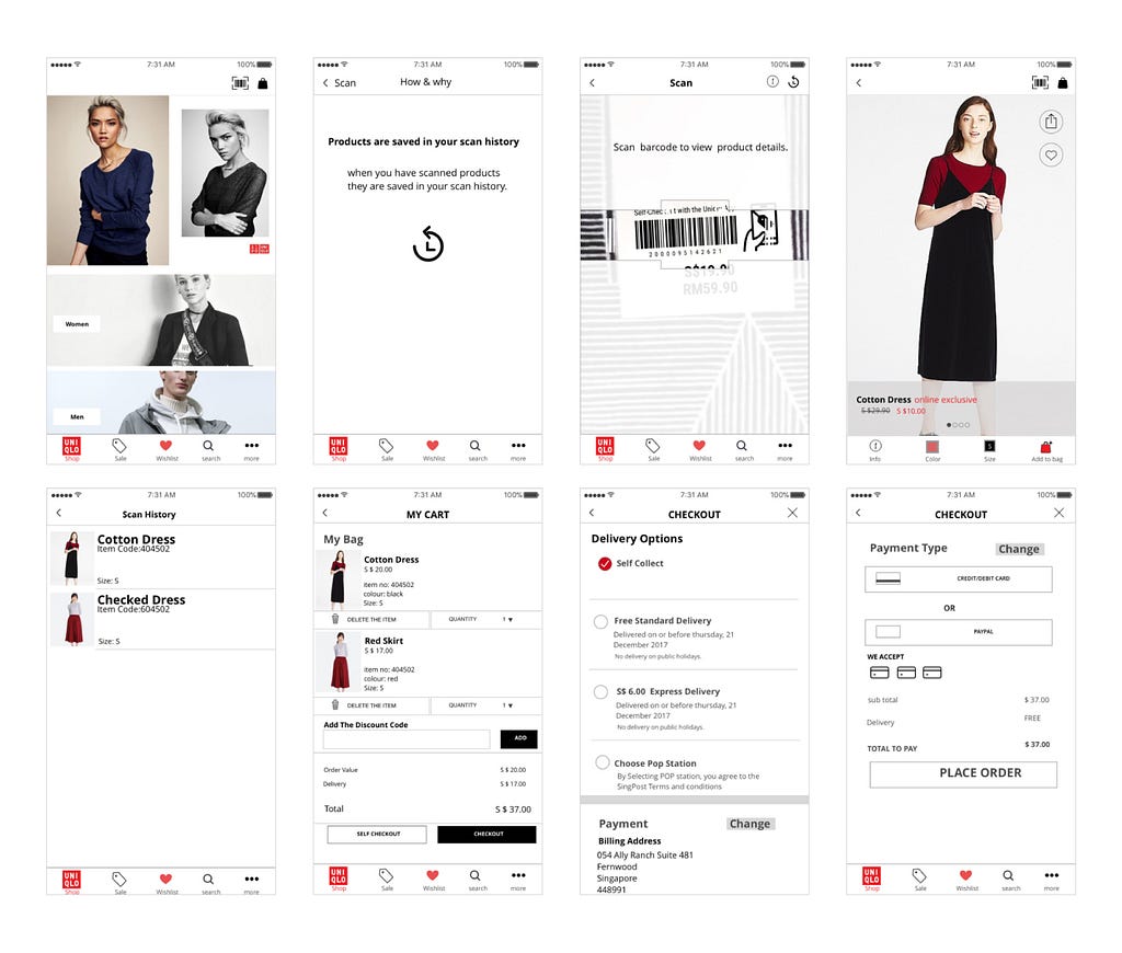 Mid-Fidelity Prototype by Parul
Since my team comprises two visual designers (myself included), we skipped to a mid-fidelity prototype after doing quick sketches. Visuals of the clothing may be important in helping users visualise the actual app.
The version was used for testing with actual customers on our second trip to the store. The purpose of the test is to determine if customers are receptive to the new scanning and self-checkout feature.
Key findings from the usability test:
From the usability test, we iterated a high fidelity prototype. The branding was also enhanced in the design by using the right fonts and colours. The interactive prototype can be viewed on InVision.
Click here to view the project `Uniqlo App`

We created a video to show the new scan feature on the app since it was impossible to prototype the actual feature.
Another feature on the app is an animated target bar for free delivery. This will encourage users to spend more to meet the target while providing greater clarity to the users.
 Animated delivery target bar
Users will receive a mobile coupon through push notification when their GPS indicates that they are near a store outlet. This will encourage them to use the app for self-checkout.
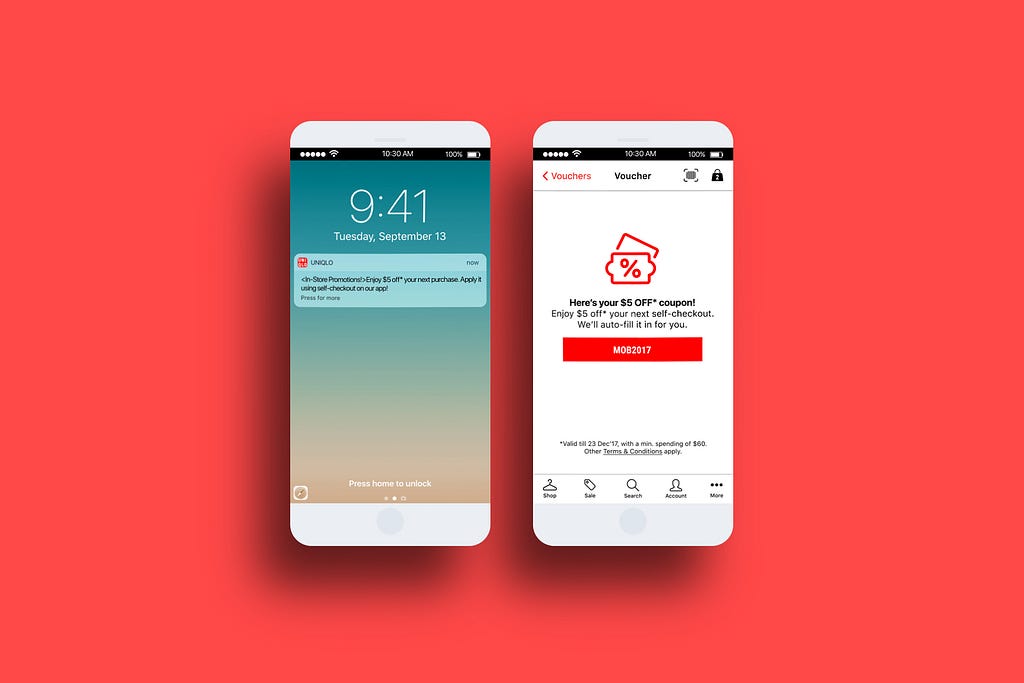 Receiving a mobile voucher through push notification when user is near an outlet
 Tasks assigned for usability tests
Participants were given 4 tasks to complete. Task 1 was conducted on both the existing app and the new app. The clicks for 3 of the tasks were illustrated below.
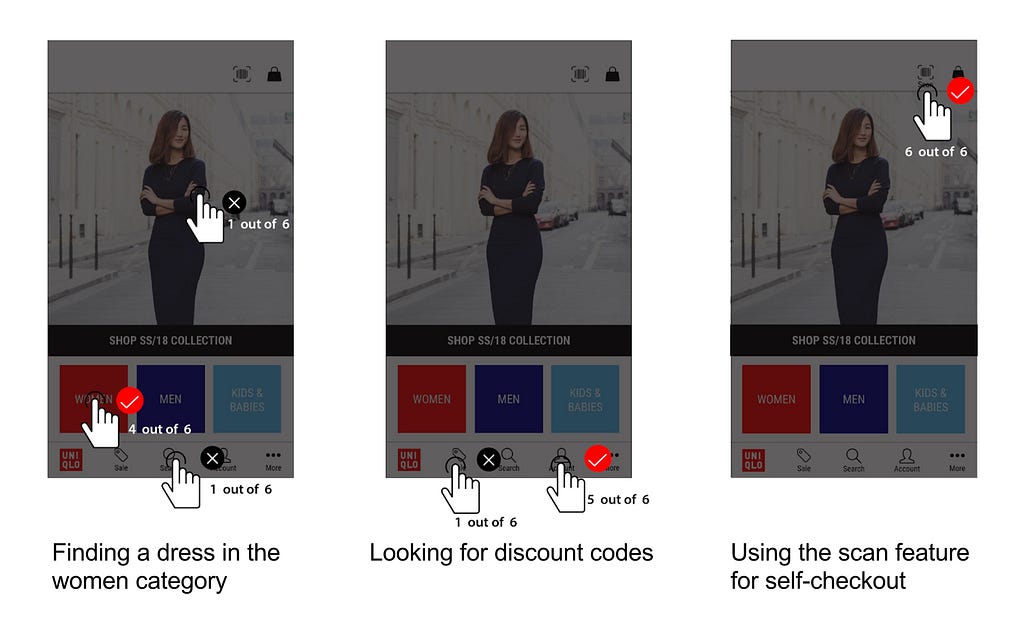 Where did the users click?
 Time taken by user to find a dress on the current and new app
To collect quantitative data, we timed users on how fast they took to complete the task on the existing app and new app. The new design allows the user to complete the task more efficiently.

 Quantitative Data from System Usability Scale(SUS)
In addition, we conducted a post-test survey to collect feedback from the participants on their views of the new app. This was done with the System Usability Scale(SUS) test. The results were tabulated and calculated based on the method specified by the standardised test.
After the usability test, we discovered that users were confused by the product detail page after scanning the barcode. They assumed that the item was already added to the cart after the scan.
 Revising the user flow to provide more feedback
 Providing feedback to guide users in completing their task
We made the process more informative for users by providing feedback on what is happening. First, we prompt users if they want to add the item to the bag after scanning the barcode. Next, we gave them the option to continue scanning or proceed to the shopping bag. This provides more clarity to the user as they are provided with options to proceed to the next step.
 Revising the self-checkout user flow to provide more instructions
This is a case where a simpler user flow, may actually cause greater confusion to the user. With more steps inserted, users are more confident in performing tasks.
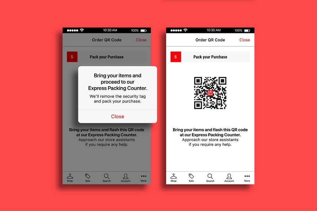 Providing instructions on what to do after self-checkout payment
The revised self-checkout user flow may seem a lot more complicated, but provides greater clarity to users. This is because instructions are given to them to proceed to the Express Packing Counter to get their items packed, and the security tags removed. Without these instructions, users were unsure what to do after making a payment.
Through our app redesign, we created opportunities where users can use the app within the physical store. Hence, to encourage the usage, this should be accompanied by various promotional materials around the stores.

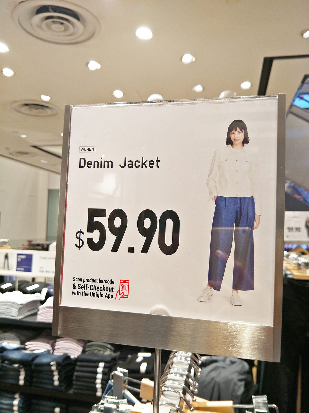 Clothes Tag and InStore Posters
For example, the clothes tag can include a line to inform users that they can scan and perform a self-checkout with the app. This can also be included in the signages found throughout the store.
 Express Packing Counter for self-checkout users
As users have to get their items packed and security sensors removed, we propose setting up an Express Packing Counter lanes that will be quicker in serving these customers. This will help to bring about a greater awareness of the app.
In the short term:
In the long term:
The design of the app in the InVision prototype does not follow the guidelines listed in the iOS Human Interface Guidelines. This was due to my unfamiliarity with iPhone app design. After studying the guide, I redesigned the app to match the style specified for iPhone 7.
The main difference is in the system font choice (SF Pro Display) and in the navigation labels. This is to ensure consistency throughout the iPhone.
 Revising the navigation to match Apple iOS Human Interface Guidelines
Thank you for reading my case study. Feedback and suggestions are welcomed!
+1 Clap, +2 Claps, +50 Claps!
Team mates, Parul Shukla & Cheryl Lee,
Instructor, Nie Zhen Zhi,
and Teaching Assistant, Wilson Chew
Hou Teng is a current student at General Assembly, Singapore, User Experience Design Immersive (UXDI) programme (21 Nov 2017–09 Feb 2018). The documentation is the third project assignment for the course. Before attending this programme, he has worked as a graphic designer at an advertising agency and launched an e-learning startup. In 2018, he hopes to be a UX designer.
His design works can be viewed in his portfolio, and digital marketing writings are available on his blog.
Leow Hou Teng. Design & Digital Marketing
UI/UX Case Study: Mobile Self-Checkout App Design Concept was originally published in UX Planet on Medium, where people are continuing the conversation by highlighting and responding to this story.
AI-driven updates, curated by humans and hand-edited for the Prototypr community