Build Design Systems With Penpot Components
Jul 21, 2:15 AM
Penpot's new component system for building scalable design systems, emphasizing designer-developer collaboration.
smashingmagazine.com

medium bookmark / Raindrop.io |
Today I want to go through a very common problem for designers: the UX of Login, Register and Password Recovery. This problem affects a lot the exit page rate and, of course, conversions.
There are two cases that you should consider:
The UX of Login and Registration is always painful. Nobody loves registering on a new site by filling forms, check and validate emails, invent new passwords that follow strictly rules.
How many times does it happen where you don’t remember the password used during a registration process? I do forget it a lot of time and need to recover it.
On mobile devices, the user experience of login and registration is more painful than on desktop. That’s because the user has to switch apps in order to confirm the email, or switch keyboard in order to find special characters.
There is a study carried out at University of Munich that shows that, on mobile, people tend to spend double the time to enter a password and, at the same time, they create weaker passwords compared to on the desktop.
What do people get by creating an account? What benefits do they get by registering?Example:

It’s a way to be able to register more quickly. You can use social logins or google.
Avoid typing and remembering passwords; it’s a good way to improve this process. Even if there are users that prefer the standard email registration.

Less is more! From a UX point of view, asking for email and password should be enough.
Avoid asking, at this stage, info like gender, date of birth or other informations that are not essential. You can always ask the user to add more info in the profile page.
Just don’t repeat the fields in a registration form: e.g. two password fields, two email fields, etc.
This step is very important.
For some companies is very important to validate the users in the platform.
Consider that you can always validate them by sending the email but let them do it later and use the system now with all the functionalities. The validation process via email can be done during the next days.
In the case you must confirm credentials, do so using other services that avoid the user having to switch applications. A good practice is the message validation: the user will receive a code by sms that can be easily typed without switching applications (on mobile) or switching webpage (on desktop).
Switching context is a bad practice in UX. The user can get disoriented which can raise roadblocks that ultimately may prevent them from attaining their original goal.
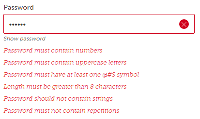
Improve password in UX is a topic that I wanted to separate from the others.
Password are really painful in UX.
How many times did you get bored by inventing “secure” passwords? How many times could you not use your “most used” password on a website because it doesn’t include a symbol or a number?
I think that security is very important today on websites. Reasearching on over 50 websites I discovered that 90% of them are using only two or three password constraints and they haven’t have password security issues during the last years.
I really recommend the use two or three of the following rules for your website:
Not all of them
Giving this option to the user is very good in UX. The user make fewer mistakes while they can see what are they typing.
As I said above, in the registration UX section, just don’t repeat fields in a form.
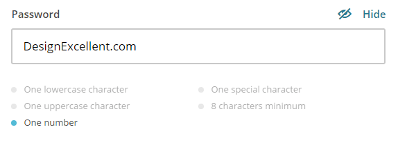
Today there are many simple JS scripts that can be easily added to your website and that can improve the UX of the password field.
With this script the user can see the level of security in real time and with visual helpers (like colours: green, yellow, red).

Mailchimp has this nice feature. I simply love it.
Improve the UX of login is the last part of this article.
This is the same idea of the Social Registration.
With this method you can reduce pain from the login process. It can be done with TouchID, as 80% of the smartphones allows that nowadays.

The same idea of what I said above in the registration section.
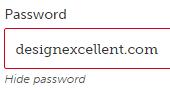
However, showing the password doesn’t need to be the default option. That’s because the user can feel unsecure.
My advices is to cover the password with the classic symbol “*”, and let the user decide to show/hide.
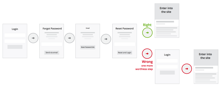
Rarely used passwords are forgotten, and recovering them should be available on any login process.
This is how the optimal password recovery process should work:
Few companies are trying to innovate this process by skipping the insert password field.
How can we do that? Few example:
Plan the best user experience for Login and Registration on your website:
Credits for this article to: Gartner, Nielsen Norman Group, Baymard
Does your ecommerce website need help? Do you want to increase your conversion rate? Book a FREE call with me to discuss about that.
AI-driven updates, curated by humans and hand-edited for the Prototypr community


