Build Design Systems With Penpot Components
Jul 21, 2:15 AM
Penpot's new component system for building scalable design systems, emphasizing designer-developer collaboration.
smashingmagazine.com

medium bookmark / Raindrop.io |
 <img class=”progressiveMedia-noscript js-progressiveMedia-inner” src=”https://cdn-images-1.medium.com/max/1600/1*Y6ylaxFE8yqZg6PxnvRDUw.jpeg”>
In this post I’m going to argue that we, as a generation of designers and developers, have failed. Failed spectacularly.
Failed to make interfaces that are usable, failed to make software that is intuitive, and failed to make products that normal people can understand.
I started building (awfully designed) websites as a teenager in my bedroom in 1995, and over the last 20 years I’ve watched user interface design improve, plateau and, I’m afraid, decline again.
The iPod wasn’t a science fiction invention from the future.
Hard disk music players already existed and Creative Labs were selling the Zen player with an awful UI — it was just too hard to click, click, click your way through tracks to play the one you wanted.
Trackpads already existed on notebooks and had replaced the ‘pointing stick’ of old IBM ThinkPads.
Apple made the trackpad circular, called it a Click Wheel and added to the front of a hard disk music player.
Suddenly you could scroll through vast libraries of music effortlessly. The UI was solved, and the music industry would never be the same again.
And then;
Google beat all the search engines with a better UI
Facebook beat MySpace with a better UI
Slack beat Hipchat with a better UI
UI. Every time. Uncluttered UI, user-focused, function over form.
Some examples of UX disasters you probably see every day;
 <img class=”progressiveMedia-noscript js-progressiveMedia-inner” src=”https://cdn-images-1.medium.com/max/1600/1*VXPzi4XnEAOkVCD2K6BxSQ.jpeg”>
(Source)
Banks tell us to protect our details from identity theft, yet “3D Secure” asks for your details in a form (with such a lack of appreciation of the basics) that it looks exactly like a phishing scam. And the primary action button is in the wrong place.
 <img class=”progressiveMedia-noscript js-progressiveMedia-inner” src=”https://cdn-images-1.medium.com/max/1600/1*HZ9JgPA3pPuLgy-ettRu5Q.png”>
(Source)
 <img class=”progressiveMedia-noscript js-progressiveMedia-inner” src=”https://cdn-images-1.medium.com/max/1600/1*Nt6ieUMzkRDiTd_W3sOKOw.png”>
(Source)
People don’t understand how to use Facebook. Facebook. With a billion active users.
 <img class=”progressiveMedia-noscript js-progressiveMedia-inner” src=”https://cdn-images-1.medium.com/max/1600/1*-pWdRDpz3zwPPvadq5cfNw.png”>
How do I open a new tab in Google Chrome? The tiny, unmarked, low-contrast button with no label, of course! Can you honestly say that your mum or grandfather would know how to open a new tab? Would someone with less-than-perfect vision even see the button?
Minimalism does not mean “make controls impossible to use”. This is not a ‘power user’ feature, it’s opening a new tab in a web browser.
 <img class=”progressiveMedia-noscript js-progressiveMedia-inner” src=”https://cdn-images-1.medium.com/max/1600/1*cxQ5lxMxKvF_J996AOcxUg.png”>
Apple’s Music app for iPhone. Installed on hundreds of millions of devices. The seek bar is 2 pixels high. TWO FUCKING PIXELS. It’s a portable device, I’m outside and I have to stop walking and peer at my phone to seek to a position in a track or podcast. Would it have killed them to make it thicker, or put a handle on there?
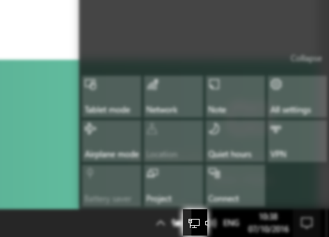 <img class=”progressiveMedia-noscript js-progressiveMedia-inner” src=”https://cdn-images-1.medium.com/max/1600/1*oWcL2i96DeE_m3y95v05jw.png”>
State of this: the Windows system tray Network icon. The first thing you need to do on a new computer is connect it to a network. The fuck is this supposed to be? It looks like a spoon next to a table. In no way did that say ‘network’ to anyone, ever.
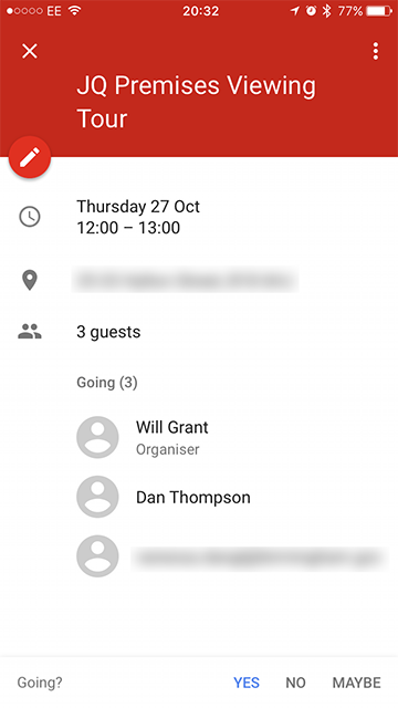 <img class=”progressiveMedia-noscript js-progressiveMedia-inner” src=”https://cdn-images-1.medium.com/max/1600/1*maYjwRl2sOcsBzQZLi0V6Q.png”>
And don’t get me started on the ‘flat design’ aesthetic. In Google Calendar on a touch screen device where anything can be tappable, what is tappable?
The date, to edit it? No.
The names, to email people? No.
The address? Yes! Opens Google Maps.
How do I email guests or delete? The unlabeled ‘ellipsis’ menu, obviously.
Try to imagine you’re not a UI person, or a UX designer. How the fuck is a regular normal human user supposed to know, when looking at a flat design interface;
Somewhere along the way, as the web stopped being about Geocities fan sites, as the web turned transactional, and as smartphones became ubiquitous, we forgot something important; UI design is not art. It’s the opposite of art: it’s design to perform a function. To serve users.
It can still look great, but not at the expense of actually working.
The branding agency got involved; they insisted that because, as a company, we always refer to photos as ‘Memories’ the photos menu should be called ‘Memories’ too. Then nobody knew what it meant or how to find their photos.
The CEO personally picked the shade of ‘lemon breeze’ that the company uses for its headings everywhere, so all the headings are pale yellow. Which means nobody can read them against a white background.
The marketing department decided that a pop-up collecting users’ email addresses would be good for the Quarter 4 CRM metrics. Oh, and don’t make the close icon too big because we don’t want them to actually close it.
The paradox is that, as UX and UI people, we’re over-exposed to components, controls, patterns and interfaces in general. It’s the curse of knowledge and we are the last people who should be designing interfaces — unless we can do the hard bit: objectivity.
UX has taken the purist concepts of HCI and distorted them.
By coating design rigour with a layer of brand fluff, and putting form over function again and again, we’ve built products that serve nobody but the internal needs of our corporations and brands.
We are UX people building products for UX people.
I don’t care how your brand makes me feel: if I can’t use your damn product it makes me feel angry.
Basics, people, basics. That sign in reception that says how customer-centric you are may be bullshit for most of the organisation, but it needs to be true for your design team. Fight for the user.
Test stuff with real people. Not your boss, not the CEO, with actual real users. You only need 5 of them to get some major insights.
Objectivity: Try, for at least 5 minutes a day, to look at your products with fresh eyes. Imagine you are a normal person, not a person like me, or like you, or any of us UX/design/UI people.
A normal person.
Ok, now look at the user interface of your product and ask yourself;
Does this make any fucking sense at all?
Will Grant is a User experience and interaction designer at D4 and is @wgx on Twitter.
AI-driven updates, curated by humans and hand-edited for the Prototypr community


