Build Design Systems With Penpot Components
Jul 21, 2:15 AM
Penpot's new component system for building scalable design systems, emphasizing designer-developer collaboration.
smashingmagazine.com

uxdesign.cc – User Experience Design — Medium | Daihan Zhu
I usually spend my flights reading or staring out the window, but when I was on route home from Toronto a couple weeks ago I decided to check out WestJet Connect, an app feature that replaces the little screen found on the back of most airplane seats.

After a quick scroll through the movie selections, I settled on the title of Miss Peregrine’s Home for Peculiar Children, a movie I’ve been wanting to see since I read the book back in high school.
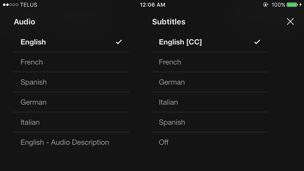
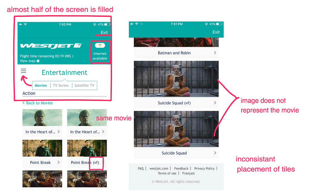
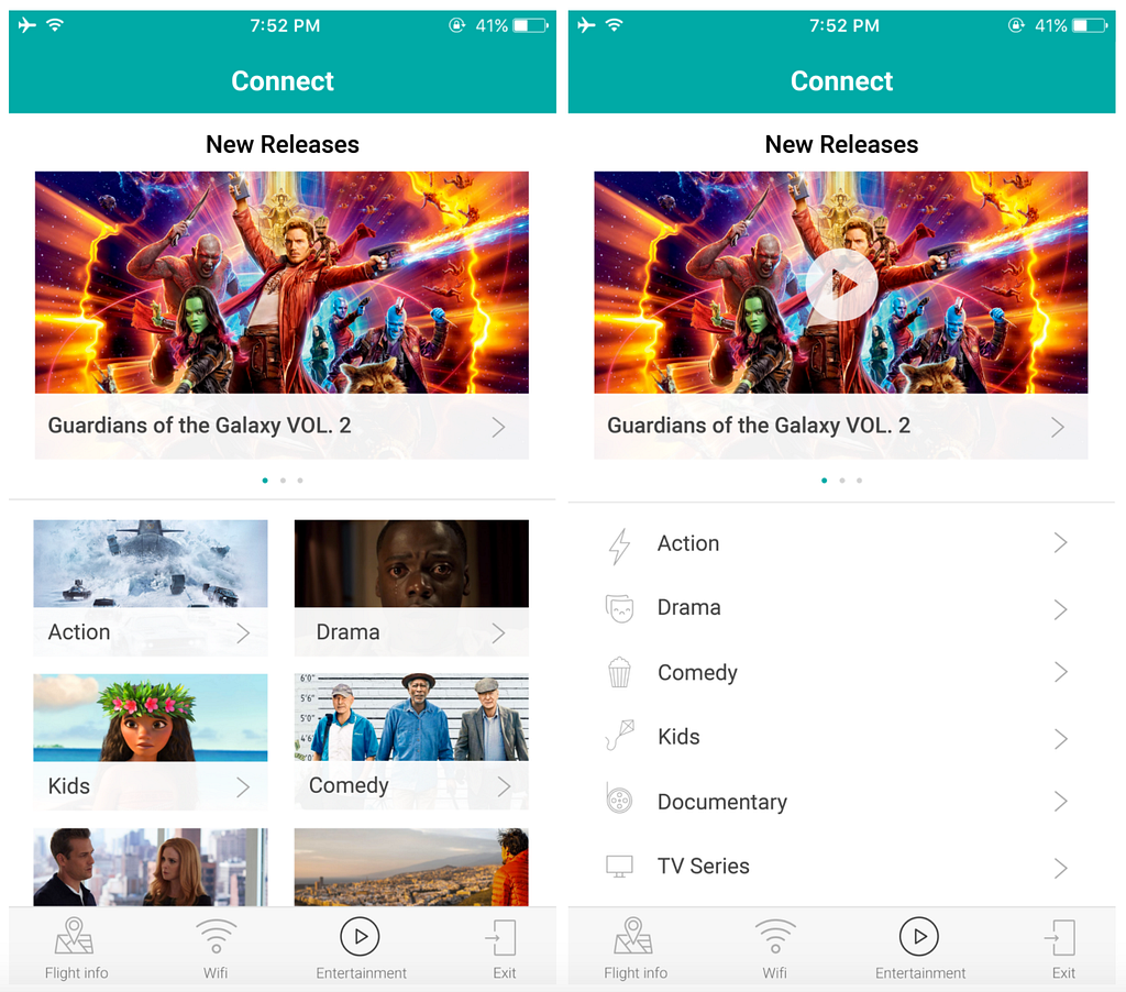
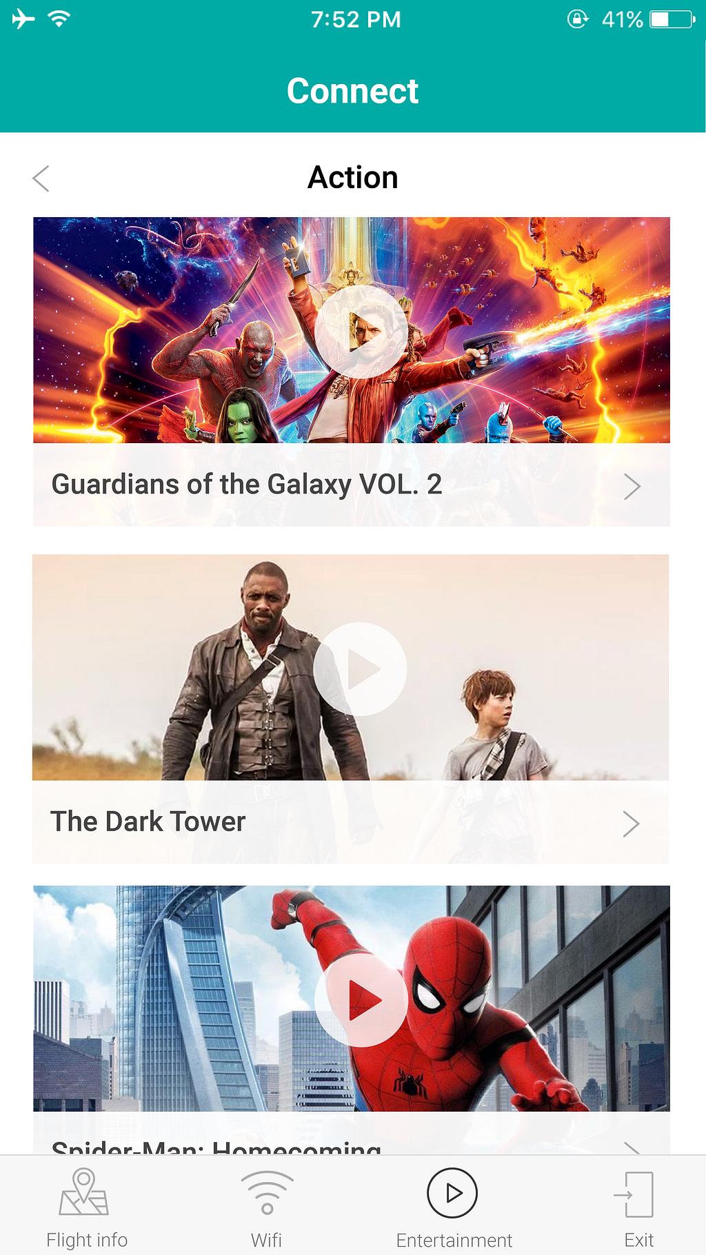
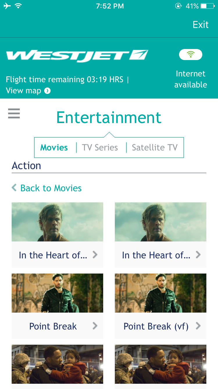 Screenshot of the movie selection page, notice when the movie title exceeds the space, no indications that the film is in French will be shown
It wasn’t until a couple minutes into the opening scene, a character spoke for the first time, in French!! I don’t remember there being a language selector nor was there another way of changing the language directly in the movie player. Because of this, I had to exit the movie, then another navigation back to the movie selection page in order to select the English version.
Only then has it become clear to me that the same title is listed side by side, with ‘vf’ in brackets indicating that the movie is in French. Maybe it’s just me but that could very well stand for Vanity Fair, or view finder, or vegan friends. Certainly, Version française is not the first thing that pops into my mind.
From the problem I experienced, I saw an opportunity here to improve the entertainment experience for other travelers. I will be following this human centric approach:
To validate this problem, I volunteered a few minutes of my friends time and asked them to complete a series of user testing exercises. Out of the 10 people I interviewed, here are the bias:
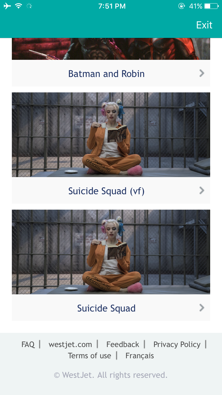
I started off by showing the screenshots of the app below and asking the user to select the movie they would watch given the title.
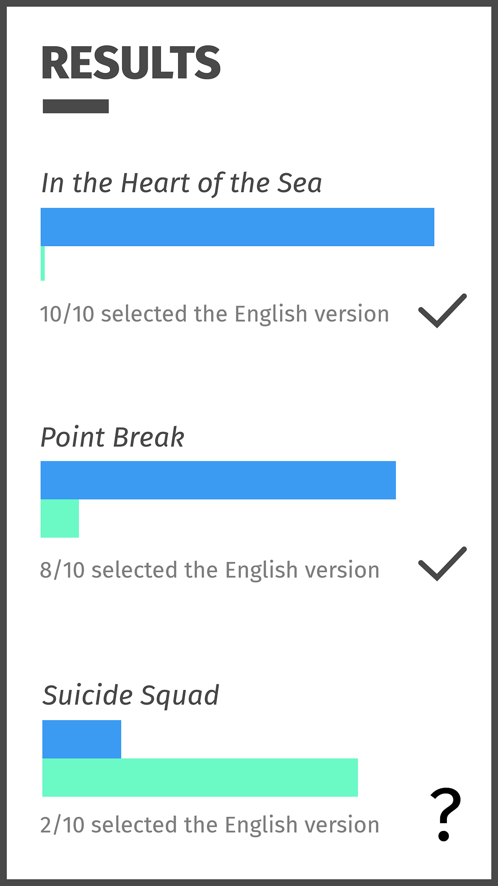
The results were not very surprising. Almost all users selected the first movie listed versus the second; this is especially true for the movie In the Heart of the Sea, in which ‘vf’ is hidden. When asked why they chose to select the ‘vf’ version for Point Break, both the users thought it meant a higher definition.
Interestingly, despite those who selected the not ‘vf’ movie for Point Break, 7/8 have chosen to watch Suicide Squad in ‘vf’. When asked why one user responded “the English version is usually always seen first”(classic Anglophones). It’s a shame I could only gather feedbacks from English speakers. Out of the two users who are bilingual, they were successful all three times selecting the English movie but agreed that ‘vf’ is not very common outside of Quebec.
From this exercise, I have to assume that users are likely to overlook the titles because we rely heavily on default practices. Our brain is made to be on autopilot.
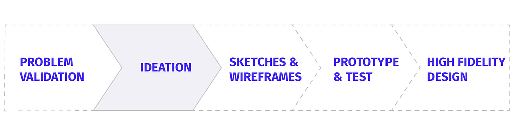
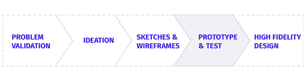
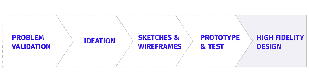
To begin my ideation process, I first determined what my goals are and who I am designing for.
From some quick research and understanding, the shift from the seat back entertainment to mobile devices adds another revenue stream for the airline while cutting cost on the screens, genius. As a passenger who frequents 4+ hours of flights, a delightful entertainment system should be a given. With such a wide array of passengers, accessibility will also be a large focus.
 Oh this? This is just an image I found on the internet. I thought if you scrolled fast enough you wouldn’t notice.
I jotted down some ideas that flew in my head.
On the left, you see the built-in language selector that Netflix adopts. While this is a great solution, I can only imagine the technical limitations.
How could the title be more clear to avoid confusion?
A big button that says “English” and another smaller faded out button that says “Français”.
I’m here imagining a flag icon that corresponds to the language selections. But do we use the French Flag or the Quebec Flag? 🇨🇦 🇫🇷 ?
A language selector is pretty commonly used. And everyone loves to scroll right? Right!?
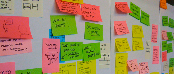
I have also gathered some insights and inspirations from other apps with similar features. It’s important in the next steps to constantly refer back to mood boards and of course, the problem statement.
First, I used the new Invision Freehand tool to redline some of the UI problems I identified.
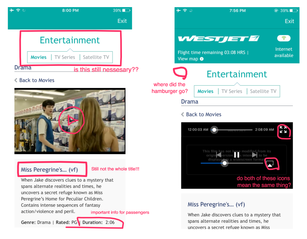
One of the recurring problems is a poor use of screen space. The “entertainment” navigation appears on almost every screen but it does not add value to the user once they are exploring movie options. Another poor user experience problem I identified is the amount of uncovering needed to get to the actual content. A question I’m interested in finding answers to is why can’t the movies be played directly from the home page if the user does not require that extra information?
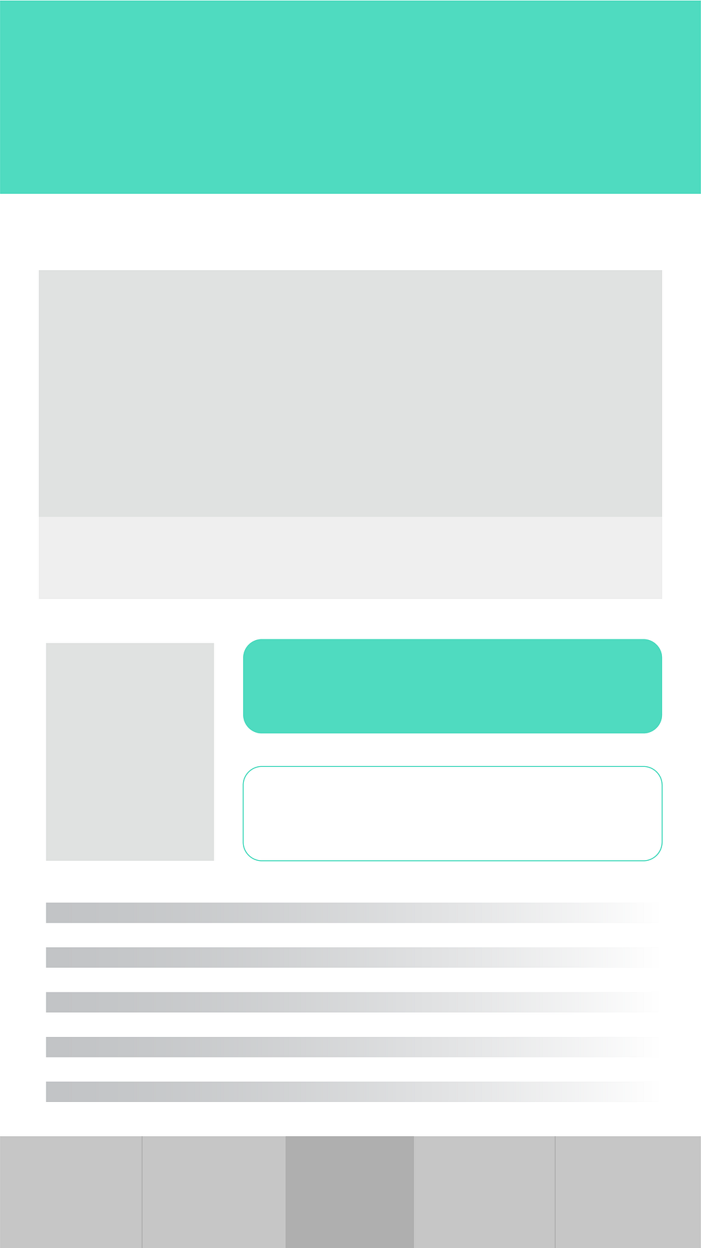
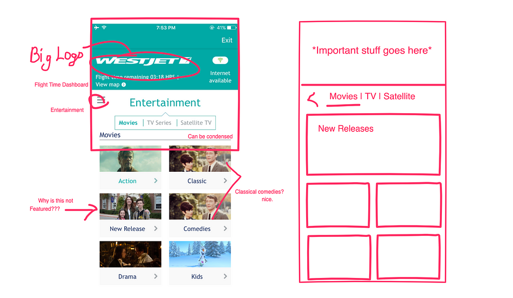 Figured the home page needs some work as well
Going forward, I believe a bottom navigation would solve both the problem of inconsistency and improve information architecture. A bottom navigation is increasingly adopted by many well-known apps like Facebook and Spotify. I made a few sketches in illustrator on what it could look like.
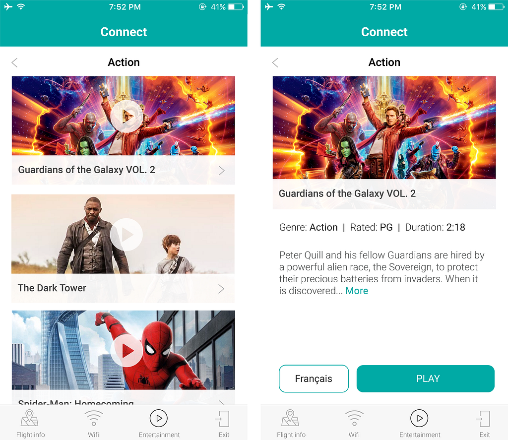
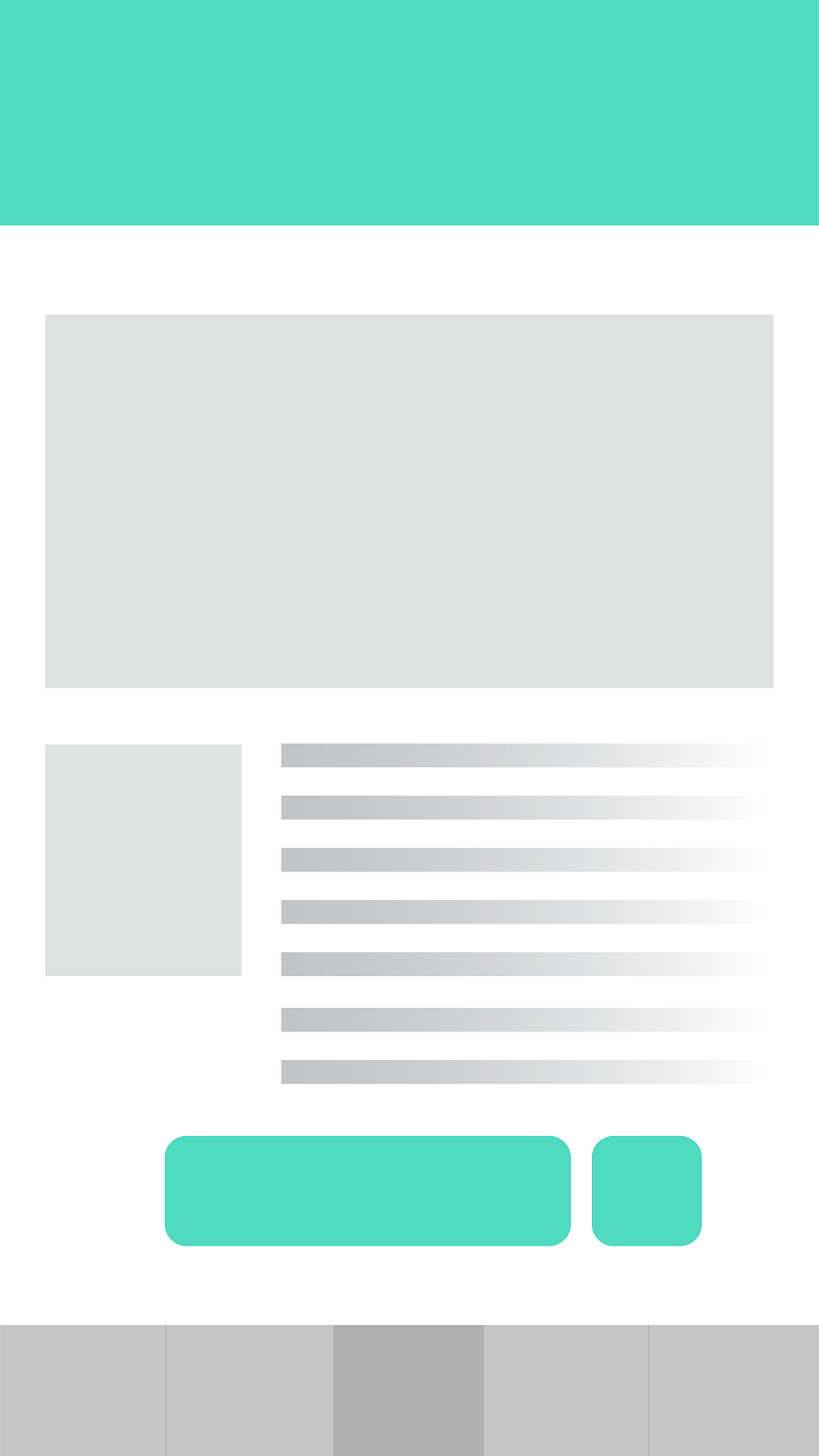 Movie selection screen with two different iterations for the detailed description screen
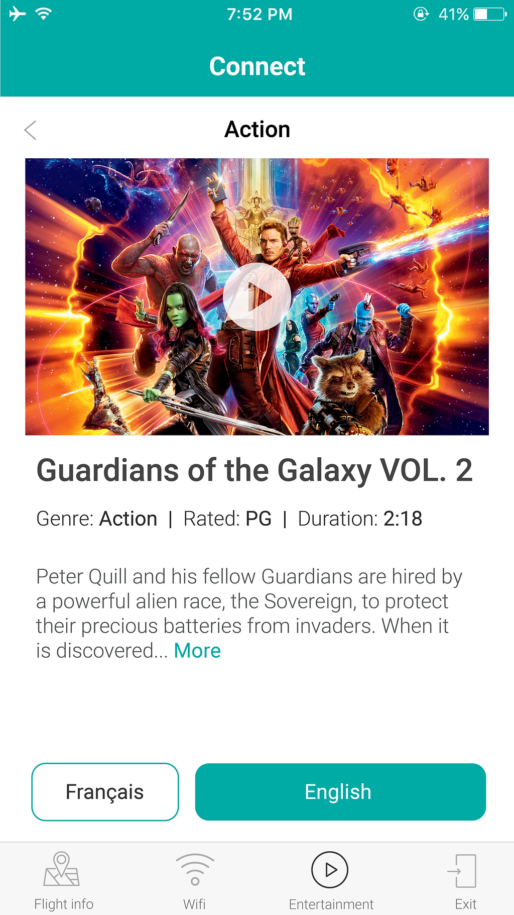
The bottom navigation could include the entertainment selector, flight information, internet access, and the exit button. Not only would this save interface space, it is also very friendly for use with one hand. On the home screen, users could go straight to the movie player or found out more information, if they’d like. Once they reach the detailed description page, the bright blue button will prompt the user to play the movie in either English or French. Hopefully, the new interface will solve the problem I initially faced.
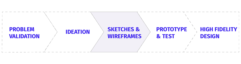
I designed several more iterations of the screens with varying level of details in preparation for the prototype and test part of the case study.
 A / B
A / B
I decided to use A/B testing methods to validate my solutions. For example on the left, I designed two different entertainment screens with one have similar elements to the original. I then interviewed five users, here are a few things I observed.
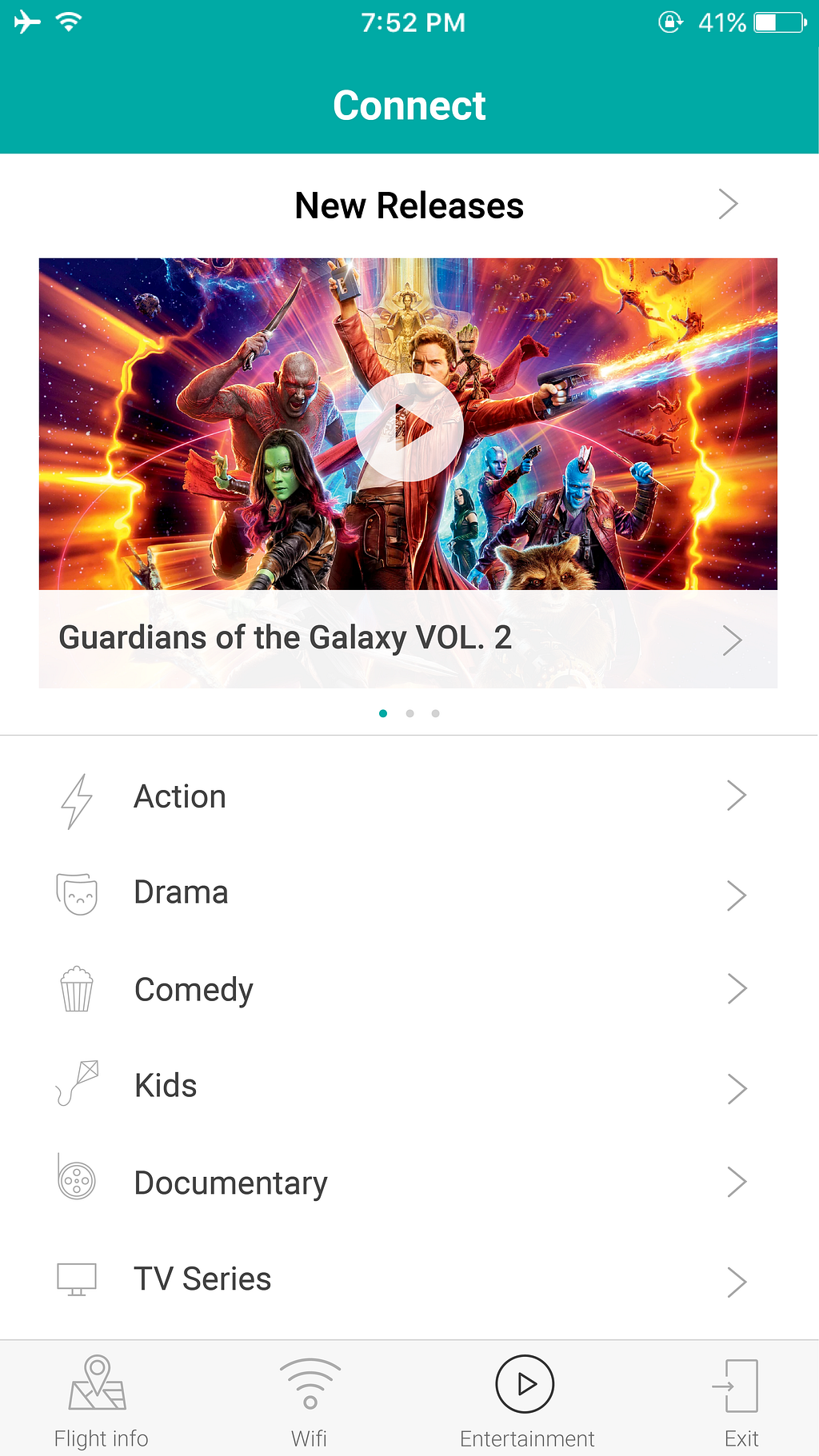
One user tapped on the word “New Releases” hoping it would show another list of just new released movies. A different user commented on the ease of being able to play the featured movie right from the home screen, which is a plus. Out of everyone I interviewed, version B performed better because the list was easier to scan than thumbnails. The additional thumbnail provides very little additional value because most people know what to expect when categorizing movie genres.
As the feedbacks come in, I go back to my design and make improvements based on user’s needs. This is also when you need to be careful of taking each feedback blindly. Not everything a user says need to be considered for enhancement. But when you notice a pattern in the feedback, that’s when you know there’s something there to look closer at.
Design is a process, not a goal.
Some of the feedbacks I got with the language selector for the version above is very insightful. What makes perfect sense to me does not in someone else’s mind. You can never be too clear in your word choice. So from here, I went back into the wireframing phase to discover what I have missed.
With the final high fidelity prototype, I interviewed 5 more people and they were all successful in choosing the movie they want to see and found it to be a delightful experience.
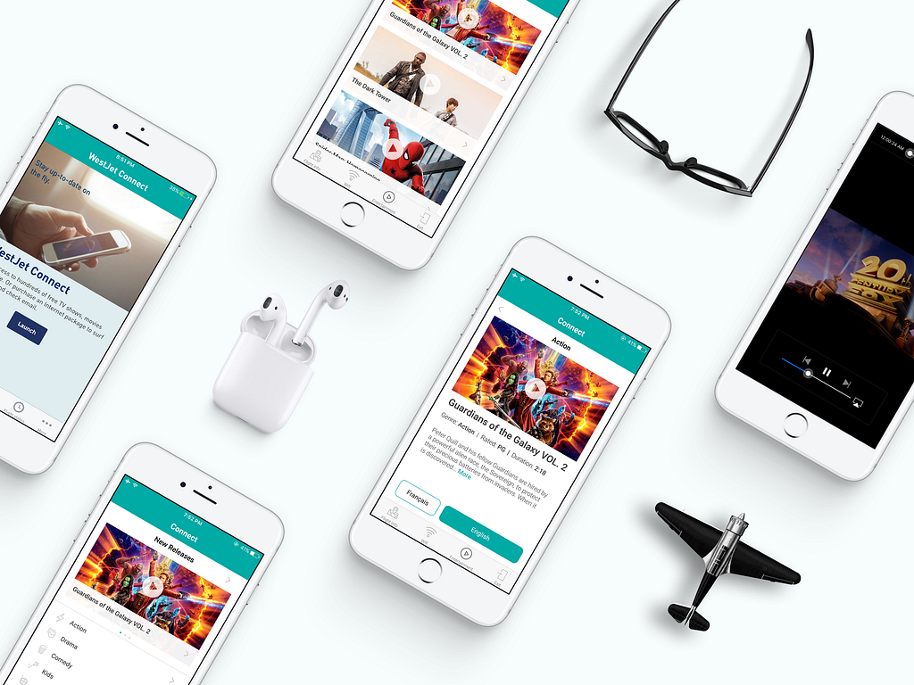
What I have taken away from this project is that plenty of thoughts go into a seemly simple design. There may not be one right approach to good design, but continual improvement is essential. Check out the mockup screens below and enlarged for detail.
I had a great time researching, testing, and presenting this case study. I learned a lot but there’s still so much more to learn! Your feedbacks would be invaluable to me. In the mean time, I will be looking forward to my next flight when I can finally catch up on the episodes I downloaded on my Netflix app. 😜

WestJet Connect — A UX Case Study was originally published in uxdesign.cc on Medium, where people are continuing the conversation by highlighting and responding to this story.
AI-driven updates, curated by humans and hand-edited for the Prototypr community


