Build Design Systems With Penpot Components
Jul 21, 2:15 AM
Penpot's new component system for building scalable design systems, emphasizing designer-developer collaboration.
smashingmagazine.com

UX Planet — Medium | Rafayel Mkrtchyan  Photo by Saveliy Bobov
Imagine a street where there are ZERO street signs. A lot of people, cars, buses, bikes. But NO street signs. Pedestrians and drivers are yelling. A complete chaos….
Now imagine a mobile app with tons of cool features and no onboarding, no tips, no hints, no guidance, nothing. Looks like a street where there are no street signs, right?
You know what I mean? An app is like a street and the users are like the pedestrians and the drivers. When there are no street signs on the street, chances are that a traffic jam is going to happen. And most probably people will call the police to come and help them resolve the problem.
The sad news is that app users won’t call you if they feel lost in your app. What will they do? Exactly, leave it! I know, this sounds pretty gross. But that’s the reality. Face it!
If you think that people are going to fall in love with your product at the first sight, you are wrong. If you think everyone is going to like it anyway, you are wrong. And if you think users are always going to understand intuitively how to navigate in your app… Again. You. Are. Wrong.
Even if you are genius, you cannot come up with a 100% intuitive product design.
That’s why a lot of wise guys use onboarding tactics, tooltips, progress bars, product tutorials and a bunch of other things to help users figure out how the app is working. Because everything has it’s way of working, right? A decade or two ago people were attaching a long list of instructions with products like washing machines, blenders, and even fridges. Now that we have got advanced methods to build intuitive products, we just need to make sure a few core instructions and at least some guidance on how to use the product are provided.
So today, I am going to talk about tooltips which are basically a way of product commentary that make a part of the user onboarding flow. Tooltips help direct attention toward a specific item or action.
The ultimate reason why you should opt for tooltips is to explain the core product features to the user. But sadly, there are folks out there who abuse the usage of tooltips and thus make the products unappealing and spammy.
According to Google’s Material Design guidelines:
“Tooltips are text labels that appear when the user hovers over, focuses on, or touches an element.
Tooltips identify an element when they are activated. They may contain brief helper text about its function. For example, they may contain text information about actionable icons.
Tooltip labels do not receive input focus.”
There are a few things you can do to avoid looking spammy while using tooltips. Here you go.
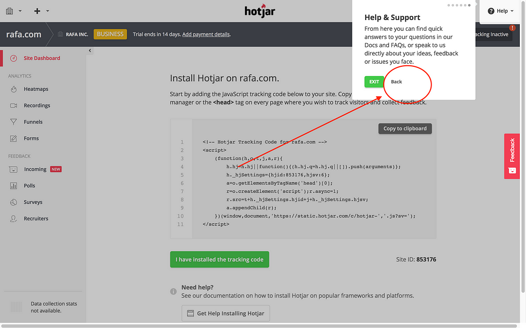
Otherwise, you will be overloading the new users with tons of new information. That’s not the way it should be. Hotjar nails tooltips. See the screenshots below:
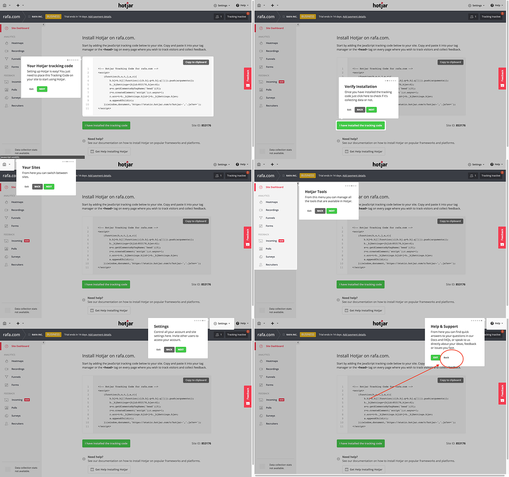
In Hotjar’s scenario, you only see the next tooltip after you press “next” on the current one.
In Hotjar’s example, the progress is shown through the little dots. That’s pretty sweet especially from the new user’s perspective. The user needs to know where they are standing and how long there remains until the end of the tour.
This is a golden rule! It’s OK to make the descriptions a bit long and the tooltips higher in number. Just make sure you include only ONE action per tooltip otherwise the users might get misled by the number of actions they have to perform.
As you can see, in Hotjar’s example, the user has no such option which is pretty sad. They should have the chance to skip the tutorial at any moment they want to. Remember, you don’t want to look spammy.
Sometimes some things might sound vague to the user. So, make sure you provide them with the chance to go over the tooltip tutorial again.
Impressive onboarding is vital for engaging and retaining web and mobile users. Constantly improve the onboarding flow. Try A/B testing, experiment with onboarding techniques and tools. Make it clutter-free. If you have decided to use tooltips, don’t abuse them. Happy onboarding!
If you enjoyed this article, please hit that clap button to help others find it.
I am an Internet Entrepreneur with extensive experience in product management, software engineering, business operations, and strategy. And I am also the co-founder and CEO of CodeTrace, which is a real-time skills-assessment software that measures developer’s experience based on their code.
Follow me: Medium | Twitter | LinkedIn
What are Tooltips and Why Should You Use Them was originally published in UX Planet on Medium, where people are continuing the conversation by highlighting and responding to this story.
AI-driven updates, curated by humans and hand-edited for the Prototypr community


