Build Design Systems With Penpot Components
Jul 21, 2:15 AM
Penpot's new component system for building scalable design systems, emphasizing designer-developer collaboration.
smashingmagazine.com

medium bookmark / Raindrop.io |
Sometimes is difficult to know why a design works or not. I have selected some really good designs (in my opinion 😉 ) in order to analyze what makes them be that good:
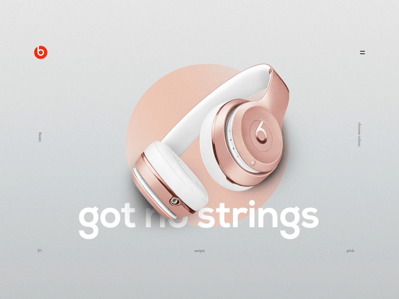
The composition is perfectly balanced with the main element centered and all the other elements generating a frame around it, without interfering. This way, the attention of the user is drag immediantly to the product, with no noise around it.
The hierarchy is clear, we have three levels of importance clearly defined:
The design has depth, playing with three layers overlaped: background, typography and the product itself, making it more interesting. This allows also to create some attractive animations when swiping between products.
The use of gradients is sublime, providing a touch of light in a very subtle way.
The selected color scheme is Good color scheme is very harmonic. Adjusting the saturation and luminosity of three almost primary colors, they have achieved a soft and pleasant combination.
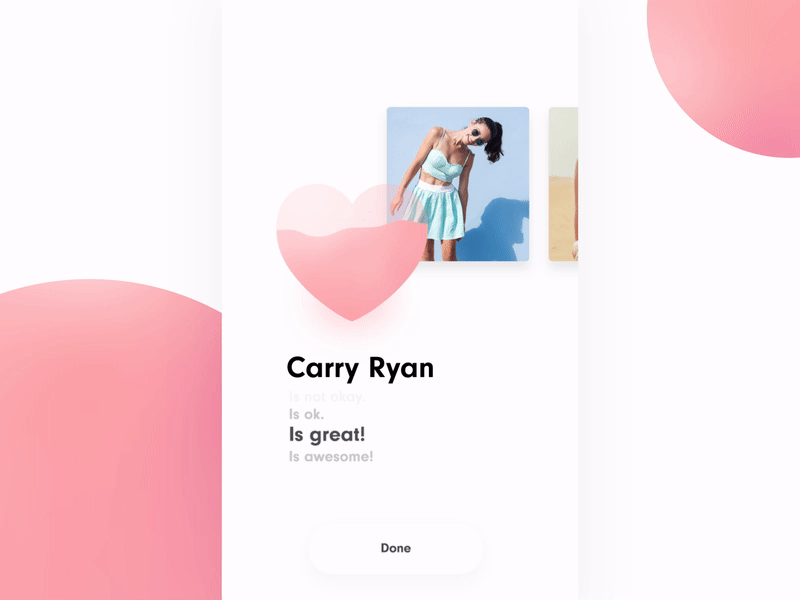
The photographies selected have a nat background, with almost no elements that could interfere with the main content of the photography. This helps to have a clear view of the clothing.
The use of the gradient inside the like icon, helps to emphasize this icon.
We can identify a clear grid used at the design. This helps to maintain all the content perfectly organized.
Microinteractions and microanimations ara smooth and appear just at the right time. They also help to guide the user in and out different screens.
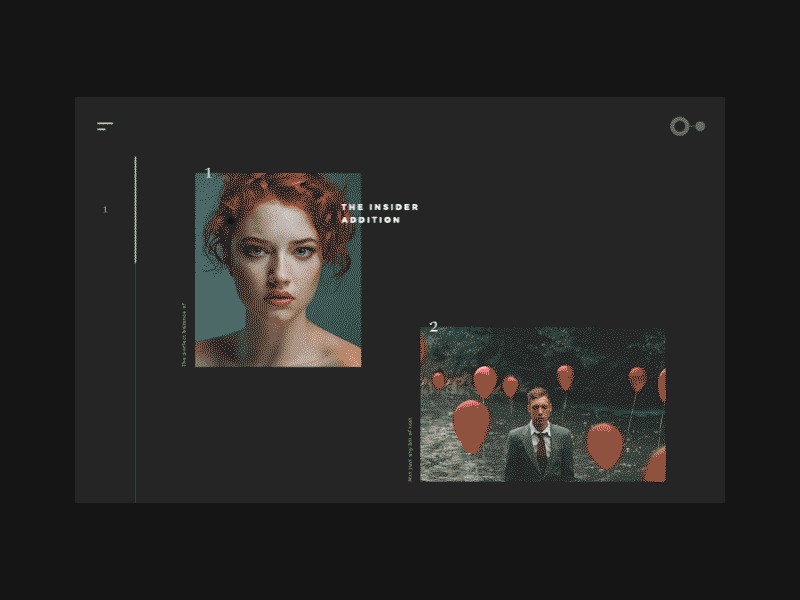
The color scheme is well-rounded. Due to the non-saturated colors of the images, the background color applied is also a non-saturated gray with match perfectly with the images.
As the photographies are meant to be the main elements, the rest of information is put on a second level. Heading and text are in a small size and navigation indicators are very delicate.
The wide white-space around photographies (in this case black-space 😉 🚀 ) helps contemplating them without interferences.
The animation is also well conceptualized. It enhances navigation and helps the user knowing when he is entering a second level of navigation, but it’s not invasive or distracting.

AI-driven updates, curated by humans and hand-edited for the Prototypr community


