Build Design Systems With Penpot Components
Jul 21, 2:15 AM
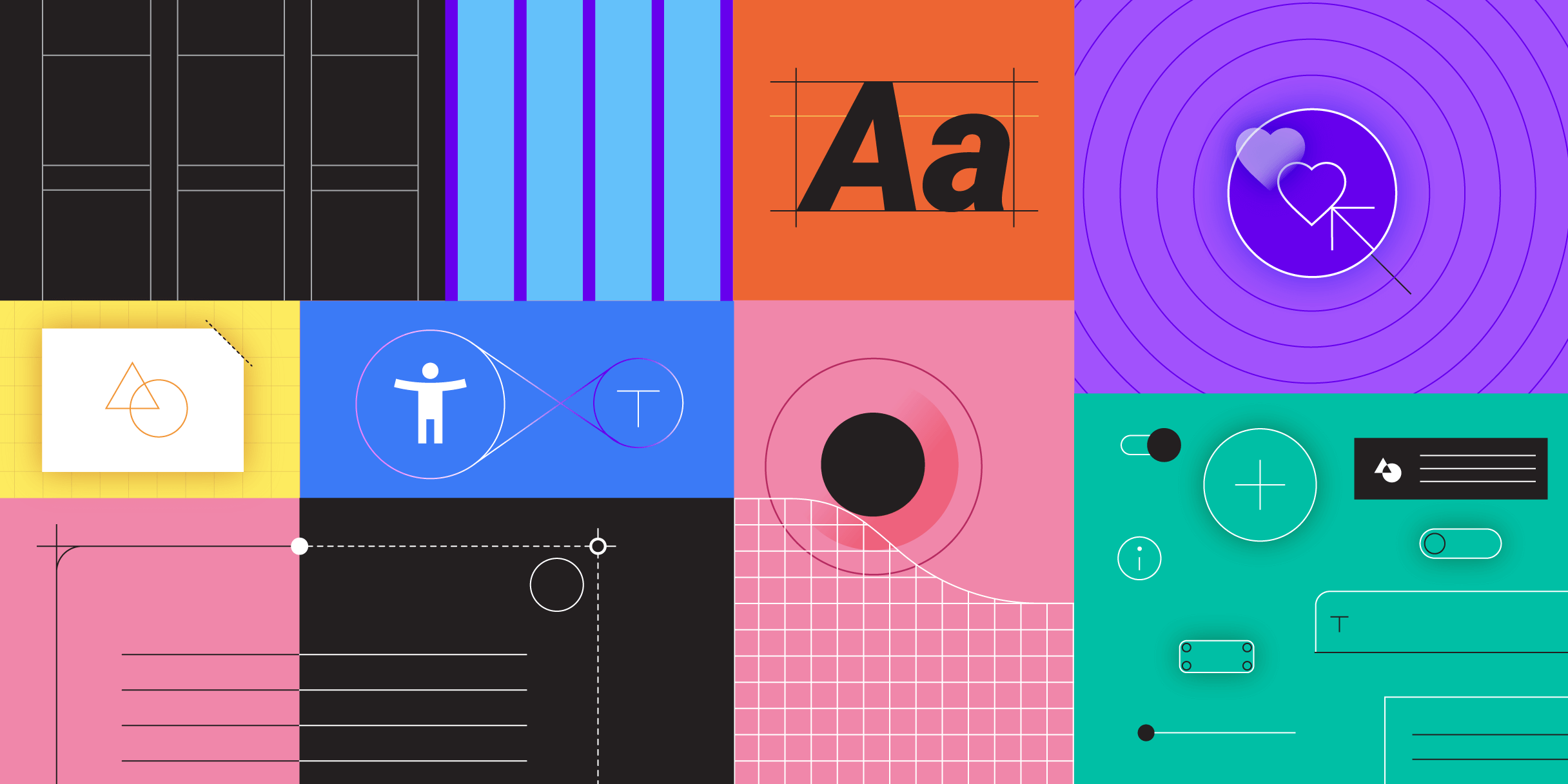
Penpot's new component system for building scalable design systems, emphasizing designer-developer collaboration.
smashingmagazine.com

Design + Sketch App — Medium | Pratik Shah
Since the launch of Material Design in 2014, it has been the most used(and loved) visual design language! This is because of two main reasons:
But Google wants Material Design to be much more than just another Visual language. Google is building tools to improve our design-development workflow! Here are the big announcement made in this year’s Google I/O:
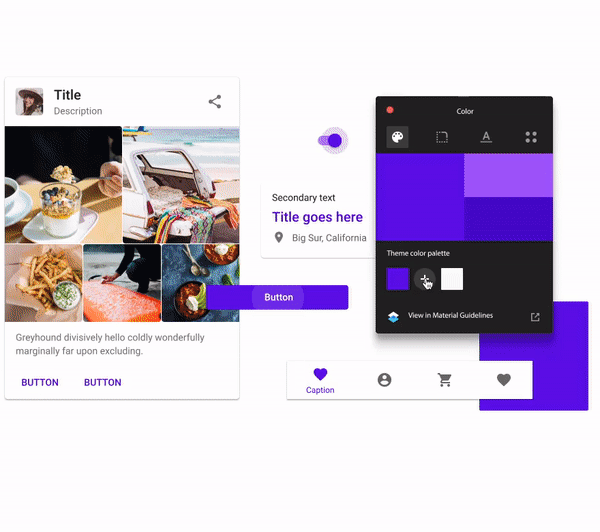
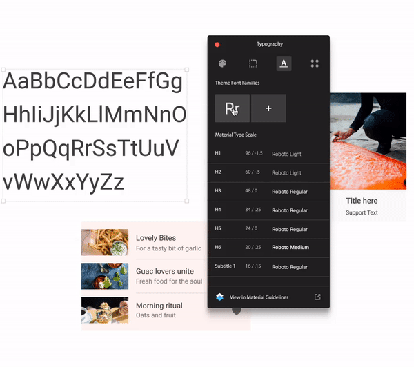
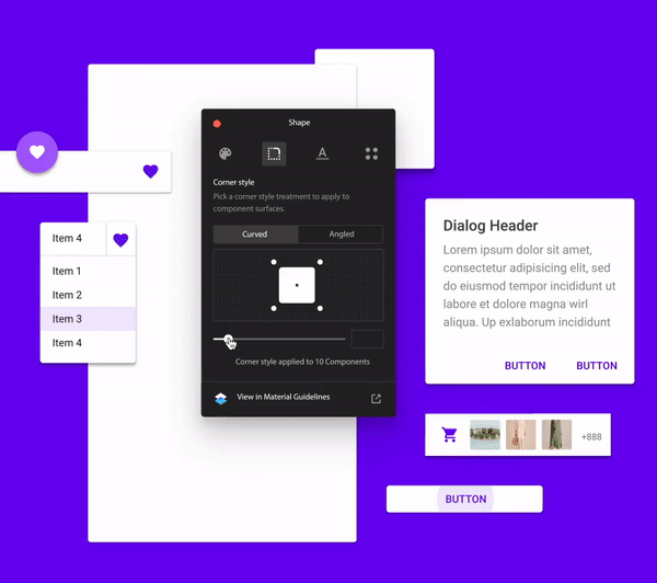
This is a huge upgrade to Material Design! Material Theming is the ability to “systematically” customize Material Design to better reflect your product’s brand. Let me explain what systematically means here:
The brand is represented visually by colors, typography and shapes.
So we need a way to change these things in Material Components, too!
Earlier to make such changes we had to use multiple plugins to update Sketch symbols/library, but now we have “Material Theme Editor”.
Do you guys remember this from last year? This was a tool Google launched claiming this will streamline your design workflow, but all it could do is allow users to comment on image versions!
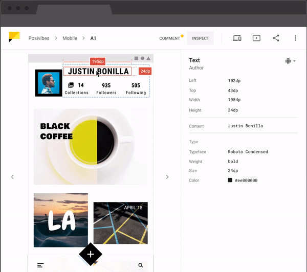
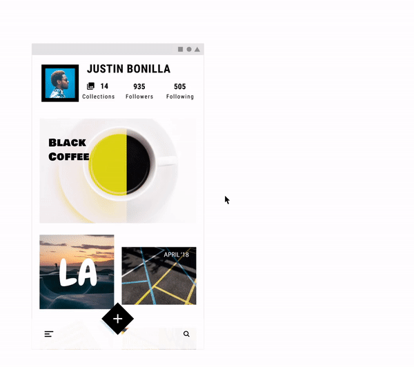
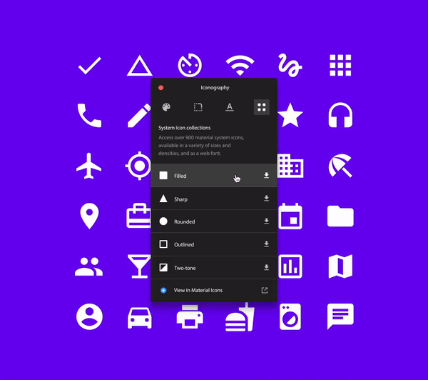
Google’s Gallery is back with the bang! Now it offers features which will definitely solve your design handoff headache. Let’s see what it can do.
2. How Google created a custom Material theme: explains how Google is treating their Material Design rules.
How Google created a custom Material theme
3. Material partner studies: Learn how apps like Lyft, Genius, NPR, Pocket Casts, and Zappos bring Material’s new expressive capabilities to life.
Any updates I forgot? Tap the 👏 button if you found this article useful. Have any tips of your own? Let me know 🗣
What’s new in Material Design? was originally published in Design + Sketch on Medium, where people are continuing the conversation by highlighting and responding to this story.
AI-driven updates, curated by humans and hand-edited for the Prototypr community


