


Build Design Systems With Penpot Components
Jul 21, 2:15 AM
Penpot's new component system for building scalable design systems, emphasizing designer-developer collaboration.
smashingmagazine.com

medium bookmark / Raindrop.io |
Senior Design Partner at Innovatemap and co-founder of UX Power Tools.
This is part three of three articles detailing the internal groups we have to design for in order to get great products built and sold. Part three focuses on the groups that ensure your designs are usable, extensible, and functional.
At this point, you probably think your designs are ready to see the light of day. But even in this agile, continual release world, you still need checks and balances to make sure the work is high quality.
Some of you may be solo as a designer or may not have product managers, but someone will be playing these roles whether it’s you, your startup’s CEO, or your cat. And we know how judgmental cats can be.
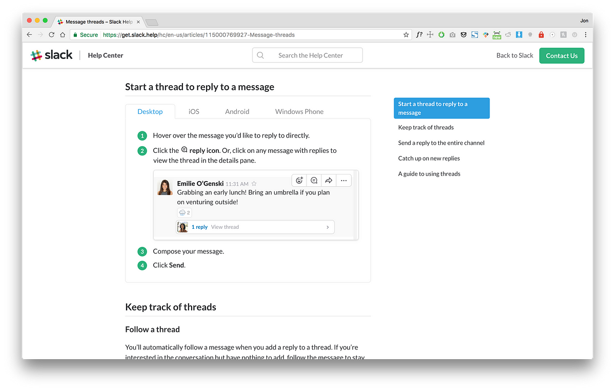
You know that User Manual you get with your shiny new 8K TV? The one you either a) Throw away immediately or b) Use to kill a spider on the wall?
Well guess what? That complicated new app you just designed has a user manual, too!
Individuals responsible for owning product documentation do everything from writing and answering FAQs, to producing how-to videos. Your grimy designer fingerprints will be everywhere in these documentation materials, so be consistent and be thorough.
While it’s not a huge deal if things like website marketing images aren’t perfect, documentation has a higher bar. It’s literally how your users learn your product. You wouldn’t want your math professor using a book that’s mostly correct, right? Neither would your users.
A product experience extends far beyond the product itself, so put the same effort into perfecting screenshots for documentation as you do animating that menu button. If users can’t figure out how to use the button in the first place, it doesn’t really matter what that animation looks like anyway 🙃
If you’re not working at a huge, global software company, you probably won’t really have to worry about this. But it’s worth understanding so you can at least be empathetic toward their worries and needs.
As a designer, you’re responsible for crafting a product that will shine on any continent. Here are some things to consider:
What I can only assume is a login page in Russian, by Anna Bakurova

The scale shows average Mbps. Red = really slow.
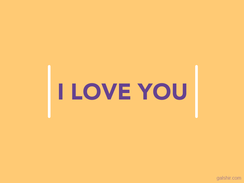
My absolute favorite responsive GIF, by Gal Shir.
Here is how a typical conversation goes once my design hits testing:
“Uh, hey Jon, I was testing your age dropdown and it got crashed when it got to 1,020”
“Um, well it’s an age dropdown so you probably just need to test into the 90’s”
“So like, 99?”
“Sure, Greg. 99”
Or
“Hey Jon, you didn’t specify the RGB value of this link color”
“Yeah that’s because it’s just the same link color we have set in the main.css”
“But what is the actual RGB value? I need to verify that it’s correct.”
“I’m looking at it on your screen right now and I can tell you it’s right.”
“But I’d like to know what the right RGB is so I can close this defect.”
“Well, you don’t need to worry about it. It’s a global style and it won’t ever be off.”
[blank stare]
Admittedly, QA was the biggest shock for me when I started my design career. I really struggled with conversations like these — often, my ignorance to the role came off as arrogance.
But QA does exactly what it’s acronym symbolizes and if you have any chance at your design reaching your high standards as a designer, QA is the group that will make it happen.
Most of what QA needs is covered in the previous two groups. What’s more important is to help get your testers aware of your design intent earlier on so you get better defects and solutions.
A tactic I’ve used is something I’ll call Audit Defense™. This is where you review your designs in-person with QA closer to the concept phase and well before implementation to reduce the amount of time spent later on communicating and logging defects:
Your role as a designer is not to keep defects to a minimum, but to help QA log better defects.
This wraps up the series! Hope it was useful and, at worst, helped you pass the time. You can subscribe to get this in your inbox below, and see what we’re up to at uxpower.tools.
When I’m not trying to get my design implemented accurately, I’m working on Sketch design tools at UX Power Tools to make you a better, more efficient designer. You can learn more here:
AI-driven updates, curated by humans and hand-edited for the Prototypr community


