Build Design Systems With Penpot Components
Jul 21, 2:15 AM
Penpot's new component system for building scalable design systems, emphasizing designer-developer collaboration.
smashingmagazine.com

medium bookmark / Raindrop.io |

Systems thinker, Strategy, Information Architecture and UX
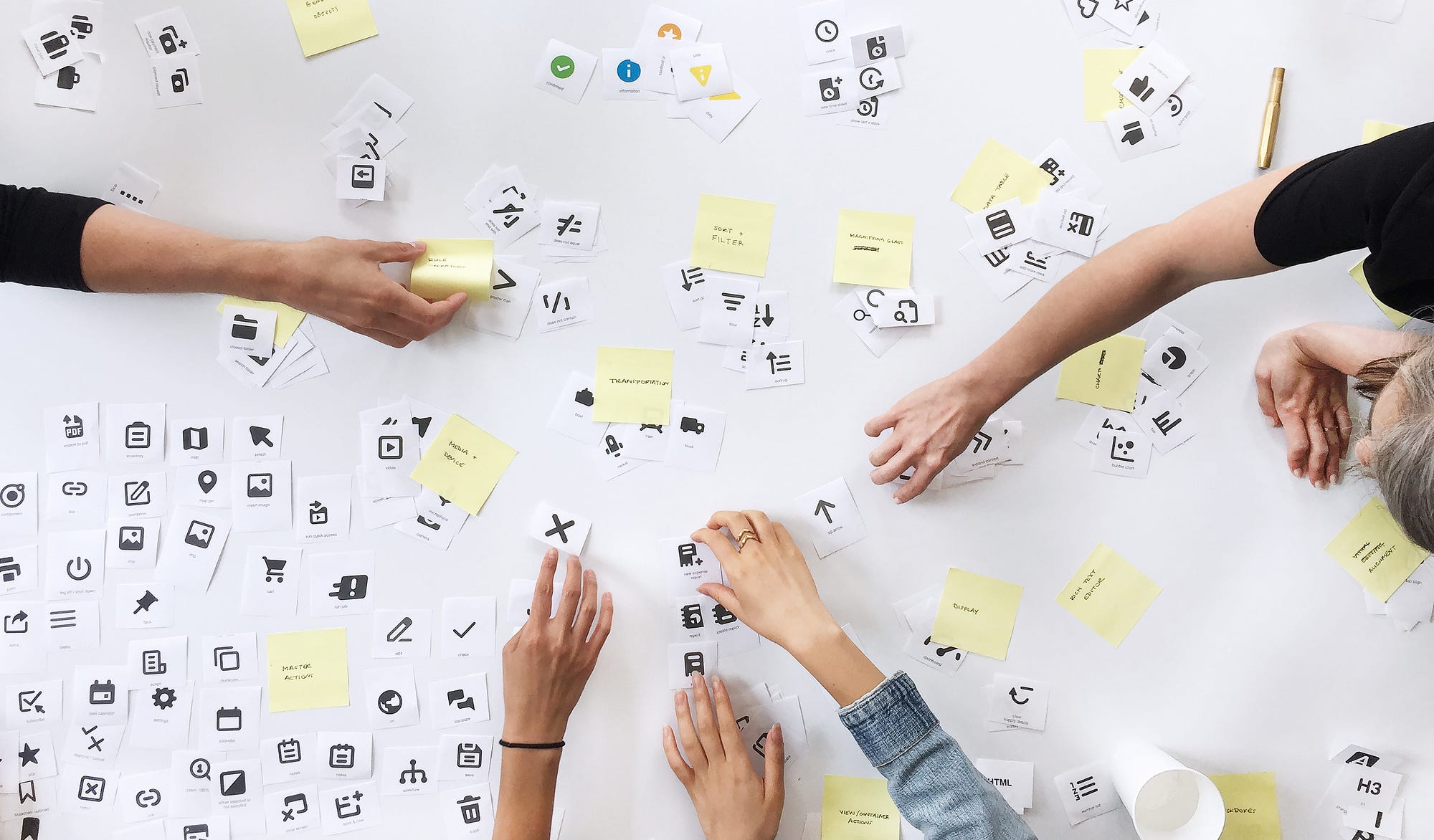
H&L icon workshop
Yes, I’m not a pixel perfect designer.
To clarify, this doesn’t mean I don’t care about the details and final delivery of a product. Rather, I don’t consider pixel perfect UI specs the ultimate design deliverable. As the tech industry evolves, our design outputs and the way we conceptualize them should change, too. We should focus more on design as a methodology instead of design as a deliverable.
With the advent of the Internet of Things (IoT), end users’ devices are becoming ever more connected. End users can integrate contacts from their phones to their cars. They can text no matter where they are, whether it’s controlled by touch or by voice. Users are also relying more on voice control and chat-bots for additional convenience. Amazon Echo has removed the user interface, so users can simply use voice commands to query a verbal or written response. There are less limitations to what a user can do and where. User inputs and device outputs do not always need to correlate 1:1. Convenience and efficiency are the users’ new mantra.
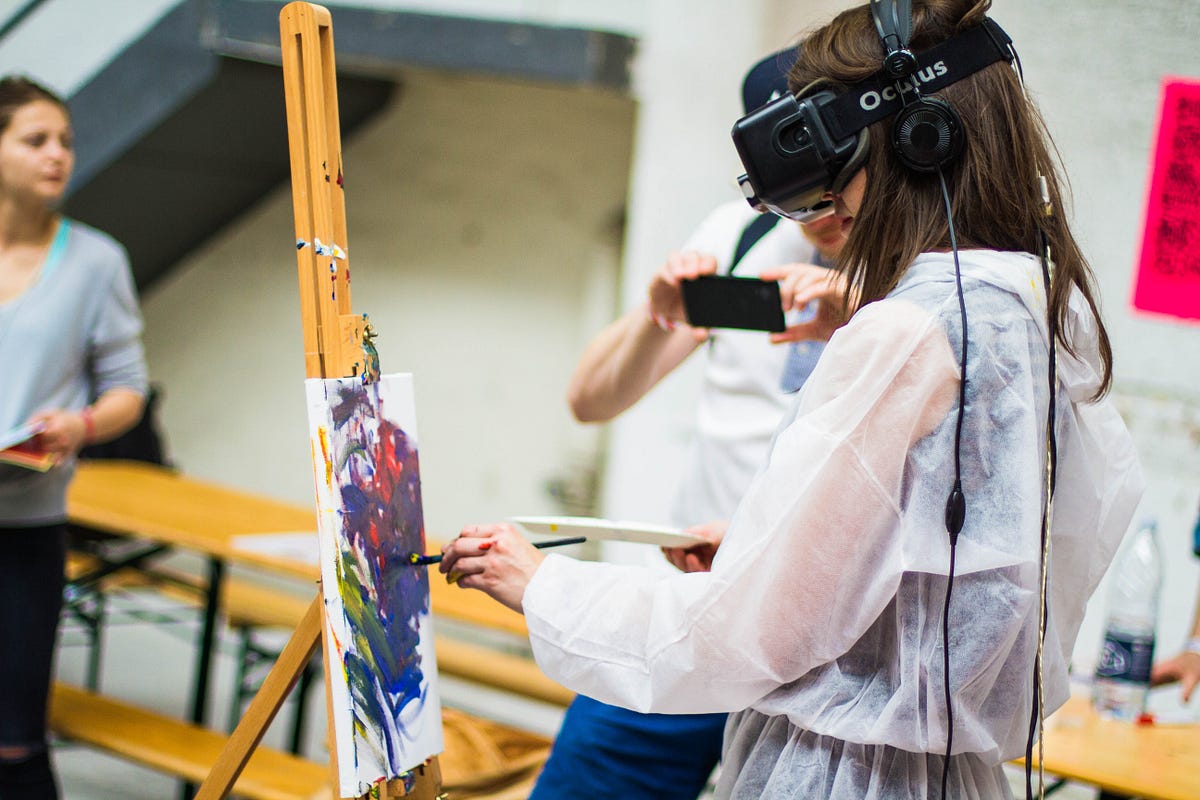
Photo by Billetto Editorial on Unsplash
In addition to end-users adapting and influencing the rate of change, so is the design industry itself. Companies want to be able to test ideas more quickly, but the process from ideation to development can take a while as it passes from expert to expert. Companies like Airbnb, InVision, and Etsy are exploring rapid prototyping and design automation to more efficiently pull existing components into a page design instead of starting from scratch. These companies are focusing more on efficiency of reusable parts as UI design becomes more standardized.
As designers, we should follow this trajectory of efficiency when it comes to deliverable types: think more broadly; be device agnostic; consider the overarching design of data. We might be designing for mobile-web right now, but what happens when we need to integrate products into the newest devices like iWatch or Amazon Echo? How can we smartly scale our designs to fit new use cases and new users over time? How can we make the best use out of the research that we’ve already done? If we can think more globally, we can start to uncover to baseline solution that can scale out to many modes.
Methodologies like Object Oriented User Experience (OOUX) have been leading on this front. OOUX promotes the identification and prioritization of database or DOM objects. Thinking about objects as an initial kickoff point to design process helps to inform the breadth and reach of what the user is trying to achieve.
By extracting the objects first, and not thinking about the user interactions, we can start to understand all of the potential actions that a user can take, not just the actions that are immediately annticipated. As products grow and a user’s needs expand, this will help to better scale out future designs.
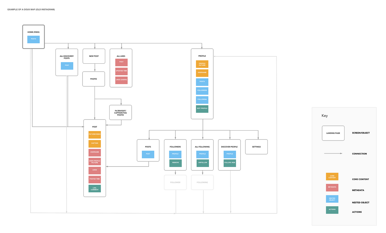
OOUX site map of Instagram by Becca Kroll
We’re currently applying this universal object-oriented framework to a range of projects large and small.
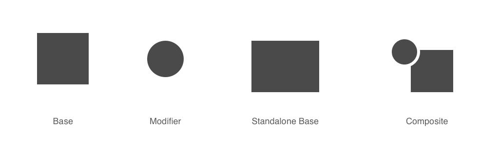
One example is our icon library overhaul. As an enterprise company, we have a lot of different software applications. Over the years, many product teams have requested unique icons for their specific use cases. As a result, we’re dealing with a lot of variations of similar icons that address the same function. The naming conventions got so messy over time that we couldn’t even effectively audit what we already had. Additionally, we knew our icon library was a living evolving thing, a system that would need to be maintained over time.
First, we printed out every icon we had and did an audit. This helped identify any duplicates in either an icon’s name or its function. We found that some icons were heuristic to the software industry or universal in both name and appearance (such as “Save” and “Trash”) and that we didn’t need to touch them and could set them aside. From there we had a more core group of icons that we could dive into.
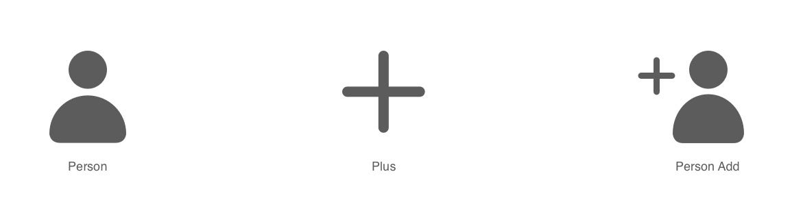
Next, we started to identify patterns in how parts of icons were getting used as part of other icons. We found that some modular building had happened naturally.
We wanted to focus our efforts on these modular properties of these icon types. Since we’re such a big team with such varied use cases and users, we don’t want to be in the business of restricting the creation of new things. Instead, we wanted to come up with a framework where people can better understand how to leverage existing icons and how to create new ones when the right use case arises. We want to be the shepherds not the creators.
We classified icons into different types to think more clearly about how they could be used together:
We’re in the process of creating documentation around how teams can use this framework in the evaluation of existing icons and the creation of new ones. This is a new process for us, so we’ll be testing and iterating along the way!
Advances in technology are happening more rapidly than ever. Our users’ behaviors are changing as quickly as we are able to reach out to research them. As designers in a constantly progressing industry, we will deal with debt in both design and development that grows over time. If our goal as UX designers is to make efficient, smart products for our users, we have to think about future growth since that is a part of our industry landscape. We need to create modular and scalable solutions that can be reapplied no matter what we’re designing for whether it be an iPhone today or a talking house tomorrow.
Design should not be fixed or monolithic. It should be fluid and move with the tides of user and industry change — and because that change is constant, design doesn’t need to be pixel perfect.
Shout outs to: Laura Hahn, Nick Wynja, Kayiu Ho & Elizabeth Kim
One clap, two clap, three clap, forty?
By clapping more or less, you can signal to us which stories really stand out.
Be the first to write a response…
prototypr.io
AI-driven updates, curated by humans and hand-edited for the Prototypr community


