Build Design Systems With Penpot Components
Jul 21, 2:15 AM
Penpot's new component system for building scalable design systems, emphasizing designer-developer collaboration.
smashingmagazine.com

medium bookmark / Raindrop.io |

There has been a lot of debate going on about the notch lately and most people are truly upset that Apple choose to go with a notch’ed design. Apple even went as far as explicitly mentioning it in their human interface guidelines (HIG).
Don’t attempt to hide the device’s rounded corners, sensor housing, or indicator for accessing the Home screen by placing black bars at the top and bottom of the screen. Don’t use visual adornments like brackets, bezels, shapes, or instructional text to call special attention to these areas either. (source)
But HIG are not always enforced during app review and many developers will likely want to build their own implementation of hiding the notch. To do that however you’d want to consider the fact that there will be certain trade-offs, and I’ll talk about those in a while but to overcome those trade-offs you will have to custom build many of the default iOS UI elements.
As you begin fixing the notch, you’ll quickly realise there are a lot more things to consider and embracing the notch might actually be the better option.
First off, to make a notch-less UI, you’ll have to create a visual separation between the status bar and navigation bar, this means you’ll likely have to apply a mask to the entire window or to the view controller.

(source)
The notch/status bar area on the iPhone X is 30pt. Which means applying a mask that moves the navbar down by at least 30pt will be your first step.
This is how it would look:

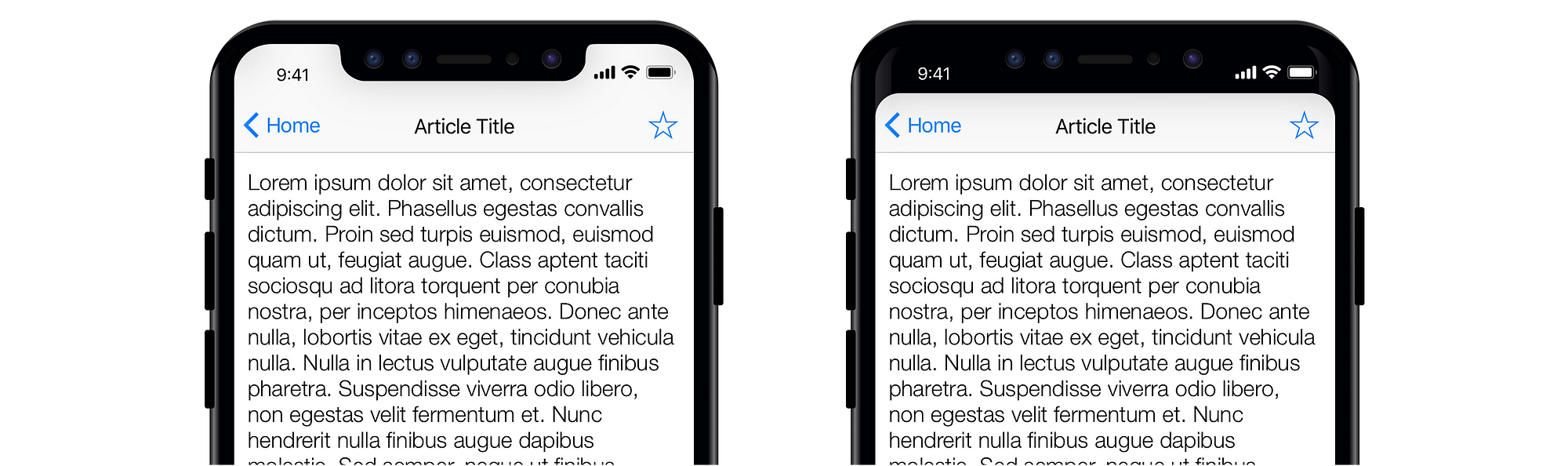
The image on the left is how it looks by default. The navbar has almost perfect visual symmetry with the tabbar at the bottom.
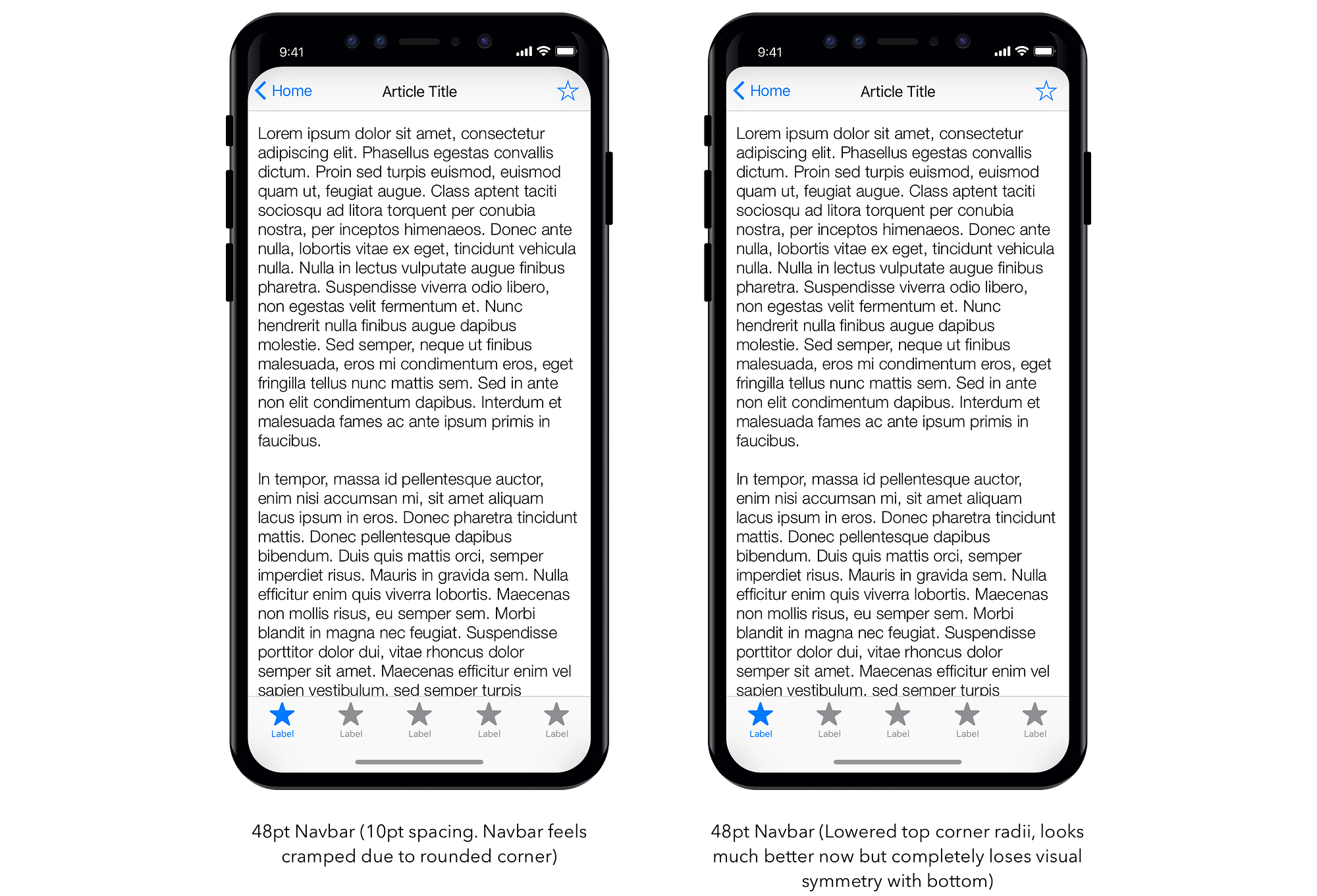
The one on right starts to lose that but is still within acceptable range. Except now the status bar looks wrong and needs more vertical spacing. Let’s fix that.

With the status bar spacing fixed, we now have a new problem, nav bars which have elements such as icons and back buttons look cramped. This is due to the high corner radius of iPhone X screen. Most of the mockups you’ve seen so far ignore the fact that your navbar is bound to have a few buttons and labels.
Notice how each of these concepts conveniently keep the navbar area clutter-free or don’t have any navbar at all.
Let’s now fix that cramped look by having a different (smaller) corner radius for the top.
Trade-off #1: Visual symmetry
Not only are the rounded corners different but the top navbar completely loses visual symmetry with the tabbar looking comically large.
To fix this, you can apply a mask to the bottom.
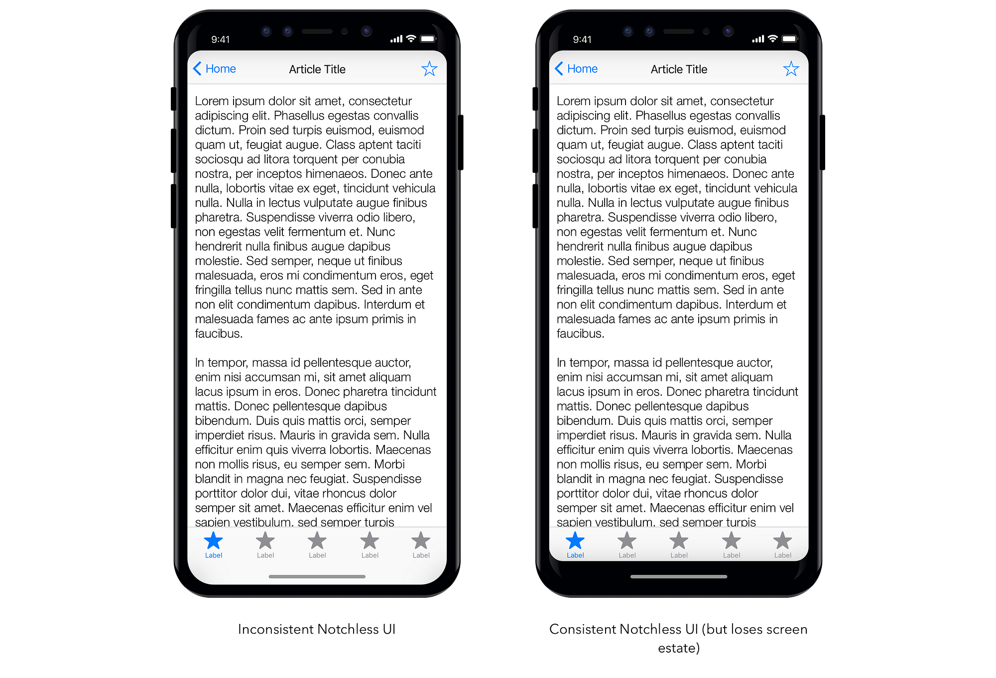
Trade-off #2: Screen estate
By trying to make notch-less UI appear consistent, we had to sacrifice some screen estate, in this case about 34pt of usable space was lost. This in my opinion is absolutely unacceptable. The entire point one buys the new iPhone X is to utilise the bigger screen to see more content.
Trade-off #3: No clear visual separation between content
With the default notch design, the article title and it’s body have a distinct separation due to the additional padding in navbar making it easier for user to distinguish. You can tell Apple really cares about this when they announced the new LargeTitleDisplayMode.
Having a dark theme with black UI elements will blend seamlessly with the notch. You can even ship a feature which automatically uses the dark theme in an iPhone X.
To mitigate all of the above trade-offs, you can custom design you entire app that means designing your own navigation bar and tab bar alternatives. Apple’s own apps such as Reminders or Wallet seem to be well designed for a notch-less approach. Both of these apps are excellent examples of designing custom interface elements.
Anyone who has built custom UI elements will tell you that it’s not a trivial task, it requires a lot of development time and 100’s of edge-cases to consider. Not to mention the fact that they’re likely to break with the next iOS release. Which leads to:
Trade-off #4: Risk
Custom UI elements will eventually break
Every major iOS release comes with slightly tweaked interface APIs. Apple tries it’s best to makes sure old apps continue to look and feel the way they used to on new versions of iOS with little to no changes. But that only works if the app makes use of default elements.
All that being said, the entire point of being a creator is to go beyond the status-quo, create something that’s truly different. If you truly believe your app will look it’s best by going notch-less, nothing should stop you from doing so (except maybe the app review team).
AI-driven updates, curated by humans and hand-edited for the Prototypr community


