Build Design Systems With Penpot Components
Jul 21, 2:15 AM
Penpot's new component system for building scalable design systems, emphasizing designer-developer collaboration.
smashingmagazine.com

uxdesign.cc – User Experience Design — Medium | Christian Behrens 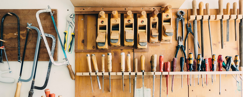 Photo by Barn Images on Unsplash
Over the past few years I’ve been working in a couple of design projects of what I’d call “advanced complexity”: Large multi-platform products for various device classes and screen sizes, featuring sometimes hundreds of screens, and being shared by designers and developers across different locations and timezones.
One of the biggest obstacles in these projects is often a lack of what I call “workplace hygiene”, i.e. the maintenance of a tidy working file environment and the adherence to some basic conventions within your design team. As a result, as projects run longer and files grow bigger, people easily lose track of latest versions, send out the wrong files or struggle with time-consuming manual changes.
This can be a recipe for disaster (or at least a lot of headache) unless you and your team agree on laying down a few simple rules that will make everyone’s life easier. Here are some suggestions that proved very useful for me and my team whole working on large-scale design projects using Sketch:
Everyone knows the infamous file called “VisualDesign_v4.2_final_final2 Copy”, and yet it pops up on our desktops every once in a while again — usually when the designer in charge is on vacation, and the client needs the final version in the next 10 minutes.
If you google for things like “file naming convention”, you will find a plethora of different approaches how to name your design files. In fact, these are all just variations of the same principle: Pick one naming convention, agree on it as a team and then stick to it no matter what.
Here’s a real-world example I’ve been working on some time ago, an online restaurant management platform called Cilantro, which comprised of several responsive web front-ends and required quite a few design iterations:

My preferred naming convention takes different attributes of a working file into account, such as sub components, major and minor revisions as well as multiple team members. In simpler project settings, for instance when there’s only one device class to design for, we’d ditch the corresponding attribute in order keep names as simple as possible.
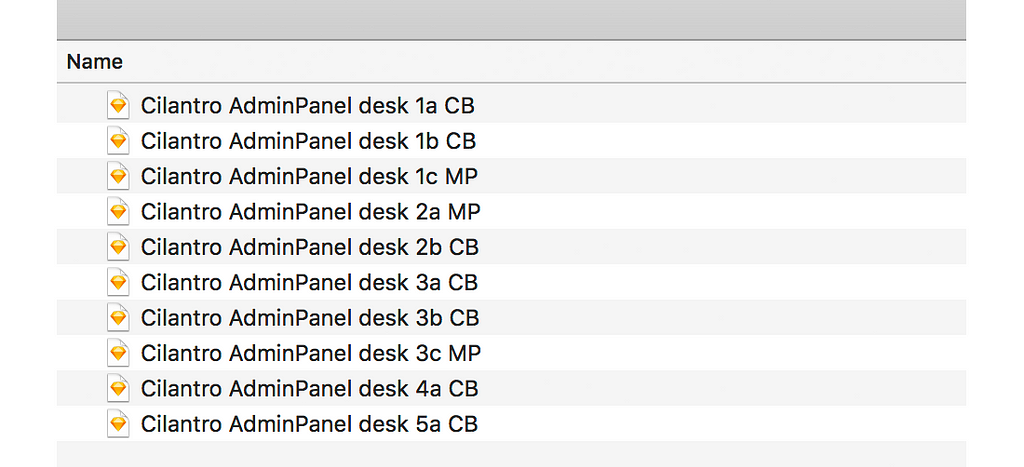 An OCD designer’s wet dream
No matter what convention you are using, what’s crucial is to have consistency throughout the project. Once everyone knows how to apply these simple rules, they will become an extremely powerful tool to save everyone a lot of time, stress and grey hair.
Edit: As several readers pointed out, in order to tackle the file management issue it is worth looking into version control tools like Abstract or Plant. I haven’t tried them myself yet (I remember some Git experiments we’ve done years ago though), and would be happy to hear your opinions and experiences.
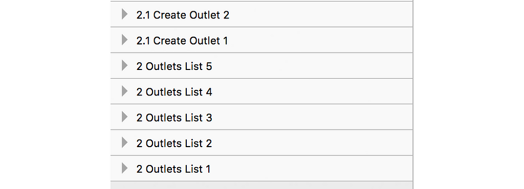
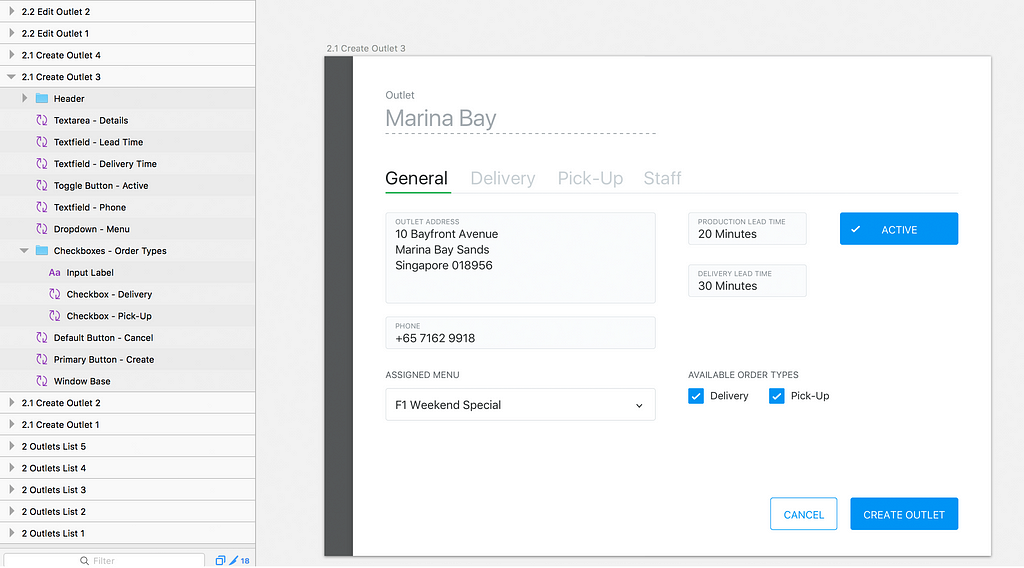
An artboard is a dedicated drawing area or canvas in a graphics editor that represents a page, view or component of an interface. Because Sketch exports artboards nicely into files or pushes them directly into a prototyping platform like InVision, it’s a very good idea to keep their naming consistent, transparent and in a sequential order. Here’s how I usually achieve this.
 A snippet from Cilantro‘s information architecture.
Once the initial concept phase is over and I have a rough idea of the information architecture of a product, I go through all screens/views and assign them an ID and a name tag. These IDs are numerical identifiers that provide a hint to the hierarchical structure of an app or website.
 Artboards for a main and a sub view in multiple states
In Sketch’s drawing area, artboards for each view are placed in vertical direction, while different states of the same view (think for example of a login form in disabled, empty and filled out states) are arranged horizontally. To distinguish different states of the same view, each artboard gets a trailing number starting at 1.
 Each row contains a view (or page) in different states
This convention not only gives you and your teammates better orientation especially in large Sketch files, it will also let all your exported files or InVision screens appear in a strictly sequential order, which makes it easier to find or replace single screens. This may look like overkill for small projects (and it probably is), but it will be highly beneficial once your project is becoming larger and more elaborate.
How many layers does your typical Sketch file contain that are named “Rectangle 2 Copy 5” or “Type something”? And how often did you struggle to find a certain layer in a cluttered artboard because they were basically all named the same?
Giving layers meaningful names so their corresponding elements can be easily spotted is one of the most basic yet most neglected exercises in keeping a design file tidy. And for sure it used to be an annoying task in the past, when renaming had to be done by hand (I’m looking at you, Photoshop!).
 Give layers meaningful names that correspond to what they represent
Luckily, the Sketch universe offers a bunch of little helpers for mind-numbing tasks in the form of plugins, and for renaming layers alone there are quite a few to choose from. My favourite for this job is Rename It, but whatever tool you use: Do yourself and your colleagues a favour and clean up your layers.
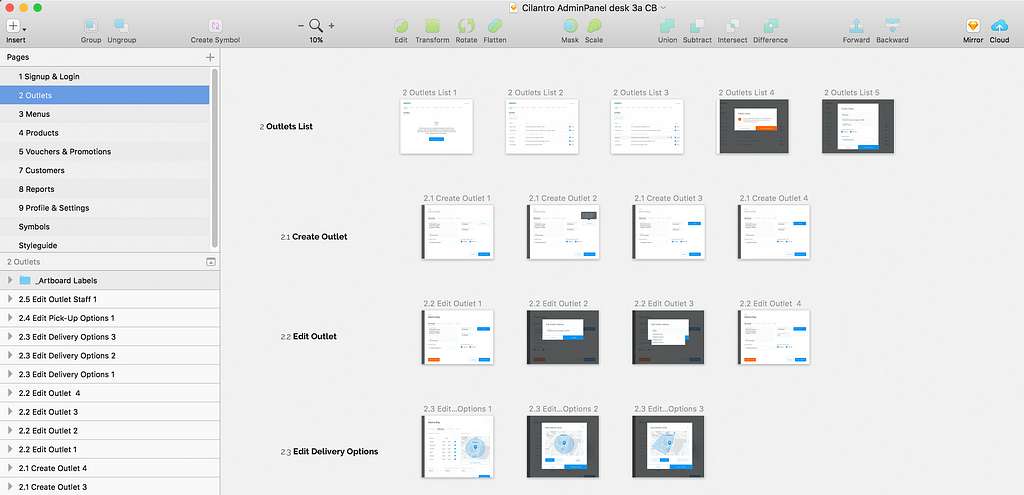
Sketch offers the ability to distribute your work across different pages, which can be a relief once your project is really big and consists of a lot of artboards. Make use of it!
 Each main section of our web app gets its own page
I normally use pages whenever an app/website has more than one major section, which is reflected by a different major ID. Each major ID gets its own page, so the number of artboards I have to deal with at the same time stays relatively small.
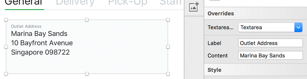
This is probably one of the most powerful features Sketch has to offer: A symbol is sort of a blueprint of a graphics object (which can be anything from a vector shape to a bitmap to a text element, as well as groups of those) that gets stored in a separate page called –you guessed it– “Symbols”. In order to use a symbol in your artboard, you create a copy that, under the hood, keeps a steady connection to the symbol it originates from. This copy is called an instance of a symbol. The beauty of symbols lies in the fact that once you edit the symbol itself, all its instances will inherit these changes and update themselves automatically.
 Override text elements in symbol instances
Symbol instances can be resized and text labels overridden individually, which makes them a highly flexible and powerful tool in Sketch. Even better, using a forward slash in a symbol name lets you created sub categories, which is an extremely useful tool once your project, and hence your symbol library, becomes really large.
 Lots of symbols, neatly organised
As a rule of thumb, whenever you’re using the same type of element more than once (i.e. a button or a text field), you should create a symbol and use instances of it instead. For some time now Sketch allows to nest symbols, which means different symbols can be grouped into a higher-level symbol. An example would be a symbol of a login menu that contains symbols of text fields and buttons.
The ability to nest symbols and to control their resizing behaviour lays also the foundation for building sophisticated design systems in Sketch. I’m going to write a separate article about my experiences and learnings here, but it basically allows to realise concepts like Brad Frost’s Atomic Design in Sketch.
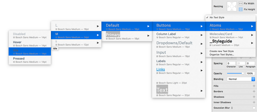
Very similar to symbols, shared layer and text styles help you to keep your Sketch file tidy as well as your team sane. If you’re remotely familiar with HTML and CSS, the concept will be a no-brainer for you: You create a shape or a text element and assign style definitions to them that will transform their visual attributes, such as fill and stroke color or opacity, and in the case of text elements font family, font size, weight etc.
 Nested shared text styles
Just like symbols, text and layer styles can be nested using a forward slash in their name, which lets you organise your styles nicely in a hierarchical structure.
You have your files nicely named so that your teammates won’t get confused when they’re looking for the latest version. You’re using symbols and text styles to keep all elements within a file consistent. What if you decide to apply a change to an element style or a symbols that you would like to propagate to other files as well? Enter shared libraries!
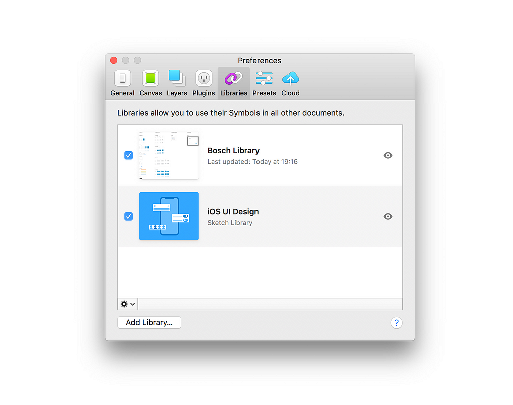 Connect to shared libraries in Sketch
A shared library is exactly what the name implies: A library (aka a collection of symbols) that is shared between multiple Sketch files. Originally we required third-party tools to take care of this, but since version 47, Sketch has this awesome functionality built in.
This is how it works: In a separate Sketch file, which will be your library, you define all kinds of symbols. Now if you start a new Sketch file (or open an existing one), you can import the symbols from this library by linking it to the Sketch file. Once done, you can access all symbols from the library file just the same ways you access local symbols.
 Decide which changes from the shared library you want to take over
And here’s the kicker: If you decide to edit a symbol in your library and save these changes, every time you open a linked file you will get a notification about changes to a shared library. Sketch allows you to go through them one by one to decide which changes you would like to import. Neat!
As you can see, the methods and features I’ve discussed here are pretty straightforward and can be implemented in your next project with little effort — all it takes is a bit of discipline for you and your team. And while your files seem small and your projects manageable in the beginning, by the end of a design phase they’re often a big, entangled mess. And how often did you have to dig out an archived project after half a year to make adjustments when you couldn’t make any sense of the artboard chaos or struggled even to find the latest version?
If you apply these simple rules and stick to them throughout your process, chances are that this little additional effort will pay off greatly for you and your team further down the road.
I hope these tips will be useful for your next project – if you have any additional, and maybe totally different best practices to share, I’d be happy to hear from you!
Happy Sketching! 🙌
Workplace Hygiene in Sketch was originally published in UX Design Collective on Medium, where people are continuing the conversation by highlighting and responding to this story.
AI-driven updates, curated by humans and hand-edited for the Prototypr community


