I have a bookmark folder of website designs that I like.
Every time I stumble upon a beautiful website I add it to the folder.
Here are 5 gems out of that folder that I really liked!
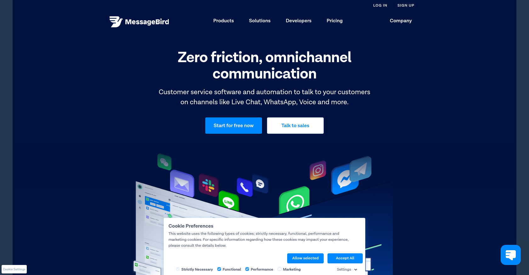
1. MessageBird
I always like simple clean designs. Messagebird is a text-book example of such a clean design.
2. ScraperBox
Bright red is a difficult color to match, but I think that it works quite well in Scraperbox’s case.

3. Plausible
Sometimes less is more. Plausible proves that point for me.
Design-wise their landing page is pretty basic. But I think it works remarkably well with transferring the message of their product.

4. Flatfile
Flatfile is another clean and elegant website design.

5. Sleepiest
Sleepiest truly went all out with their landing page design.
The beautiful landscape is quite eye-catching. And as a bonus, it is all vector graphics so the page load is still fast.

And that’s it. I hope this list gives you some inspiration!
