Until Apple's iPad cursor, the mouse arrow hadn't really evolved much since 1981. They'd always been the same slanted arrow from Xerox engineer, Douglas Engle.
Then a couple years ago, Apple reinvented the cursor to be 'touch-first' - on the new iPadOS, the cursor became a transparent round blob that interacts with elements just like a finger would. It's more dynamic and interactive than a regular mouse arrow though - for example, the colour adapts to different backgrounds for accessibility:
The cursor changes from dark to light depending on what's underneath it, keeping a good contrast.
In my last post on collaboration tool cursors, I outlined how mouse pointers come in different shapes and sizes these days, and can even include elements to become 'video cursors' or 'avatar cursors'. After playing with an iPad trackpad, I thought this blob cursor is another great demonstration of how cursors can become more useful and fun to use through changing their shape and form.
Here are some observations and new things to consider with touch cursors, starting with Pointer Magnetism:

Cursor Shapes and Pointer Magnetism
On the iPadOS, as you approach and hover certain elements such as buttons, the cursor morphs around the element, like a little capsule. It's what Apple calls 'Pointer Magnetism':
According to Apple's Human Interface Guidelines, each element on the UI has a 'hit region', and as you get close to it, the system begins to transform the pointer’s shape. It also works with dynamic movements that are more related to how your finger would move:
When people flick the pointer toward an element, iPadOS examines the pointer’s trajectory to discover the element that’s the most likely target. When there’s an element in the pointer’s path, the system uses magnetism to pull the pointer toward the element’s center.

Letter
Cursor Borders
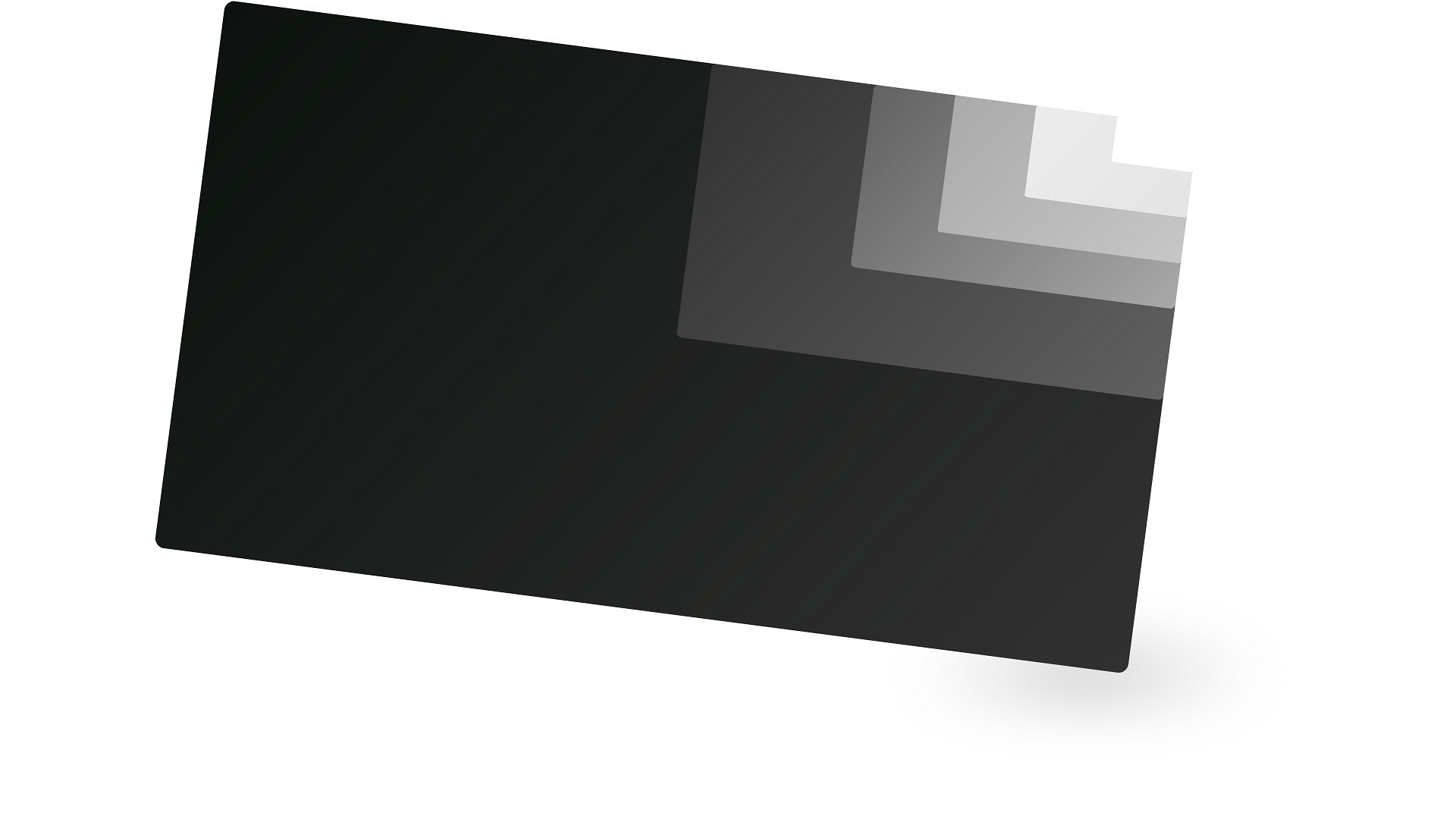
If you turn on the cursor border in the accessibility settings, this pointer magnetism becomes more obvious. It's like the original green circle changes into a green square, highlighting elements to show they're in focus:
It even feels a bit like the focus outline on a website (when you tab through elements on the page).
There can be some nice interactions too. When the cursor is inside a button, it can shine as you move the mouse to the edges:
Here's some of the accessibility options:
Accessible Cursors
Unlike the mouse cursor, which has a shadow and border, the touch pointer can sometimes be difficult to spot. To make it easier, you can change its border colour, width and size:
When you change the size of the cursor, a smaller focal dot is added in the centre so that targeting elements on the screen remains accurate.
You can also change the contrast to make the cursor easier to see:
Useful Pointers and Annotations
Above, we've gone through some of the default accessibility options on an iPad, but developers can further customise the appearance and shape to fit the context of their app. For example, as shown in the developer guidelines, they might make the cursor smaller and attach some contextual information to be more useful:

Consider enhancing the pointer experience by displaying custom annotations that provide useful information. For example, you could display X and Y values when people hold the pointer over a graphing area in your app. Keynote uses annotations to display the current width and height of a resizable image.
Read the full guidelines for more.
Rounded Pointers vs Arrow Pointers
The round pointer probably became popular through touch screen devices and apps. I first remember seeing 'touch pointers' used as substitutes for fingers on app demos and prototypes in tools like Principle or Flinto. Here's a more recent one in ProtoPie:
Rounded Cursor on Prototypes (ProtoPie)
Useful Cursors on the Web
With tablets making round cursors even more commonplace, round cursors seem to be trending more on the web too. For example, check out the 'Custom Cursor' feature on website builder, Semplice. Similar to those Apple Human Interface Guidelines, the cursors can change shape, expanding with useful icons that act as information cues to users:
Here's another nice example on Leyann Studio. It's similar to the previous accessible cursor, where the larger cursor has a smaller focal dot inside:
It's not really new for the web to have custom cursors, but maybe one day we'll see the mouse arrow start to borrow elements back from the touch pointer if it makes sense. Or maybe it'll eventually die as touch screens take over...Or maybe it'll last forever like the floppy disk icon.
Thanks for reading, if you have thoughts to add, or if I've missed anything, please point me in the right direction.

 Buy me a coffee