From Text Carets to 'Video Cursors'
What makes real-time collaboration tools extra fun to use are those colourful 'collaboration cursors'. First appearing as blinking text carets in editors like Google Docs, they became flying mouse cursors on whiteboards such as Mural. Figma then brought them to the design canvas, and since then, we've seen them evolved into floating avatars and 'video-cursors', with presentation software like Pitch showing the way:
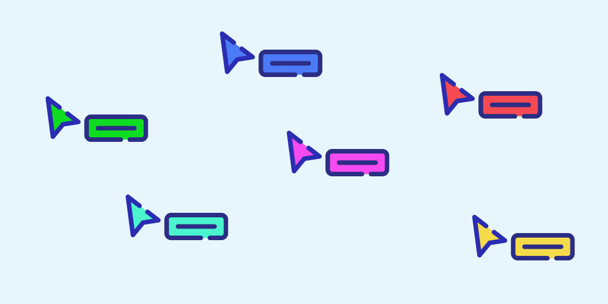
Multiplayer mode and live cursors create the feeling that you’re sat with friends and teammates, so it's natural that designers started experimenting with them to improve product experiences. They've gone from default browser elements to becoming little components in themselves - they can be arrows, shapes, floating avatars, or videos that bring voices onto the canvas – depending on the user needs.
As Ahmed, Head of Extend at Pitch observed, real-time cursors are on every app at this point - similar to how the Stories feature spread across social media apps:
Real-time Cursor feels like Stories feature all over again.
Almost every app has it at this point. pic.twitter.com/XdpScwndtM— Ahmed 🇺🇦 (@ahmed_sulajman) December 21, 2020
This article is an observation on the different types of real-time cursor that have been emerging. With Apple Freeform bringing FaceTime video to the canvas, could the Pitch's 'video-cursor' become a future norm too?

Text Carets and Parking Lots
It all started with the text editor - here's an early version of Google Docs, and their colourful text carets:

Notice that the '6 other collaborators' in the red box of the image doesn't even use avatars yet - they're just coloured squares. Another side-note is that these places can get crowded:
Always be sure to provide ample parking when presenting a google doc pic.twitter.com/9tWKMLJvNq
— Adam Leventhal (@ahl) July 29, 2021

The Early Collaborative Cursors
Back in 2015, when I was working at IBM Design, we used this cool whiteboard tool called Mural. Maybe that was the first tool with a collaborative cursor that gained widespread adoption (correct me if I'm wrong):

From Colourful Cursors to Pen-shaped Cursors

Figma's Arrows
When Figma brought multiplayer to design tools (all the way back in 2016), the cursors began to look more custom, with differently shapes and styles. Figma's have a little border and shadow, and they really make it part of their branding:

Sometimes they went a bit wild with bear cursors 🐻 for a laugh:
This year, the @figmadesign team said no to April Fools and yes to April Fun with a small surprise for all the teams out there working in multiplayer. May your Figma files be filled with many 🖍️🐱🧁🎻 cursors and lots of joy!! pic.twitter.com/s0RgIlxrSn
— Emily Lin (@eymlin) April 1, 2020
Figma's Speaking Cursor 💬
[Update 10 June 2022]: The cursor can become more interactive with the press of the forward slash key too! This is a nice example of how the cursor can have different uses. Pressing slash anywhere on the canvas attaches a text field to the cursor, letting you 'say something' for teammates to see:
InVision Pen
InVision Freehand use the pen:
Framer Triangle
Framer use a cute and simpler triangle:

Avatar Cursors
Instead relying on colour to show different users, what about changing the cursor to an avatar? Niice.co are a great example of this - instead of showing avatars stacked up in the top right, the avatars become part of the cursor:


This concept also appears on Pitch:

Video Cursors
If you look closely at the video above, the Pitch avatars are actually 'video avatars', floating and talking on top of a presentation deck, which is pretty crazy:
See it in action here on YouTube. It's a mode that you can activate when you need to talk to each other, attaching a video avatar to the mouse cursors. Switching video mode on and off when you need it means the regular cursors can be used for the most part, so avatars and faces don't distract from the content you're working on.
The Future and Virtual Workspaces?
With Apple's Freeform bringing FaceTime to the canvas, maybe it could become a thing we get used to...right before we jump into virtual workspaces, like this concept by Nuha Maulana Ahsan:
Until then, companies will keep experimenting. For example, CodeSandbox are testing the use of collaborative live text carets (for typing in code), and mouse cursors in their cloud IDE for developers:
What if you could see the live mouse cursors of the people you're collaborating with? 🤔
That's what we're exploring right now in CodeSandbox. Let us know what you think! 😀 pic.twitter.com/VY5xBCItYy— CodeSandbox (@codesandbox) May 30, 2022

Thanks for reading - sign up to Prototypr newsletter to get articles like this in your inbox! Say hi on Twitter.


 Buy me a coffee


