Build Design Systems With Penpot Components
Jul 21, 2:15 AM
Penpot's new component system for building scalable design systems, emphasizing designer-developer collaboration.
smashingmagazine.com

CSS Container Queries introduce a new way to create responsive layouts by allowing elements to change styles based on the size of their containing element, rather than the viewport size. This provides more control and predictability in designing reusable components that adapt to their container's dimensions. This post by Geoff Graham outlines everything you need to know to get started with container queries.
Container queries register an element as a "container" and apply styles to child elements.
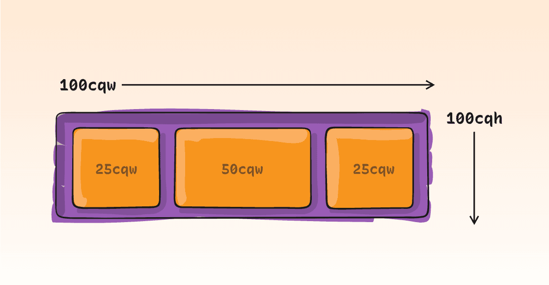
Styles can be applied to elements within a container based on conditions like the container's width, height, aspect ratio, or orientation.
Container queries introduce new CSS length units that size elements based on their container's size.
Containers must be explicitly sized as part of a flex or grid layout.
Container queries support range syntax and can be chained with logical operators like and, or, and not.
AI-driven updates, curated by humans and hand-edited for the Prototypr community


