Build Design Systems With Penpot Components
Penpot's new component system for building scalable design systems, emphasizing designer-developer collaboration.


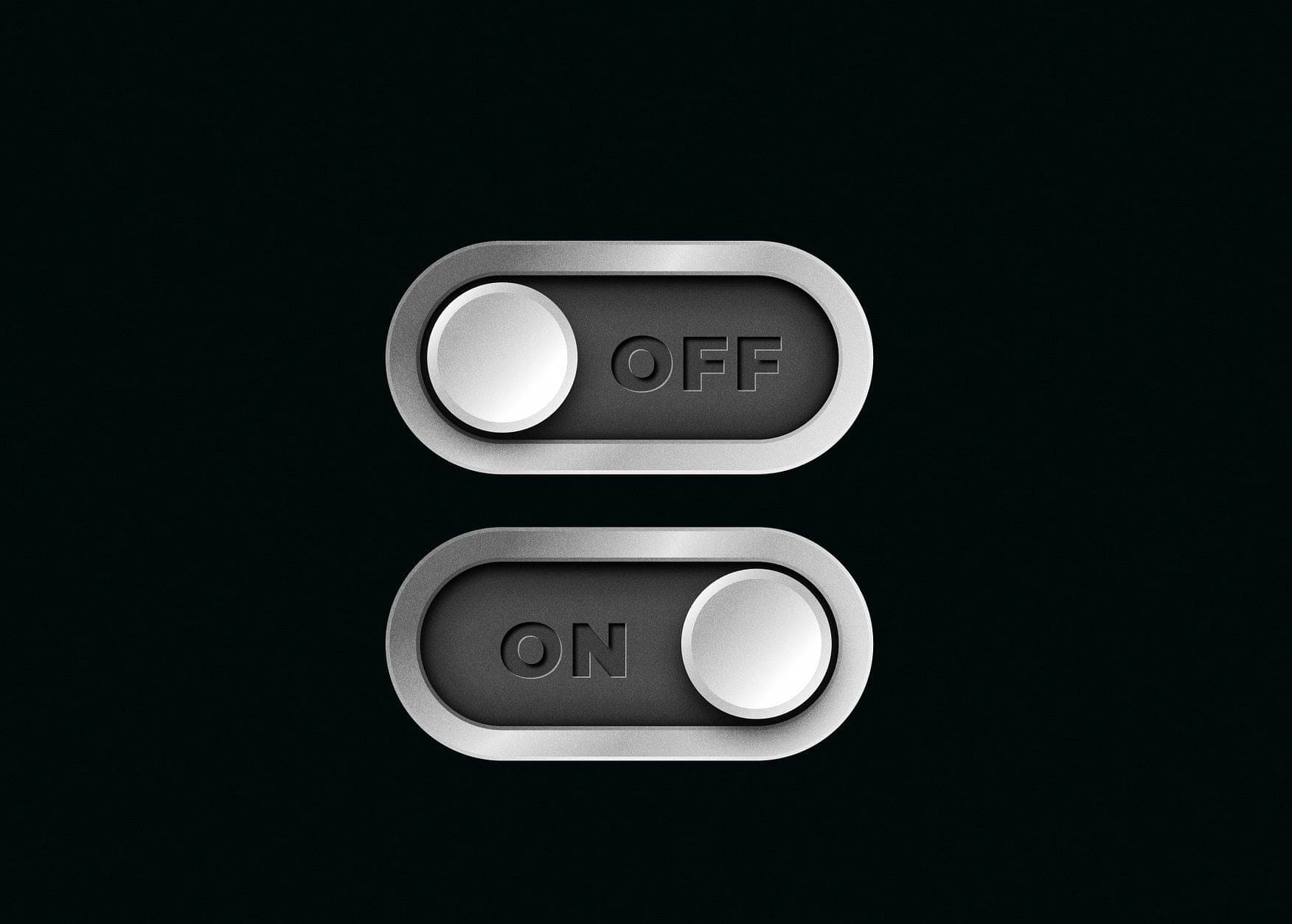
Adam Silver argues against the use of toggle switches in user interface design. He discusses five main reasons why toggle switches can be problematic, including user comprehension issues, usability challenges, potential technical failures, inconsistency in design, and reliance on JavaScript.
Toggle switches can be confusing to understand their state
There's risk of settings not being saved due to slow AJAX requests
They require JavaScript to function, potentially compromising progressive enhancement
Alternatives like radio buttons or simple toggle buttons are often better choices
AI-driven updates, curated by humans and hand-edited for the Prototypr community