Build Design Systems With Penpot Components
Jul 21, 2:15 AM
Penpot's new component system for building scalable design systems, emphasizing designer-developer collaboration.
smashingmagazine.com

Visual design plays a critical role in shaping UX across digital interfaces, and certain visual design rules can serve as guiding principles to ensure aesthetic appeal and functional clarity. While these guidelines are not set in stone, they offer a reliable framework for creating visually engaging designs. This article from Anthony Hobday delves into essential visual design rules that designers can confidently adhere to, enhancing the overall quality of their work.
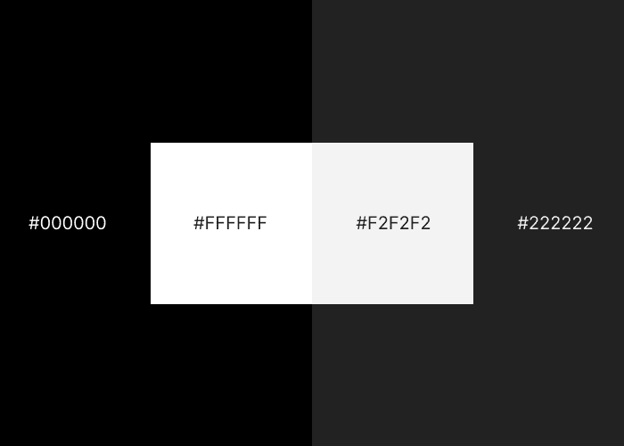
Near-Black and Near-White Usage: Use near-black and near-white tones instead of pure black and white to mitigate high contrast issues and excessive brightness levels.
Saturated Neutrals: Add a hint of color from the interface palette into neutrals like black, white, or grey to maintain color harmony.
High Contrast for Significance: Prioritize high contrast for crucial elements like buttons and content to draw user attention.
Intentional Design Choices: Use deliberate decision-making in every aspect of design, including whitespace, alignment, size, and color, to foster coherence.
Optical Alignment Over Mathematical Alignment: Emphasize visual alignment over mathematical precision – some shapes may require manual alignment for optimal visual balance.
AI-driven updates, curated by humans and hand-edited for the Prototypr community


