Hi everyone! In today’s post, we’ve picked up the best links to resources that are trendy in the design industry, and that will help you get some inspiration and speed up your workflow.
We use all the resources listed below ourselves, and we are sure that they will be useful for you too.
So what’s on our menu today: interactive buttons and widgets, style guides, a lot of cool information regarding the grid, generators for UI challenges and Dribbble shots, cool icon packs and much more.
As usual, the hottest resources are at the end, so make sure you don’t miss the most interesting items!
Font Of Web
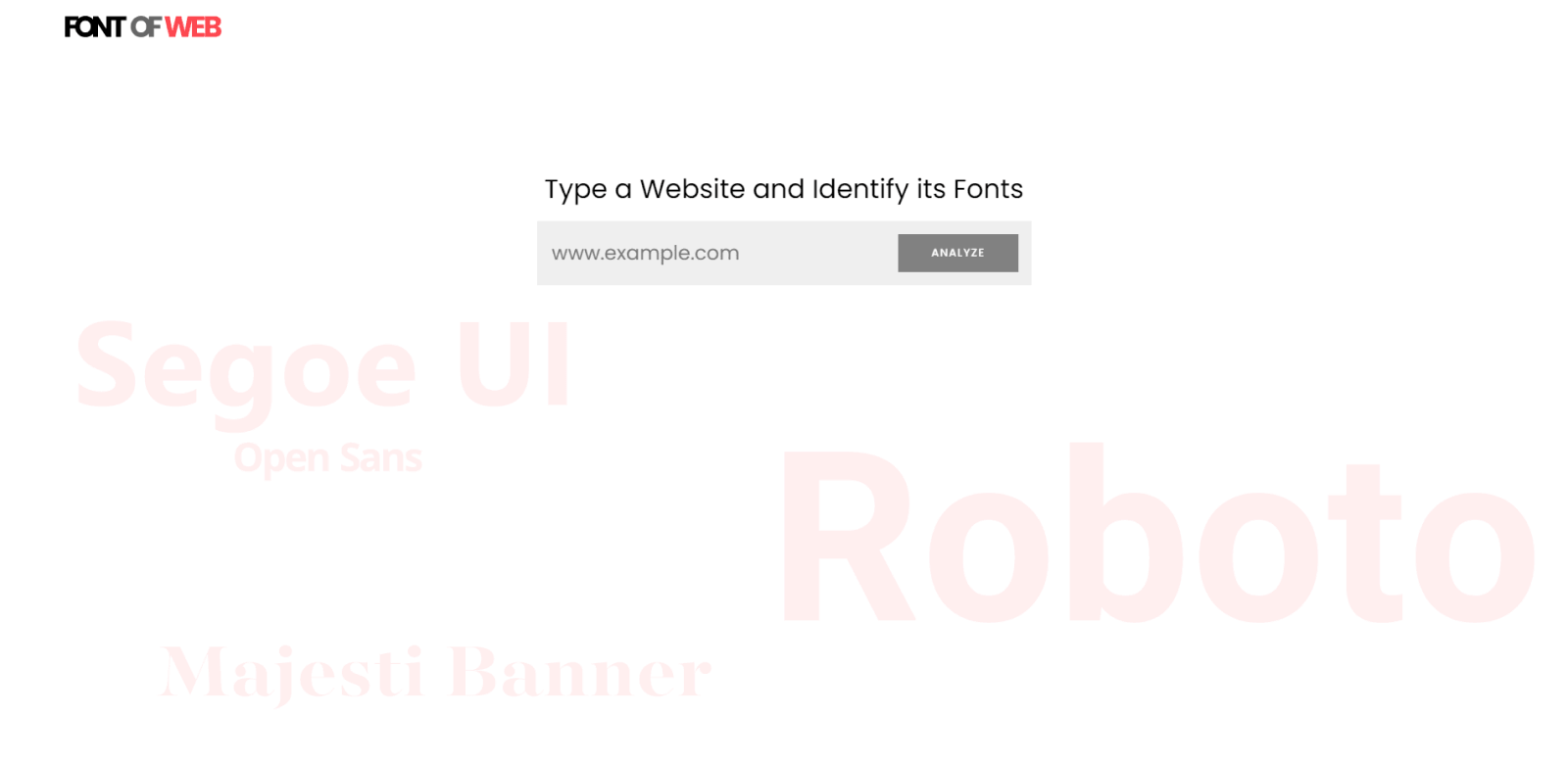
You probably came across the following situation: you like a font on a website, but you don’t know where to find the information about it. The Font Of Web is a great solution to this problem.
Now it is enough to enter the URL of the website where you favorite font was used, and in a couple of seconds you will have all the necessary information: the name of the main font, a list of fallback options for this font, all standard sizes for paragraphs and headings, as well as all specifications (size, weight, line height and even download links).
Making layout grids work for you

This interactive tutorial will show you how to set up a dynamic grid in Figma. You’ll understand how the grid works in Figma, how the layout grid differs from Auto Layout, and there are also some practical examples to follow.
The content of the resource consists of 6 sections. Here is a small summary of each of them:
- Introduction to the grid: You’ll find out about the anatomy of a grid, as well as for instructions on how to apply the layout grids in Figma.
- Figma and Layout: This section will help you understand how to work with fixed and stretched grids, and also how to manage Constraints.
- Baseline Grid: You’ll learn about spacing techniques that allow you to visually align elements, how to work with standard baseline grids, and how to use a grid for text and icon design.
- Practical Application: In this section, you will learn how to evenly distribute elements, scale complex layouts, and work with Auto Layout.
- This section covers tips and tricks that you can apply to change the color of the grid, toggle it, create styling, etc.
- The last section is a list of links to articles that you might find very useful.
ScreenBean

ScreenBean is a great tool for generating shots for Dribbble. Working with it is quite simple — just drop any screenshot from your work, and the system will automatically generate a cool shot for Dribbble.
Here is the full list of features that are generated automatically: a color palette, rounded corners of the image, as well as several background modes — normal, with gradients, with shadows, and the so-called “playful” background (with circles of different sizes scattered across the background).
Delightful Micro-Interactions

Static websites and apps look boring. So, breathe life and make your user interface more interactive with this powerful collection of interactive buttons and widgets. More than 500 shots from 213 designers are collected here.
On the one hand, all animations in this collection are visually catchy. On the other hand, they are simple and not intrusive, which is also a good trend these days. Buttons such as Download, On / Off, Search, Add to Cart, Send Message, emoji reactions and much more — you will find tons of good ideas for UI animation.
This collection is a must-have for all designers looking for inspiration when creating spectacular animations.
Glyphs Icons

Glyphs Icons is a design system of almost 3000 boolean icons created in Figma. These icons are optimized to work in a browser.
This resource allows you to export icons from Figma using its API, both as simple SVG files and as web components. With Glyphs Icons, people can create interesting applications with this system close at hand.
The search bar adds convenience, especially when working with a large set of icons.
Also, the author created the Figma plugin to improve the workflow. So far, the plugin is under development. However, when downloading the repository, it can be used locally.
If you are interested in knowing about the entire process of creating the Glyphs Icons, the author describes it in this thread on Reddit.
Phosphor Icons

Phosphor Icons is a killer icon pack for any project, whether you create interfaces, diagrams or presentations. This resource has 3500+ flexible icons for all occasions.
On the Phosphor Icons website, you decide which icons you need and in what form: perhaps you need outlined or filled icons, or maybe duotone ones. You can adjust the weight of the icons, select the desired size using the slider, set the desired color in the HEX-code field. Plus, the icon you want is easy to find by searching. Also, icons are available in the Figma library both as a file and as a plugin.
Layoutit Grid

Layoutit Grid is an open-source, interactive CSS grid generator. It allows you to create a layout and see the code in progress. You can interact with the code, resize containers, and see how CSS and HTML code changes in real-time.
Once you’re done with the layout, you can go to CodePen with the ready-to-use code. After that, you can move on to your next project. This tool brings code to the front, helping you learn a CSS grid by working directly with it.
Generators like Layoutit Grid are just auxiliary tools when it comes to working with CSS and HTML. But still, this generator will be of great help, especially for the entry-level developers and web-designers.
UI Coach

UI Coach is a design challenge generator. Ideal for those who need to get their hands on design, add more projects to their portfolio and grow organically. Everything is very simple — after clicking the Generate Challenge button, you will be given a task to make a UI design for something. What the task includes: a project idea (for example, “Create a website that sells WordPress themes and plugins”), a color palette, font combinations, and a link to a free resource (such as illustrations).
If, let’s say, you didn’t like the color palette, you can click on the Update button on the right side of the item’s field, and the system will generate another item for you. Alternatively, you can click on Refresh All and you will be presented with a completely new task.
If you do not want to create another food delivery application design, and in the pursuit of some new ideas for your design challenges, then this resource will help you.
Style Guides inspiration

Many beginners (and not only them) sometimes experience difficulties in designing style guides for their projects. And if you are facing the same problem, then this extensive moodboard on Dribbble will definitely help you.
Moodboard consists of 98 shots from 79 designers. It is constantly updated and consists of top-notch works that are worth focusing on.
This collection is not limited to style guides for UI kits and design systems. You will have the opportunity to understand how to design the logo style guides, as well as the patterns that are used on websites and applications. For example: how to style the FAQ section, and so forth.
Aspectapp web tool

The top three are opened by a rather interesting web app called Aspectapp. With its help, you can create interface designs and turn them into real websites. The program already has several ready-made templates. Although this application still needs to be improved, it’s obvious that it has huge potential. Webflow should start to worry about its user retention 🙂
The creator of Aspectapp is currently working on integrating React into his app, as well as the ability to export designs directly from Sketch, Figma, and XD.
You can find the details of this project in this thread on Reddit.
This is a great example of how any person can create his/her startup from scratch relying only on their efforts. So why not try to create something of your own if you have the necessary skills?
Kolumna grid generator

The second place is occupied by the Kolumna grid generator. With this amazing tool, you can easily create grids for your projects. This is a very flexible and convenient resource, where you can adjust the canvas width (for all devices), spacing, margins, columns, as well as sidebars on the left and right sides (their width is also adjustable).
Working with this tool is extremely simple and intuitive. You can customize the parameters using sliders, drop-down lists and input fields with numbers.
Kolumna is a great solution if you want to speed up your workflow if you want your content to be organized and your designs to be more balanced.
Responsive Grid: Ultimate Guide

The leader of today’s rating is the article Responsive Grid Design: Ultimate Guide. We’ve talked a lot about grid, but this tutorial is the most in-depth material. After reading this cool article, you will have a complete understanding of how the grid works and how to work with it as an advanced user. Through this resource, you will learn:
- The anatomy — basic information about columns, margins and gutters;
- How to design an interface using a responsive grid — how to work with images, texts, and other UI elements that are inside visible or invisible parent containers;
- How the column structure and breakpoints work;
- Grid Behavior — Everything about fixed, flexible, and hybrid grids;
- How to set up a grid layout in prototyping tools;
…and much more.
That’s it for today. We hope that this release was useful and that you have already decided which resource you are gonna try in your projects.
We constantly publish interesting news from the world of the design industry. So to stay informed and to get some inspiration, consider subscribing to our Newsletter, as well as our Youtube channel and follow our pages on: Dribbble, Behance, Medium, Reddit.

Also, don’t forget to visit our Setproduct homepage to get inspired with UI design from the nearest future. Where you will find top-notch design systems and UI kits for fast and high-quality work in Figma.
