Responsive images can be crucial for making site content available and accessible to users across various devices. This article by Dan Cătălin Burzo covers the use of the srcset and sizes attributes with img and picture/source elements to serve different image sizes based on display density, layout width, and other media conditions.
Key points
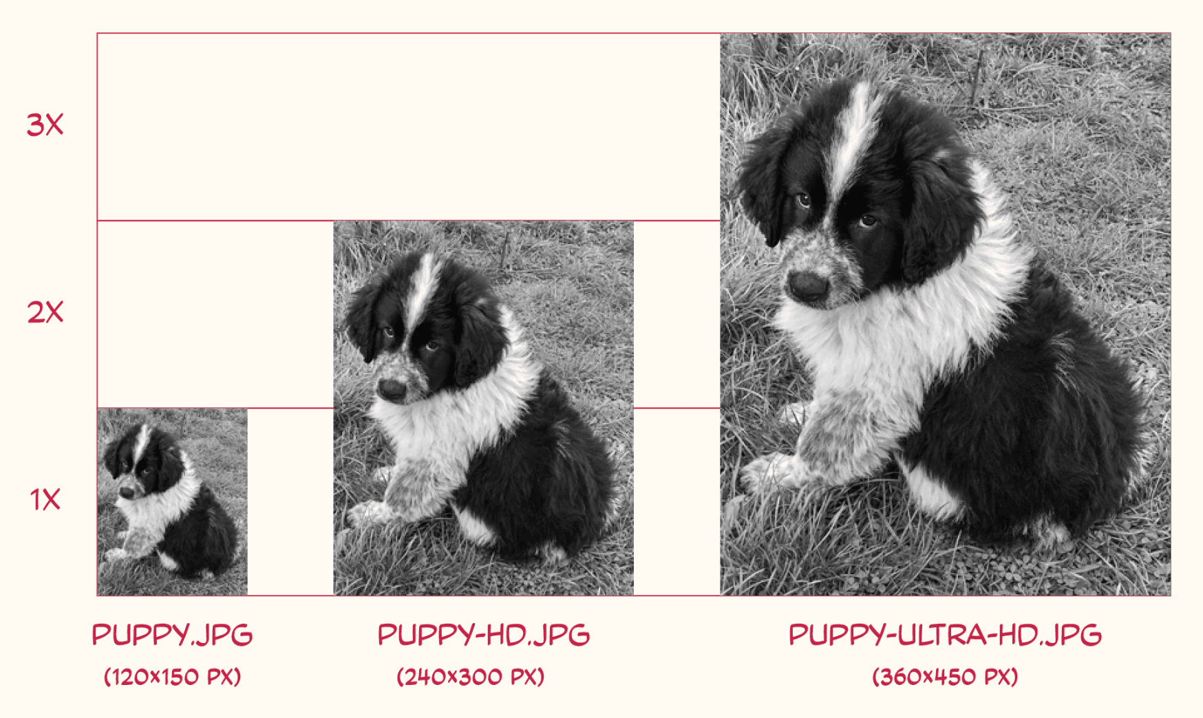
srcset attribute: Allows specifying multiple image sources with different resolutions/densities for different displays.
Width and height attributes: Include width and height attributes on <img> to prevent layout shifts.
srcset order: Order of sources in srcset doesn't matter; browsers evaluate all candidates.
Density descriptors: Use (e.g. 2x) in srcset for images meant to render at their natural size.
<picture> and <source>: The <picture> element with <source> allows art direction and serving different image crops/versions.
Type attribute: Use the type attribute on <source> to serve modern image formats safely.
Lazy-loading: For lazy-loaded images, sizes="auto" lets the browser use the actual layout width automatically.
Browser behavior: Browsers differ in how they pick sources, but generally favor the closest density or re-evaluate on window resize.
Better images handling = better UX
Web developers can enhance user experiences by optimizing image delivery based on different device capabilities and screen sizes. Implementing adaptive image techniques using HTML attributes empowers developers to deliver the most appropriate image content to users, thereby improving site performance and user engagement.


